
Header & Navigation Customization
CubeWP Custom Theme Builder + Elementor + CubeWP Mega Menu
| Field | Details |
| Platform | WordPress with CubeWP Theme Builder |
| Page Builder | Elementor |
| Scope | Header layout, navigation menus, login/sign-up, mobile popup |
1. Overview
This guide covers the complete workflow for customizing your site’s header using the CubeWP Theme Builder and Elementor. Topics include header layout configuration for desktop and mobile devices, Mega Menu setup and editing, navigation menu management from the WordPress backend, and managing login/sign-up popups with visibility controls.
2. Accessing the Header in the Theme Builder
2.1 Navigate to the Custom Theme Builder
Follow these steps to locate the header settings:
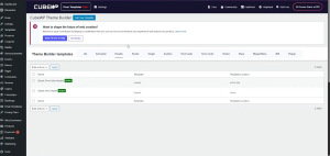
- From the WordPress Admin Dashboard,hover over CubeWP.
- Select Theme Builder from the CubeWP menu.
- Click on the Header section in the theme builder interface.
2.2 Selecting the Correct Header
The Theme Builder typically contains multiple header templates assigned to different display conditions. Common examples include:
- Site-wide header — applies to all pages across the entire site.
- Home page header — applies exclusively to the home page.
| NOTE | You can assign a header to a specific page or to the entire site based on your preference. Select the header that matches your intended scope before editing. |
To begin editing, click Edit with Elementor on the desired header template.
3. Understanding the Header Layout Structure
3.1 Desktop and Mobile Containers
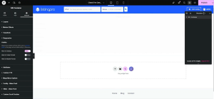
Inside the Elementor header editor, you will find two primary containers:
- Desktop container — configured to display only on desktop screens.
- Mobile container — configured to display only on mobile devices.
Responsiveness is controlled through each container’s visibility settings. When switching to the tablet or mobile view in Elementor, the system automatically hides the desktop container and vice versa. This behavior is managed through the Responsive Settings panel for each container.
| NOTE | Always verify the visibility/responsiveness settings of a container before making changes to avoid unintended display issues across devices. |
4. Updating the Logo
To replace the existing logo with a new one:
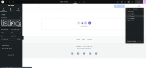
- In the Elementor editor, locate the logo element within the desktop container.
- Delete the existing logo widget or image element.
- Add a new image or logo widget and upload your new logo file.
- Confirm the logo displays correctly in the canvas before saving.
5. Configuring Navigation Menus
5.1 The CubeWP Mega Menu Widget
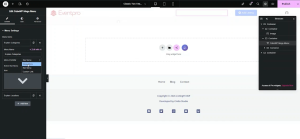
The header uses the CubeWP Mega Menu widget for navigation. This widget supports three menu-type options:
- Mega Menu — A full width menu
- Nav Menu — A Dropdown.
- Custom Link — A link to another page or source that should open on clicking.
5.2 Assigning a Menu in Elementor
Within the Mega Menu widget settings in Elementor:
- Edit the name of the menu
- Select the menu visibility (e.g., Mega Menu).
- Choose the desired mega menu from the available list (e.g., a pre-built Mega Menu such as the ClassTwo Categories Mega Mega or ClassTwo Locations Mega Mega).
- Click Publish or Update to save changes to the header.
5.3 Managing Nav Menu from the WordPress Backend
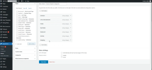
All navigation menus are managed under Appearance > Menus in the WordPress Admin Dashboard. From this screen you can:
- View all existing menus and their assigned items.
- Add new menu items, including pages, custom links, and dynamic links.
- Remove items by selecting them and clicking Remove.
- Create new menus from scratch using the Create New Menu option.
| NOTE | Any changes made in Appearance > Menus are reflected in the front-end navigation once saved. Verify on the live site or in preview mode after each update. |
Adding Custom Links
To add a custom navigation link:
- In Appearance > Menus, expand the Custom Links panel.
- Enter the target URL and a label (Link Text).
- Click Add to Menu and drag the item to the desired position.
- Save the menu.
| NOTE | Dynamic links can also be configured here. If navigation icons are not rendering as expected, consider removing the icon element rather than leaving a broken placeholder in the live interface. |
6. Creating and Editing Mega Menus
6.1 Opening a Mega Menu for Editing
To edit an existing Mega Menu:
- Navigate to CubeWP > Theme Builder in the WordPress admin.
- Go to the Mega Menu section and locate the menu you wish to modify.
- Click Edit with Elementor to open the Mega Menu canvas.
6.2 Building the Desktop Mega Menu Layout
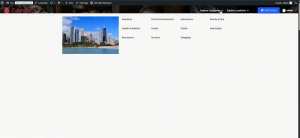
A common Mega Menu layout consists of two containers side by side:
- Left container — displays a featured image.
- Right container — displays a list of taxonomy items (e.g., listing categories or locations).
Steps to configure the desktop layout:
- Add a new container to the Mega Menu canvas.
- In the left container, insert an Image widget and upload or select a high-quality image.
- In the right container, add the Taxonomy widget.
- In the Taxonomy widget settings, choose the desired taxonomy (e.g., Listing Categories) to display dynamically.
- Apply basic styling to ensure a clean, professional appearance.
- Set the container height to 100VH to span the full viewport height.
- Set an appropriate background color consistent with your site theme.
6.3 Hiding the Desktop Mega Menu on Mobile
Once the desktop layout is complete:
- Select the desktop Mega Menu container.
- Open its Responsive Settings.
- Enable the option to hide this element on mobile and tablet screens.
6.4 Building the Mobile Mega Menu Layout
To create a separate Mega Menu layout for mobile devices:
- Add a new container or section designated for mobile.
- Populate it with the appropriate navigation links or taxonomy list.
- For static links, use Custom Links with manually entered URLs.
- For dynamic content, use the Taxonomy Repeat widget (e.g., Q Repeat Taxonomy widget) to fetch location or category data automatically.
- Set the visibility of this container to display only on mobile and tablet screens.
| NOTE | The Q Repeat Taxonomy widget (also referred to as the Taxonomy widget) fetches taxonomy terms dynamically and is the recommended approach for keeping the Mega Menu content in sync with your site’s category or location data. |
7. Managing Login and Sign-Up
7.1 Sign-In / Sign-Up Button in the Header
The header includes a sign-in or sign-up button that opens a popup when clicked. This popup is managed through the Value Pack and Theme Builder interface within CubeWP .
Configuring the Button Trigger
- In the Elementor header editor, select the sign-in button widget.
- In the widget’s action/trigger settings, assign the popup you wish to open (e.g., the Login & Sign-Up popup).
- You can also configure the button to redirect to a pricing plan page before the submit page, or go directly to the submit page — depending on your business requirements.
7.2 The Login / Sign-Up Popup
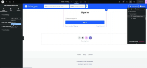
The login popup is built as a dedicated popup in the CubeWP Popups section. Then open with elementor the Popup you want to edit i.e Login/Sign Up. Inside the popup, the CubeWP Submit Form widget is used to render both the login and sign-up forms.
Sign-Up Form Configuration
In the Submit Form widget settings, Under the User form setting:
- Select the user role for new registrants (e.g., Subscriber, Administrator).
- Add required form fields such as Email, Password, and Confirm Password.
- Optionally add fields like Display Name, Website, or any other custom fields.
- You can also edit the Registration Button Text from here.
- Save and publish the popup.
Login Form Configuration
In the Submit Form widget settings, under the Login Form Settings you can edit login form like:
- Default fields include Username/Email and Password.
- Configure options such as showing or hiding the ‘Not a Member’ link.
- Set a post-login redirect URL if needed.
- Customize the sign-in button label (e.g., change ‘Sign In’ to ‘Login’).
7.3 User Availability / Visibility Settings
The sign-in and sign-out elements each have a User Availability setting that controls who sees them:
- Show to Everyone — visible to all visitors regardless of login status.
- Logged-In Users Only — only visible to authenticated users.
- Non-Logged-In Users Only — only visible to guests who have not signed in.
Recommended configuration:
- Sign-In button: set to Non-Logged-In Users Only.
- Sign-Out (User Account widget): set to Logged-In Users Only.
| NOTE | You can verify button visibility by testing in an incognito or private browsing window, which simulates the experience of a non-logged-in visitor. |
7.4 The User Account Widget
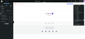
Once a user is logged in, the sign-in button is hidden and replaced by the User Account widget, which displays:
- User avatar.
- Display name or username.
- A dropdown menu containing configurable links.
Managing Dropdown Links
Inside the User Account widget settings, you can add, edit, or remove dropdown items:
- Dashboard Link — a link to the user dashboard.
- Profile Link — a link to update user profilet.
- Logout Link — a link to log out the current user.
Example: To replace the default Profile link with a Shop page link, remove the Profile item and add a new Page Link pointing to your Shop page.
8. Mobile Header and Mobile Menu Popup
8.1 Mobile Container Structure
The mobile header container is configured to display only on mobile and tablet devices. It typically contains:
- A logo or branding element.
- A hamburger (burger) menu button that triggers the mobile navigation popup.
- Sign-in and sign-out buttons, each with their own User Availability settings.
8.2 The Mobile Menu Popup
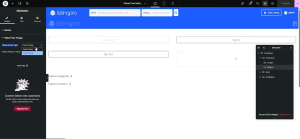
The mobile sidebar navigation is delivered through a dedicated popup named Mobile Menu Popup, configured in CubeWP > Popups.
Configuring the Hamburger Button and Close Button
In the button widget settings:
- Set the On Click action to Open Popup.
- Select the Mobile Menu Popup from the popup list.
- For the close button inside the popup, set the action to Close Popup and select the same popup.
8.3 Customizing the Mobile Menu Popup
Inside the Mobile Menu Popup (edited via Elementor):
- Add or modify navigation links, menus, or Mega Menu sections.
- Include sign-in and sign-out buttons with appropriate User Availability settings.
| NOTE | The Mobile Menu Popup can contain a full Mega Menu for mobile, including dynamic taxonomy lists (locations, categories, etc.) built with the Taxonomy widget or custom links. |
9. Styling and Customization
All elements within the header and mega menus can be styled through the Elementor Style tab. Key properties you can customize include:
- Typography — font family, size, weight, line height, and letter spacing.
- Color — text color, background color, and hover states.
- Padding and Margin — internal and external spacing around elements.
- Border — border style, width, color, and border radius.
- Flex Direction — set container layout to row, column, row-reverse, or column-reverse.
| NOTE | Always check your changes across desktop, tablet, and mobile viewports in the Elementor responsive preview before publishing. |
Here is the link of the video tutorial