
Term Card & Taxonomy Widget
CubeWP Taxonomy Widget – Configuration, Styling & Custom Grid Layouts
| Platform | WordPress + Elementor + CubeWP |
| Feature | Taxonomy Widget & Term Cards |
| Scope | Term card creation, dynamic data binding, hover effects, and per-term grid layouts |
1. Overview
This guide covers the complete workflow for displaying taxonomy term cards using the CubeWP Taxonomy Widget. The use case demonstrated is displaying location-based term cards on a homepage — for example, showing business locations from a Locations taxonomy. The process includes: adding the taxonomy widget to a page, creating a custom term card template in the Theme Builder, binding dynamic data (term images, names, counts, links), applying hover animations, and configuring custom per-term CSS grid layouts.
2. Adding the CubeWP Taxonomy Widget to a Page
2.1 Navigating to the Page
To begin, navigate to the homepage (or any page where you want to display the term cards) and open it with Elementor:
- Go to the WordPress Dashboard.
- Navigate to the pages, then select the target page (e.g., Homepage).
- Click Edit with Elementor to launch the Elementor editor.
2.2 Adding the Widget
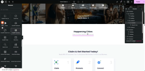
- In the Elementor sidebar widget panel, navigate to the CubeWP category.
- Locate the CubeWP Taxonomy widget.
- Drag and drop the widget into a container on the page.
- It is recommended to first add a dedicated container and set its padding to 0, then place the widget inside this container for better layout control.
2.3 Configuring the Widget Settings
After placing the widget, the following settings are available in the widget configuration panel:
- Taxonomy Selection – Select which taxonomy terms to display (e.g., Locations).
- Number of Terms – Configure how many terms to show at once.
- Style / View – Choose between box view (default) and other layout styles.
- Layout Display – You can change layout display i.e grid or flex. Can also change other grid properties such as number of grid rows and grid columns.
- Colors – Customize colors applied to the term card elements.
ℹ️ Note: The default view style is Box View. Multiple view styles are available, including pre-built styles like Classic Two Tech Style One and Classic Two Listing Feature Style One. Custom styles created in the Theme Builder will also appear here once published.
3. Creating a Custom Term Card Template
3.1 Accessing the Theme Builder
- In the WordPress Dashboard, navigate to CubeWP.
- Click on Theme Builder (also referred to as CubeWP Theme Builder).
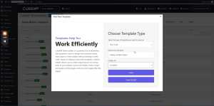
- Click Add New Template.
3.2 Configuring the Template
- In the template creation dialog, select Term Card as the template type.
- Give the template a descriptive name — for example: Location Listing Style 1.
- Attach the template to the appropriate taxonomy — in this case, the Locations taxonomy.
- Click Save and Edit with Elementor to open the Elementor editor for this term card template.
ℹ️ Note: The taxonomy assignment is critical — it ensures that this term card design is only used for terms from the correct taxonomy (e.g., Locations). If you want a term card for a different taxonomy (e.g., Categories), create a separate template with that taxonomy selected.
4. Building the Term Card Layout in Elementor
4.1 Container Setup
- In the Elementor editor for the term card, add a new Container element.
- Set the container’s default padding to 0 to provide a clean canvas.
- This container will serve as the root wrapper for all term card content.
4.2 Adding the Term Image
The term image is the primary visual element of the term card. To add it dynamically:
- Add an Image element inside the main container.
- In the Image settings, look for the dynamic options. Click the dynamic data icon
- All custom fields attached to this taxonomy will appear in the dynamic field list.
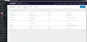
- Navigate to the CubeWP Custom Fields section in the backend dashboard to verify that a field named Location Image (or Term Image) exists in the taxonomy section. If not, create one by clicking Add New in the Custom Fields area.
Selecting the Dynamic Image Field
- In the Elementor image settings, under Dynamic Tags, select the Taxonomy Image.
- Set the Source to CubeWP Field .
- From the custom field options, Select Term Image field.
- The image will now dynamically display the image assigned to each location term.
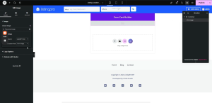
Image Styling
- Width: 100%
- Height: 100%
- Object Fit: Cover — ensures the image fills the card without distortion.
- Object Position: Top Center — controls how the image is cropped.
ℹ️ Note: By default, the term card preview will show the data of the most recently added term. This is expected behavior — on the live frontend, each card will display its own term-specific data dynamically.
5. Adding Term Count and Term Name
5.1 Container Structure for Data Overlay
To display the term count and term name as an overlay on top of the image, use the following container structure:
- Main Content Container (position: absolute) — positioned over the image to create the overlay.
- Inner Container 1 — displays the term count.
- Inner Container 2 — displays the term name.
5.2 Adding the Term Count
- Add a Heading widget inside the first inner container.
- In the heading settings, enable Dynamic Tags and select the Term Count tag from the CubeWP Taxonomy Custom Fields options.
- Apply the following styling:
- Font Family: Open Sans
- Font Color: White (#FFFFFF)
- Adjust font size and weight as desired.
5.3 Adding the Term Name
- Add a Heading widget inside the second inner container.
- Set the heading level to H3.
- Enable Dynamic Tags and select the Term Name tag from the CubeWP Taxonomy Custom Fields options.
- Apply styling:
- Font Family: Poppins
- Font Color: White (#FFFFFF)
- Adjust font size and weight as required.
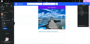
6. Configuring Position and Overlay
6.1 Positioning the Overlay Container
The content overlay container must be positioned absolutely over the image:
- Select the main content container.
- In the Layout settings, set Position to Absolute.
- Use Alignment tools to center the container horizontally and vertically within the card.
- If there is a gap between elements, adjust the section spacing to 0 and set the container height to 100%.
ℹ️ Note: Since there is no direct percentage height option in Elementor’s standard controls, you can add custom CSS via the Advanced tab. Use the selector to target the container div and apply height: 100%.
6.2 Positioning Data at the Bottom of the Card
If you want the term name and count to appear at the bottom of the card (rather than the center):
- Select the inner data container.
- Set its Position to Absolute.
- Use the Bottom property to anchor it to the bottom of the parent container.
- Center the content horizontally using the alignment controls.
6.3 Applying the Overlay Background
To create a dark overlay effect on the card (visible on hover):
- Select the main container.
- In the Style tab, go to Background and set the Background Type to Classic.
- Set the Background Color to solid black (#000000).
- Set the Opacity to 0 — this makes the overlay invisible by default.
- In the Hover state, increase the Opacity to make the overlay visible when the user hovers over the card.
7. Hover Effects and Animations
7.1 CubeWP Term Card Hover Effects
The CubeWP Term Card provides built-in hover animation settings accessible from the Style tab of the main container. Locate the section labeled CubeWP Term Card Hover Effects:
Animation Direction Options
- None – No animation (default).
- Bottom to Top – Content slides up from the bottom on hover. Recommended for most designs.
- Top to Bottom – Content slides down from the top on hover.
- Left to Right – Content slides in from the left.
- Right to Left – Content slides in from the right.
Translation Distance
When using Bottom to Top animation, set the Translation Height to control how far the content moves:
- Recommended starting value: 400px (matches typical card image height).
- Adjust based on your actual card height to achieve the correct animation travel distance.
Overflow Setting
To prevent animated content from overflowing the card boundary during the animation, set the main parent container’s Overflow property to Hidden.
7.2 Sub-Container Hover Translation
For additional animation on the sub-containers (e.g., the data overlay block), you can also apply hover translation:
- Select the sub-container.
- Navigate to the CubeWP Term Card Hover Effects section in its style settings.
- Set the translation direction (e.g., Bottom to Top).
- Set a small translation value — for example, 10px — for a subtle upward movement on hover.
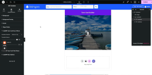
7.3 Adding a Dynamic Term URL Link to the Term Name
To make each term name card clickable (linking to the term archive page):
- Select the heading where the link should be applied.
- In the Link settings, enable Dynamic Tags.
- Navigate to CubeWP Taxonomy Custom Fields
- Select the Term URL tag — this dynamically fetches the URL of each term.
- The link will now be applied, and clicking the card will navigate to the correct term archive page.
8. Per-Term Custom Grid Layout
8.1 Overview of Per-Term Grid Settings
The CubeWP Taxonomy Widget supports a custom per-term grid layout system. This allows you to configure a CSS Grid layout where each term card occupies a specific position, column span, and row span — creating a visually complex mosaic or magazine-style layout.
To enable this feature:
- In the CubeWP Taxonomy Widget settings, locate the option labeled Enable Per Term Grid Settings.
- Toggle it to Enabled.
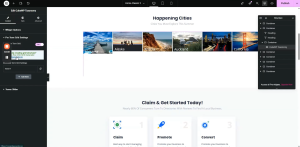
8.2 Using the Grid Configuration Tool
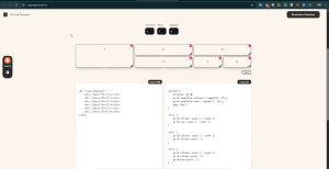
CubeWP provides an external grid configuration tool (accessible via a website link in the widget settings) that generates the necessary CSS for your grid layout. To use it:
- Open the grid tool website linked in the widget settings.
- Set the number of Columns for your grid (e.g., 6 columns).
- Set the number of Rows for your grid (e.g., 2 rows).
- Drag and drop the term items in the grid tool to define their position and span.
- For each item, configure: Column Span, Row Span, Column Start, and Row Start.
- The tool generates CSS code for each div configuration.
- Copy the generated CSS values for each term position.
8.3 Applying Grid Configuration to Each Term
After generating the layout from the grid tool, apply the values in the widget’s Per-Term Grid Settings. For each term item (by position number), configure:
- Term Position – The order/index of the term (1 = first term displayed).
- Column Span – How many columns this term card should occupy.
- Row Span – How many rows this term card should occupy.
- Column Start – The grid column line where this item starts.
- Row Start – The grid row line where this item starts.
- Custom Width – Set to 100% unless a specific pixel width is required.
- Custom Height – Set in pixels based on the image height required (e.g., 434px for a tall card, 215px for a half-height card).
8.4 Example Grid Layout: 6 Columns x 2 Rows
The following example demonstrates a 6-column, 2-row grid layout suitable for displaying 6 location terms:
| Term Position | Column Span | Row Span | Notes |
| 1 (First / Hero) | 2 | 2 | Starts at col 1, row 1; height = 434px |
| 2 | 2 | 1 | Starts at col 3, row 1; height = 215px |
| 3 | 2 | 1 | Starts at col 3, row 2; height = 215px |
| 4 | 2 | 2 | Starts at col 5, row 1; height = 434px |
| 5 | 1 | 1 | Positioned in grid as needed |
| 6 | 1 | 1 | Positioned in grid as needed |
ℹ️ Note: The first term (hero card) is positioned at column 1, row 1, spanning 2 columns and 2 rows. This creates a large featured card. Terms 2 and 3 are stacked on the right at 2 columns wide but only 1 row tall each. Adjust these values in the per-term grid settings based on your specific design.
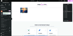
8.5 Fixing Image Height in Grid Cells
A common issue with the per-term grid layout is that images do not fill their grid cell height by default. To fix this:
- Return to the Term Card template in the Theme Builder.
- Select the Image element.
- Set its Width to 100%.
- Set its Height to 100%.
- Set Object Fit to Cover.
- Set Object Position to Top Center.
- Save and Publish the term card template.
- Reload the frontend page to verify that images now fill their respective grid cells correctly.
If the image still does not fill the container height, apply custom CSS via the Advanced tab in Elementor:
- Target the container div selector.
- Add: height: 100%;
- Publish the changes and reload to verify.
9. Publishing the Term Card and Verifying on the Frontend
- After completing the term card design, click Publish in the Elementor editor for the term card template.
- Navigate back to the Taxonomy Widget on your homepage.
- In the widget’s Style dropdown, the new term card style (e.g., Location Listing Location Style One) will now appear in the list. If it does not appear, perform a page reload.
- Select the new style from the dropdown.
- Publish the homepage page.
- Reload the frontend and verify that all term cards are displayed with the correct images, names, counts, and animations.
ℹ️ Note: After selecting the new term card style in the widget, the style will be immediately active and visible in the Elementor preview. Always publish before checking the live frontend to ensure all changes are saved.
10. Additional Widget Configuration Options
10.1 Controlling the Number of Terms Displayed
In the Taxonomy Widget settings, you can control exactly how many terms are shown at once. For example, setting it to 6 will display the first 6 terms from the selected taxonomy in the configured grid layout.
10.2 Applying Custom CSS for Advanced Layouts
For layout customizations not available through Elementor’s standard controls (such as forcing a container height to 100%), use the custom CSS option in the Advanced section of the Elementor element settings:
- Select the element that requires custom CSS.
- Go to the Advanced tab in the Elementor panel.
- Expand the Custom CSS section.
- Write your CSS using the selector provided (e.g., selector { height: 100%; }).
- Click Apply and then Publish to save the changes.
10.3 Building Custom Styles with Elementor
All term card styles are fully built using Elementor’s visual editor. You can create any number of term card styles by adding new templates in the Theme Builder, designing them in Elementor, and then selecting them in the Taxonomy Widget. There are no restrictions on the complexity of the design — you can use any Elementor widget, container layout, and styling option available in your installation.
Here is the complete video tutorial