
Archive & Search Page Builder
Archive Map · Post Results · Post Card Templates · List/Grid View
| Document Overview | |
| Scope | Archive Map widget with custom pins; Archive Posts widget, Archive post card template; list/grid view toggle; horizontal list layout; common layout fixes |
| Tools | Elementor, CubeWP Theme Builder, WordPress |
Introduction
This tutorial covers the Archive Map widget for the right-side panel, the Archive Posts/Results widget, and final page publishing. This tutorial also includes creating a dedicated post card template specifically for the archive listing page, configuring the list view and grid view display modes using the CubeWP View Switcher, restructuring the post card layout to support horizontal (list) display, and resolving layout issues such as image sizing, container wrapping, and alignment.
1. Archive Map Widget
The right-side panel contains the Archive Map widget, which displays all listing locations on an interactive map. The map spans the full viewport height alongside the search results.
1.1 Map Container Setup
- Inside the right-side container (calc(100% – 815px) width), add a nested container.
- Set this container height to 100VH (full viewport height) — the map should fill the entire visible browser height.
- Add another nested container inside it with width: 100%.
- Remove default padding from this inner container.
- Inside this container, add the Archive Map widget.
1.2 Archive Map Widget
- Search for ‘Archive Map’ in the Elementor widget panel — this is a custom widget within the CubeWP.
- Add it inside the map container.
- Show in Popup: Disable (we want the map always visible on desktop, not hidden in a popup). On mobile, popups are used instead.
- Show Layout: Desktop only.
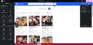
Archive Map Styling:
- Map Height: 100VH (full viewport height).
- Map Width: 100%.
- Border Type: None. Border Radius: 0.
1.3 Custom Map Pin Configuration
The archive map uses a custom pin design instead of the default map marker.
- Enable Custom Map Pin: Yes.
- Select the pin icon from the menu icon options.
Pin Wrapper (Outer Wrapper) Styling:
- Background Color: As per design (specific hex code for the pin background).
- Width: 50px. Height: 50px.
- Padding: Top 6px, Left 7px.
- Border: Solid, 1px width. Border Color: As per design (paste hex). Border Radius: 50%.
- Rotation: 315 degrees (rotates the pin to appear as a diamond/arrow shape pointing down).
Hover State for Pin Container:
- Background Color: As per design (set hover background).
Icon Wrapper Styling:
- Width: 35px. Height: 35px.
- Padding: Top 6px, Bottom 10px, Left 10px (10px all sides).
- Border Type: Solid. Border Width: 1px. Border Color: As per design (paste hex).
- Border Radius: 50% (creates circular icon wrapper).
- Background Color: White.
- Rotation: 33 degrees (counter-rotation to keep the icon upright despite the container being rotated 315 degrees).
Pin SVG Styling:
- SVG Color: As per design.
- SVG Size: 14px. SVG Rotation: 14px (adjust to align icon correctly).
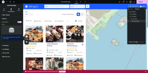
1.4 Map Post Card Styling
When a user clicks a pin on the map, a small post card appears. This card can be custom styled.
- Margin: 0. Padding: 0.
- Content Width: 330px.
- Border Radius: 5px.
- Image Width: Full (set to 100% of the card width). Height: 200px. Min-Height: 42px.
- Object Fit: Cover. Image Border Radius: 0.
- Title Padding: 15px. Top: 20px. Bottom: 20px.
- Title Color: As per design. Title Hover Color: Blue (copy hex).
- Title Typography: Open Sans, 18px.
2. Archive Posts Widget
The left-side results area uses a dedicated Archive Posts widget that dynamically displays the search and filter results as post cards.
2.1 Adding the Archive Posts Display Widget
- Inside the results area of the left container (below the filter row), add the dedicated Archive Posts Display widget.
- This is a specialized widget available in the CubeWP specifically designed for archive page post display.
- Select which post types to display from the widget settings i.e listing for our case.
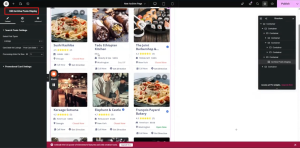
2.2 Styling the Archive Posts Widget
- Navigate to the Style section of the widget.
- Configure the styling options (card layout, spacing, columns) as required.
- A custom CSS class can be assigned here for further custom styling.
Note: The Archive Posts widget automatically links to the active filters, sort options, and the archive map. When a user applies a filter or clicks a map pin, the results update dynamically without a page reload.
2.3 Container Height for Archive Results
- Set the main archive results container height to 100VH so it fills the viewport alongside the map.
- This ensures the left panel and right map panel are the same height visually.
3. Publishing the Archive Template
3.1 Publishing Steps
- After completing all widget configurations and styling, click ‘Publish’ in the Elementor editor. All the changes made now will be published now and visible to everyone.
4. Creating the Archive Listing Post Card Template
The archive page requires its own dedicated post card template, separate from the general post card (Post Card Style 1) built previously. This ensures the archive can have its own unique layout, dimensions, and column arrangement.
4.1 Adding a New Post Card Template
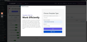
- Navigate to the WordPress backend > Cube WP > Theme Builder.
- Click ‘Add New Template.’
- From the template type dropdown, select ‘Post Card.’
- Name the template: ‘Archive Listing Post Card Style’ (or a similar descriptive name).
- Click ‘Save and Edit’ — the Elementor editor will open, initially showing an empty canvas.
Note: A separate template is created here (rather than reusing the existing post card) so that the archive page can display two cards per row by default and support a dedicated list view layout without affecting other pages that use the original post card.
4.2 Copying Existing Post Card Content
Since the archive post card design matches the existing post card (built in the Post Card tutorial), the content can be copied directly rather than rebuilt from scratch:
- Open the previously built post card template (Post Card Style 1).
- Select all content inside it and copy it entirely.
- Return to the new ‘Archive Listing Post Card Style’ template.
- Paste the copied content directly into the new template.
- All widgets, dynamic tags, and styling from the original post card are now replicated in the archive post card.
Note: The copy-paste approach saves significant time. However, the archive post card will require structural adjustments (see Section 4) to support the list view horizontal layout.
4.3 Assigning the Archive Post Card to the Widget
- After publishing the archive post card template, navigate back to the archive page in Elementor.
- Click on the Archive Posts widget.
- In the widget settings, find the ‘Post Card Style’ or ‘Basic Style’ option.
- Select ‘Archive Listing Post Card Style’ from the dropdown.
- Verify that post cards now appear in two-per-row layout on the archive page.
4.4 Adding Margin to the Post Card Container
- The main (parent) container of the archive post card needs a bottom margin to create spacing between cards.
- Open the archive post card in Elementor editor.
- Select the main/parent container.
- Add a Margin Bottom of 20 pixels to create vertical spacing between card rows.
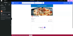
4.5 Giving Default column class to have 2 cards in a row
- From the post settings, give the default class as col-lg-6 to have specific width for the post card.
5. Configuring Grid View
The archive page supports two display modes: Grid View (cards arranged in columns) and List View (cards stacked horizontally with image on the left). These are controlled by the CubeWP View Switcher setting, which assigns a CSS class to the results container.
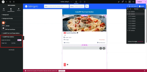
5.1 Grid View Container Setup
- Inside the archive post card template, locate the main outer container (the top container in the layer stack).
- Duplicate this container to create a copy for the grid view variant.
- Navigate to the Style settings of the container.
- Find the ‘CubeWP View Switcher’ option within the style settings.
- Enable the View Switcher.
- Select: Grid View.
Note: Grid view is typically the default selected state. Enabling it on the first (top) container establishes it as the grid display version of the card.
5.2 List View Container Setup
- On the second (duplicated) container, navigate to its Style settings.
- In the CubeWP View Switcher section, enable the View Switcher.
- Select: List View.
- This container will be shown when the user clicks the List icon in the List/Grid Switcher.
Note: The two containers (grid and list) work as a toggle pair. When grid is active, the grid container is shown and the list container is hidden. When list is active, the reverse applies. The CubeWP View Switcher handles this toggle automatically based on user clicks.
6. List View Layout Structure
The list view requires a horizontal layout where the post image appears on the left and all content (title, rating, price, location, buttons) appears on the right. This requires restructuring the container hierarchy inside the list view variant of the post card.
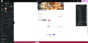
6.1 Creating the Horizontal Layout
- Select the list view container.
- Add a new full-width container inside it.
- Move the existing image container (top section) into this new container.
- Add another new container below/beside the image container.
- Move all remaining content elements (title, ratings, category, price, location, buttons) into this second container.
The result is a row layout with two columns: the image on the left and all content on the right.
6.2 Outer Wrapper Container (List View)
- Set the outer wrapper container to Full Width.
- Set display to Flex. This enables the two side-by-side columns.
- Remove default padding. Remove margin.
- Set Flex Wrap: No Wrap — this prevents the image and content from stacking vertically.
- Set Justify-Content: Left (flex-start) to align content from the left.
6.3 Image Container (Left Column in List View)
- The image container takes the left side of the horizontal layout.
- Set Max Width: 270 pixels (this constrains the image column width).
- Set Width: 270 pixels initially; adjust to 200 pixels as needed for the final design.
- Remove default padding.
Image Dimensions in List View:
- Image Height: 170 pixels (set as the fixed height for the list view image).
- Image Width: 100% (fills the 270px/200px column width).
- Image object-fit: Cover (ensures the image crops correctly without distortion).
- Image Min-Height: 200 pixels (ensures minimum height is maintained).
- Image actual height: Set to 207 pixels (exact pixel height configured in the image element settings).
- Later, image height is adjusted to 180 pixels for better visual balance.
Note: The image height values go through several iterations during testing. The final recommended value is 180 pixels, but you can adjust this to match your specific design requirements.
6.4 Content Container (Right Column in List View)
- The content container takes the right side of the horizontal layout.
- Set Width: 100% (fills remaining space after the image column).
- Set Height: 100% (matches the height of the image column).
- Remove all default padding.
- Set position: relative or as needed for the action buttons.
Right Content Container Width Calculation:
- The content width is calculated as: 100% minus the image column width.
- Example: If image column = 200px, content column width = calc(100% – 200px).
- In Elementor, use the custom width field and enter the calculated value.
6.5 Flex Direction & Alignment
- Set the main wrapper container flex-direction to Row.
- Padding-Left for the content section: Set to 20 pixels to create inner spacing between image and text content. This results in 10px effective spacing on left and right sides.
- Gap between image and content columns: 0 pixels.
7. Final Dimension Adjustments
7.1 Image Height Finalization
- After the initial list view setup, test the page on the frontend.
- If the image appears too tall or short, adjust the image height value.
- Final recommended height: 180 pixels.
- After adjusting, set the image container Bottom Padding to 0 to remove any gap below the image.
- Publish changes. Reload the page to verify the correct image height on the frontend.
7.2 Container Width Refinements
- If the layout does not appear correctly after the first publish, return to the list view container.
- Adjust the image container width from 270 to 200 pixels.
- Ensure the content container width is set to calc(100% – 200px) or equivalent.
- Set the content container position offset to -200 (matching the image column width).
- Publish and reload to verify alignment.
7.3 Height to 100%
- For both the image and the content container, set Height: 100%.
- Navigate to Advanced settings and remove any fixed height values that might override the 100% setting.
- Set the image element inside the container to Height: 100% as well.
- This ensures the image stretches vertically to match the content column height.
- Publish and reload after each change to verify the result.
8. Applying the Post Card to the Archive Page
8.1 Selecting the Archive Post Card Style
- Navigate back to the archive page in Elementor.
- Click the Archive Posts / results widget.
- In the Style section, find the post card style selector.
- Select ‘Archive Listing Post Card Style’ from the dropdown.
- The archive post card is now deactivated from the general post card slot (which previously showed the default style), and the new archive-specific card is active.
8.2 Two Cards Per Row
- After selecting the archive post card style, the grid view should show two cards per row by default.
- This is controlled by the CSS class defined in the post card template.
- Define the specific CSS class in the post card’s outer container settings.
- Set the alignment to left (flex-start) to ensure cards begin from the left edge.
Here is the complete video tutorial