
Single Page Setup
CubeWP Gallery Widget Configuration
1. Overview
This guide provides step-by-step instructions for setting up a custom single page template for a post type listing using theCubeWP Theme Builder and Elementor page builder. The tutorial covers the complete workflow from creating the template to configuring the CubeWp Gallery widget with a custom grid/slider layout.
2. Prerequisites & Navigation
2.1 Accessing the Theme Builder
To begin creating a custom single page, navigate through the following path in the WordPress dashboard:
- Go to Dashboard
- Navigate to CubeWP
- Select Theme Builder
- Click on the Single section
2.2 Creating a New Single Page Template
Once inside the Single section of the Theme Builder:
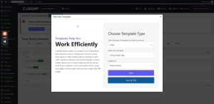
- Click the Add New button to begin creating a new template.
- Select the template type “Single”.
- Name your template for example ‘Listing Single Page’
- From the display on dropdown, select ‘Single Listings’
- Click the save and edit button to open edit with elementor.
Important: When creating content in the new template, you must carefully select it for both the listing view and the single page view before publishing.
3. Edit with Elementor Workflow
3.1 Preview Settings
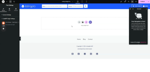
Before building, configure the preview settings in Elementor:
- Select the specific post type from the dropdown menu — the listing data of which post you want to show here.
4. Gallery Container Setup
4.1 Adding the Gallery Container
Begin by adding the primary container for the gallery section within the main page layout:
- Add a new container element to the main page layout.
- Set the container type to Flexbox.
- Configure all sizing and spacing properties as specified below.
4.2 Container Configuration Settings
| Setting / Parameter | Value / Configuration |
| Container Type | Flexbox |
| Container Width | 1,150 pixels |
| Background Color | Set to the designated background color |
| Default Padding | 0 (zero) |
| Margin | 0 (zero) |
5. CubeWP Gallery Widget
5.1 Adding the Widget
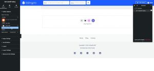
Locate the CubeWP Gallery widget in the Elementor sidebar panel:
- Find the CubeWP Gallery widget in the sidebar.
- Perform a drag-and-drop action to place it inside the gallery container.
- Verify that the post type is set to Listings and the gallery field is correctly assigned.
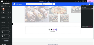
Once the widget is dropped and configured correctly, the image gallery will begin populating automatically on the screen.
5.2 Content Settings
| Setting / Parameter | Value / Configuration |
| Post Type | Listings |
| Gallery Field | Designated gallery field |
| Display Size | Full-size |
| Image Gap | 0 (zero) |
| Lightbox | Enabled |
| ‘See All’ Button | Hidden (disabled — a slider is used instead) |
6. Layout Configuration: Grid & Slider
6.1 Enabling the Slider Layout
The default gallery layout is a standard grid. Since a slider element is incorporated into this design, the slider layout must be enabled:
- Navigate to the Layout settings of the CubeWP Gallery widget.
- Change the layout from the default Grid format to Slider.
6.2 Grid Layout Settings
| Setting / Parameter | Value / Configuration |
| Grid Row Template | 2 rows |
| Grid Gap | 7 pixels |
| Total Items | 5 items |
| Grid Gap (Advanced) | 14 pixels |
7. Advanced Grid Item Configuration
Configure each of the 5 grid items individually with the following column span, row span, column start, row start, width, and height settings:
| Item | Col Span | Row Span | Col Start | Row Start | Width (px) | Height (px) |
| Item 1 | 2 | 2 | 1 | 1 | 488 | 344 |
| Item 2 | 2 | 1 | 3 | 1 | 360 | 165 |
| Item 3 | 1 | 1 | 3 | 2 | 173 | 165 |
| Item 4 | 1 | 1 | 4 | 2 | 173 | 165 |
| Item 5 | 1 | 2 | 5 | 1 | 260 | 343 |
All grid items are contained within a single unified grid. Ensure that column and row start positions are set correctly for proper image staggering.
8. Slider & Sidebar Settings
8.1 Image & Sidebar Styling
| Setting / Parameter | Value / Configuration |
| Image Spacing (Sidebar) | 0 (zero) |
| Autoplay | False (disabled) |
| Playback Speed | 500 milliseconds |
| Infinite Loop | True (enabled) |
8.2 Navigation Arrows Configuration
| Setting / Parameter | Value / Configuration |
| Icon Size | 11 pixels |
| Icon Colors | 3 colors configured |
| Icon Hover Effect | Not required — leave as default |
| Arrow Width (HCG) | 36 pixels |
| Arrow Border Type | None |
| Arrow Border Radius | 6 pixels |
| Arrow Padding (Top) | 12.5px / 15px |
| Arrow Padding (Bottom) | 12.5px |
| Arrow Padding (Right & Left) | 15 pixels each |
8.3 Arrow Positioning
Configure the absolute position of the navigation arrows using the following values:
| Setting / Parameter | Value / Configuration |
| Bottom Position | 6.9% |
| Left Position | 90% |
| Right Position | 2.2% |
The container’s position must be set to absolute to ensure the arrows remain within the frame and do not overflow outside the gallery.
9. Image Styling
9.1 Image Style Settings
Navigate to the Style tab of the CubeWP Gallery widget, then open the Image Styling section and apply the following configuration:
| Setting / Parameter | Value / Configuration |
| Image Width | 100% |
| Image Height | 100% |
| Unit | Percentage (%) — not pixels |
| Object Fit | Cover |
| Object Position | Center |
| Border Radius | 5 pixels |
| Padding | 0 (zero) |
| Margin | 0 (zero) |
| Hover Styling | None — default image appearance maintained |
Here is the complete video tutorial