
Single Page Builder
| Document Overview
Scope: Displaying description, post title and watch video button and attach youtube video url to it using the CubeWP Meta Widget. |
1. Introduction
This part of the Single Page Builder series covers the content sections that appear in the lower portion of the single listing page. These include: Displaying description, post title and watch video button and attach youtube video url to it using the CubeWP Meta Widget.
2. Body Content Layout Structure
2.1 Outer Full-Width Container
Add a new container for the main body content area below the action buttons:
| Setting / Parameter | Value / Configuration |
| Container Width | 100% |
| Padding | 0 (zero) |
| Margin | 0 (zero) |
2.2 Inner Container
Add a second container nested inside the full-width container:
| Setting / Parameter | Value / Configuration |
| Container Width | 1,170 pixels |
| Layout Direction | Row |
| Alignment | Flex-start |
| Margin | 0 (zero) |
| Padding | 0 (zero) |
| Margin Top | 7 pixels |
| Background Color | Match the main container background color |
2.3 Two-Column Layout
Inside the inner container, the layout is split into two columns — a left section and a right section. Add two separate sub-containers:
| Setting / Parameter | Value / Configuration |
| Left Container Width | 66.66% |
| Right Container Width | 33.66% |
| Default Gap (Div) | 0 (zero) |
| Main Container Gap | 0 (zero) |
| Default Padding (Both) | 0 (zero) |
3. Left Column — Description Area
3.1 Description Container
Inside the left column container, add a container specifically for the description text:
| Setting / Parameter | Value / Configuration |
| Layout Gap | 0 (zero) |
| Padding | 0 (zero) |
| Margin Bottom | 34 pixels |
3.2 Inner Description Container
Add a nested container inside the description container:
| Setting / Parameter | Value / Configuration |
| Gap | 0 (zero) |
| Margin | 0 (zero) |
| Padding Top | 10 pixels |
| Padding Right | 10 pixels |
| Padding Bottom | 10 pixels |
| Padding Left | 25 pixels |
| Background Color | Set from style panel |
3.3 Inner Content Row Container
Within the description container, add a container with ‘space-between’ layout alignment:
| Setting / Parameter | Value / Configuration |
| Alignment | Space-between |
| Padding | 0 (zero) |
| Margin | 0 (zero) |
3.4 Left and Right Sub-Containers
Insert two sub-containers inside the space-between container — one for the left side and one for the right side:
| Setting / Parameter | Value / Configuration |
| Width (Both) | Fit content |
| Layout Direction | Row |
| Item Alignment | Center |
| Gap | 1 pixel |
| Padding | 0 (zero) |
4. Play Icon Configuration
4.1 Adding the Icon
- Add an icon element to the left sub-container.
- Select the Play icon from the icon library.
- Set the icon color to the primary theme color.
4.2 Icon Styling
| Setting / Parameter | Value / Configuration |
| Icon Color | Primary theme color |
| Font Size | 26 points |
| Text Alignment | Center |
| Padding | 11 pixels |
| Parent Container Padding & Margin | 0 (zero) |
5. Video Title Heading Typography
Add a heading element alongside the play icon for the video section title and change the content of the heading to ‘Checkout’. Apply the following typography and style settings:
| Setting / Parameter | Value / Configuration |
| Font Family | Quicksand |
| Font Size | 18 pixels |
| Font Weight | 500 |
| Text Transform | Capitalize |
| Line Height | 33 pixels |
| Text Color | Copy and paste from design |
| Margin Top | -8 pixels (negative offset for alignment) |
| Padding Right | 4 pixels |
6. Dynamic Post Title Heading
Add another heading element to display the dynamic single post title:
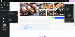
- Go to the Single Post Title section within the builder.
- From the Dynamic tags, select the Post Title under the CubeWP Single Post Data .
- Navigate to the Style section and apply the same style settings used for the video title heading.
- Paste the style attributes and select the span tag for the HTML tag setting.
6.1 Icon Color Override
If the icon next to the dynamic title is displaying in the global primary color, override it with a specific shade of blue:
- Copy the exact blue hex code required for this design.
- Paste it into the icon color field to apply the custom primary blue color.
7. CubeWP Meta Widget (Watch Video Button)
7.1 Adding the Widget
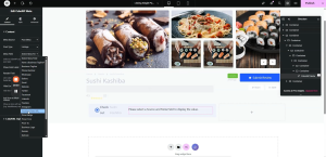
The CubeWP Meta widget provides a video watch button linked to a YouTube post field. Add a new container for this element, then:
- Add the CubeWP Meta widget inside the container.
- Set Post Meta to the Meta Source Field.
- Set Post Type to: Listings.
- Set the Post Field for Mata to: YouTube video URL.
7.2 Link/URL Options
| Setting / Parameter | Value / Configuration |
| Use Field Value as URL | Yes (enabled) |
| Link Text | Custom — set to ‘watch video’ |
| Open in Popup | Enabled |
| Use iFrame | Enabled |
7.3 Watch Button Typography
Navigate to the Style section and configure the typography for the watch button:
| Setting / Parameter | Value / Configuration |
| Font Family | Open Sans |
| Font Size | 13 pixels |
| Font Weight | 500 |
| Line Height | 26 pixels |
7.4 Watch Button Visual Styling
| Setting / Parameter | Value / Configuration |
| Text Color | Blue |
| Background Color | White |
| Padding Top & Bottom | 2 pixels each |
| Padding Left & Right | 22 pixels each |
| Margin | 0 (zero) |
| Border Type | Solid |
| Border Width | 1 pixel |
| Border Color | As specified in design (hex value) |
7.5 Hover State Settings
Define the hover interaction for the watch button so it provides clear visual feedback to users:
| Setting / Parameter | Value / Configuration |
| Text Color (Hover) | White |
| Background Color (Hover) | Blue |
| Border Color (Hover) | Blue (match background) |
7.6 Final Widget Settings
| Setting / Parameter | Value / Configuration |
| Visibility | Enabled |
| Width | Fit content |
| Margin | 0 (zero) |
| Padding | 0 (zero) |
| Line Item Alignment | Center |
8. Post Description Text Area
8.1 Container Setup
Add a new container for the post description text block:
| Setting / Parameter | Value / Configuration |
| Outer Container Width | 100% |
| Outer Container Padding | 0 (zero) |
| Outer Container Margin | 0 (zero) |
| Inner Container Padding | 0 (zero) |
| Inner Container Margin | 0 (zero) |
| Inner Container Border | 2 pixels |
8.2 Description Typography
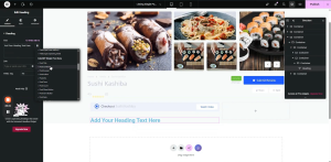
Add the heading element in the description container.
- From the Dynamic tags, select the Post Content under the CubeWP Single Post Data .
8.3 Description Typography
Configure the typography for the description content area:
| Setting / Parameter | Value / Configuration |
| Font Family | Open Sans |
| Font Size | 15 pixels |
| Font Weight | 400 (Normal) |
| Line Height | 27 pixels |
| Text Color | Set from the style panel |
Once the typography is configured and the description text color is applied, the dynamic post description will display correctly in the layout.
9. Publishing & Final Verification
After completing all configurations, follow these steps to finalize and publish:
- Click the Publish button in the Elementor editor.
- Navigate to the frontend and preview the live page.
- Verify the CubeWP Save (Bookmark) button displays correctly with all hover states.
- Confirm the body content layout shows correctly in both columns.
- Check that the Play icon, video title heading, and dynamic post title align properly.
- Confirm the Watch Video button opens the YouTube popup correctly.
Here is the complete video tutorial