
Single Page Builder
Features Display, Announcements, FAQ, Coupons, Reviews Section & Review Submission Form
| Document Overview
Scope: Displaying listing features via Keyword Update Taxonomy widget, adding Announcements section with meta query, adding FAQ with CubeWP Repeater, displaying Coupons with expiry meta query, and building the Reviews section with dynamic post ratings and a full review submission form Tools: Elementor, CubeWP Plugin, Listing Pro Value Pack, Theme Builder |
1. Introduction
This part of the Single Page Builder series covers the content sections that appear in the lower portion of the single listing page. These include: the listing features display using a custom term card, the listing announcements section fetched via meta query, the FAQ accordion section using the CubeWP Repeater, the coupons/deals section with expiry date filtering, and the full reviews section including the display of existing reviews and the review submission form.
2. Displaying Listing Features
Features are taxonomy terms associated with the current listing post. They are displayed using the ‘CubeWP Taxonomy widget with a custom term card template.
2.1 Container Setup for Features Section
- Add a new container inside the main single page container.
- Remove the default padding.
- Set padding: Top — 22 pixels, Bottom — 20 pixels. No left or right padding (padding comes from the parent).
2.2 CubeWP Taxonomy Widget (Features)
- Inside the features container, add the CubeWP Taxonomy widget.
- This widget fetches and displays taxonomy terms associated with the post.
Widget Configuration:
- Select ‘Features’ from the select taxonomy dropdown — This fetches all terms from the features taxonomy that are assigned to the current listing being viewed.
- Term Style: Select the term style created for features — ‘Classic Two Listing Features Style 1’.
- Grid Display: Set to 4 items per row.
- Gap between terms: 10 pixels (vertical), 32 pixels (horizontal row gap).
2.3 Creating the Term Card Template (Classic 2 Listing Features Style 1)
To create this term card template in the Theme Builder:
- Navigate to WordPress backend > CubeWP > Theme Builder.
- Click ‘Add New’ and select ‘Term Card’ as the template type.
- Name it (e.g., ‘Classic Two Listing Feature Style 1’).
- Select the appropriate taxonomy (Features).
- Click ‘Save and Edit’ to open the Elementor editor.
Term Card Structure:
- The main container holds a nested inner container set to ‘fit content’ width.
- Inside the inner container: an Icon element and a ‘Term Name’ heading.
- For the icon, enable the icon option and set its width.
- Field Source: CubeWP field — select ‘Feature Term Icon’ from the custom term meta.
- The icon field retrieves the term’s custom icon
Note: The icon field must be configured in the backend under CubeWP > Custom Fields > Taxonomies. The field should be attached to the ‘Features’ taxonomy with an icon field type.
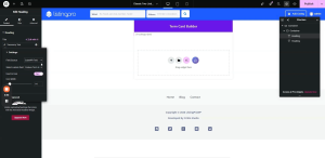
- From the dynamic tags, select the ‘Term Name’. Also set a dynamic url to it called ‘Term URL’.
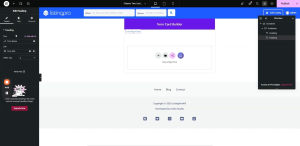
- From the CubeWP Taxonomy Widget options, enable the Post Associated Terms to show the terms associated only to the selected post.
3. Listing Announcements Section
The announcements section displays announcement posts that have been linked to the current listing via a custom meta field. This requires a CubeWP Post widget with a meta query filter.
3.1 Container Setup for Announcements
- Add a new container inside the main single page container.
- Set margin to 0. Padding: Top — 11 pixels, Bottom — 20 pixels.
- Add a nested inner container inside this. Remove its default padding and margin (set both to 0).
3.2 CubeWP Post Widget (Announcements)
- Inside the inner container, add the CubeWP Post widget.
- Post Type: Select ‘Announcements’ (the custom post type created for listing announcements).
- Number of Posts: 1 (only show the single associated announcement).
- Title: ‘Listing Announcements’.
- Inside the Title and Content settings, Enable ‘Hide When No Results Found’: — this hides the entire section if no announcement is attached to the current listing.
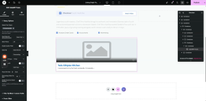
Meta Query Configuration:
- Navigate to CubeWP Post widget settings > Filter by Meta/custom fields — enable it.
- Select the relation: ‘AND’.
- Add Item: Set Custom Key to ‘lp_announcement_listing’ (the exact slug of the custom field).
- Meta Value Source: Current Post ID (dynamically links to the current listing being viewed).
- Condition: ‘Like is equal to’.
This meta query finds all announcement posts where the ‘lp_announcement_listing’ field equals the ID of the current listing. Only announcements assigned to this specific listing will be shown.
Note: The custom field ‘lp_announcement_listing’ is added to announcement posts in the backend to link announcements to a specific listing.
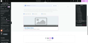
3.3 Announcement Post Card (ListingPro Announcements)
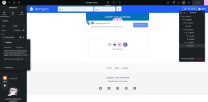
A dedicated post card template named ‘ListingPro Announcements’ is used to display each announcement. The card contains:
- An Icon element (custom icon added for the announcement type).
- Post Title — displayed dynamically.
- Post Content — the announcement body text submitted by the user displayed dynamically using ‘Post Content’ dynamic tag.
- A functional Button — its link is set using a dynamic tag linked to a ‘button link’ custom field inside the Announcements post type.
Note: Both the button text and button link are fetched dynamically from custom fields through the text field type. This allows each announcement to have its own unique button label and destination URL.
4. Frequently Asked Questions (FAQ) Section
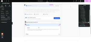
The FAQ section uses the CubeWP Repeater widget, which can display data as an accordion, static list, or tabs. This section displays questions and answers associated with the listing.
4.1 Container Setup for FAQ
- Add a new container inside the main single page container.
- Set margin to 0. Padding: Top — 15 pixels, Bottom — 30 pixels.
- Add a nested inner container. Set its default width and margin to 0.
- Inside this inner container, add a Heading element with text ‘Frequently Asked Questions’.
FAQ Heading Styling:
- HTML Tag: H4.
- Font Family: Open Sans. Font Size: 20px. Font Weight: 600.
- Text Transform: Capitalize. Line Height: 24px.
- Text Color: As per design (paste hex code).
4.2 CubeWP Repeater Widget (FAQ)
- Add another container below the heading. Set padding and margin to 0.
- Inside this container, add the CubeWP Repeater widget.
- Post Type: Listing.
- Display Style: Accordion (or static / tabs depending on preference).
- The Repeater supports accordion, static, and tab display modes — select as required.
- Each item in the repeater should use the appropriate icon from the style section.
- Field Padding: 0. Field Margin: 0.
Note: TheCubeWP Repeater fetches associated FAQ data from the listing’s custom fields. Configure the repeater’s field source according to your FAQ field group in the CubeWP custom fields settings.
5. Coupons & Deals Section
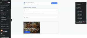
The coupons section displays active coupon/deal posts linked to the current listing, with an additional expiry date meta query to exclude expired coupons automatically.
5.1 Container Setup for Coupons
- Add a new container inside the main single page container.
- Set margin to 0. Padding: Top — 11 pixels, Bottom — 20 pixels.
- Add a nested inner container. Set default padding and margin to 0.
- Inside this inner container, add the QWP Post widget.
5.2 CubeWP Post Widget (Coupons)
- Post Type: Coupons (custom post type created for deals and coupons).
- Post Card Style: Select ‘Listings Coupon Style 1’ (or any available coupon card style from the Theme Builder).
- Layout: 2 columns (for a two-column display of coupons).
Note: Multiple coupon card styles can be created in the Theme Builder. Select whichever style matches your design. Each style can be previewed by selecting it from the dropdown in the widget settings.
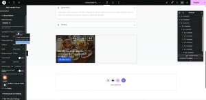
Meta Query for Coupons (Two Conditions — AND Relation):
Two meta queries are applied simultaneously to filter coupons correctly:
Meta Query 1 — Link to Current Listing:
- Filter Type: Filter by Meta. Relation: AND.
- Add Item: Custom Field Type.
- Custom Key: The slug of the ‘Open Listing’ field (e.g., ‘lp_open_listing’ — copy the exact slug from the backend under CubeWP > Custom Fields).
- Meta Value Source: Current Post ID.
- Condition: Equal to.
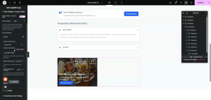
Meta Query 2 — Exclude Expired Coupons:
- Add a second item to the meta query.
- Custom Key: The slug of the ‘Open End Date’ field (the coupon expiry date field — copy from backend).
- Meta Value Source: Current Timestamp.
- Condition: Greater than or equal to the current timestamp.
This ensures that only coupons whose end date is today or in the future are shown. Expired coupons are automatically filtered out.
6. Reviews Section — Display
The reviews section shows all user-submitted reviews for the current listing, with a summary header showing the review count and listing name.
6.1 Reviews Header Container
- Add a new container inside the main single page container.
- Set padding to 0, margin to 0. Margin Top: 30 pixels.
- Add two child containers side by side:
- Container 1 (Review Count): Margin 0. Padding: Top 10px, Bottom 10px.
- Container 2 (Title ‘Reviews for’): Gap between elements: 2 pixels.
Review Count Heading (Dynamic):
- Add a Heading element inside Container 1.
- Dynamic Tag: Under ‘Overall Post Rating’ settings, select the dynamic option — ‘Total Number of Ratings’ (the cumulative count of all reviews submitted for this post).
- This displays the total number of reviews dynamically.
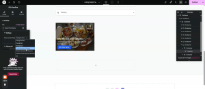
‘Reviews for [Listing Name]’ Heading:
- Add a second Heading element.
- Dynamic Tag: Post Title — this shows the listing name.
- HTML Tag: H3.
- In the Advanced section > ‘Before’ field: add the text ‘Reviews for ‘ — this prepends the static text before the dynamic post title.
- The combined output reads: ‘Reviews for [Listing Name]’.
Reviews Header Typography:
- Font Family: Open Sans. Font Size: 20px. Font Weight: 600. Line Height: 24px.
- Text Color: As per design. Copy and paste styling between the two headings for consistency.
6.2 Reviews Body Container
- Add a new container below the reviews header.
- Set margin to 0. Padding: Top 8px, Right 20px, Bottom 30px, Left 20px.
- Background Color: White.
- Inside this container, add the CubeWP Post widget.
CubeWP Post Widget (Reviews):
- Post Type: Reviews (the review post type built into CubeWP Reviews).
- Card Style: Select ‘Classic2 Review Style 1’ (or the equivalent review card style from the Theme Builder).
- Number of Posts: All Posts (show all reviews for the listing).
- Columns: As per design.
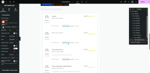
Reviews Meta Query (Two Conditions — AND Relation):
Meta Query 1 — Link Reviews to Current Listing:
- Filter by Meta: AND relation.
- Custom Key: The meta key from the CubeWP Reviews plugin that stores which post the review was submitted against (copy from backend).
- Meta Value Source: Current Post ID. Condition: Equal to.
Meta Query 2 — Filter by Review Type (Post Reviews):
- Custom Key: ‘cwp_review_type’.
- Custom Value: ‘post’.
- Condition: Equal to.
This ensures only reviews submitted against this specific listing (post reviews, not user reviews) are displayed. If you also want to show user reviews, remove this second meta query condition.
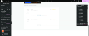
Note: CubeWP Reviews supports two review types: Post Reviews (reviews left on listing posts) and User Reviews (reviews left on user profiles). The ‘cwp_review_type’ meta key distinguishes between them.
6.3 Classic2 Review Style1 — Post Card Structure
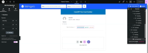
The review post card displays each review’s details. The card template ‘Classic2 Review Style1’ contains:
- Author Avatar — set using the dynamic ‘Post Author’ tag.
- Post Title — the review’s title.
- Post Date — formatted date with a specific date format.
- Post Info (Time) — shows the review’s publish time.
- User Statistics —In Heading’s dynamic tag, select ‘User Statistics’. Configured to show ‘Post Reviews’ count (number format only).
- Static Heading for section label.
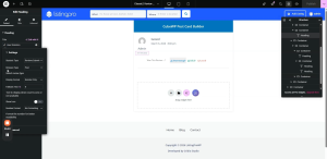
- Post Reactions widget (from ListingPro Value Pack) — allows users to react to individual reviews. Three default reactions are pre-configured; additional reactions can be added.
- Divider — separator between review sections.
7. Review Submission Form
The review form is embedded inside an accordion widget, allowing users to expand the form to submit a review. The form is built using the CubeWP Submit Form widget .
7.1 Accordion Container Setup
- Add a new container inside the main single page container. Set padding to 0, margin to 0.
- Add a nested container inside this. Padding: 15px all sides. Margin Bottom: 30px.
- Inside, add an Elementor Accordion widget.
- Configure the accordion to have only one item.
- Item Position: Stretch.
- Expand Icon: Angle Up icon. Collapse Icon: Angle Down icon.
Accordion Styling:
- Border: Solid, Bottom border only — 1 pixel. Border Color: As per design (paste hex).
- Border Radius: 0. Padding: Top & Bottom 0, Right 10px, Bottom 15px.
Accordion Header Styling:
- Font Family: Open Sans. Font Size: 16px. Font Weight: 600. Text Transform: Normal.
- Line Height: 24px. Text Color: As per design.
- Icon Size: 20px. Icon Color: As per design.
- Icon Hover Color and Active Color: As per design.
Accordion Content Styling:
- Border: Solid, 1px from top. Border Color: As per design. Border Radius: 0.
- Padding: 0 (Top 0, Bottom 15px from top edge).
7.2 CubeWP Submit Form Widget (Review Form)
- Inside Accordion Item 1, add the ‘ CubeWP Submit Form‘ widget.
- From the Form settings, select Post Form from the Form Type field.
- In the Post Form settings, select Reviews from the Post Type field.
Review Form Fields Configuration:
Navigate to CubeWP > Custom Fields > Reviews Fields to configure the fields required for the review submit form. Title and description are the defaults fields of the reviews Post Type. Now we will add just 2 fields one for rating stars and the other for the gallery.
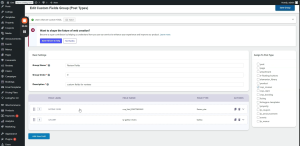
Now in the CubeWP Submit Form widget we will add all four fields of the submit form.
Field 1 — Rating Stars: Field Type:CubeWP Custom Field, Field: Rating Stars. Custom Label: ‘Your Listing Rating for Listing’. Width: 50%.
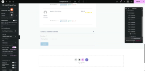
Field 2 — Gallery (Images): Field Type:CubeWP Custom Field, Field: Gallery. Label: ‘Select Images’. Width: 50%. Visibility: All Users.
Field 3 — Title: Default field. Width: 100%. Add placeholder text.
Field 4 — Content (Review Body): Default Field Width: 100%. Label: ‘Review’.
Note: Remove any unnecessary fields from the form layout. Only the Rating Stars, Gallery, Title, and Review Content fields are required for this design.
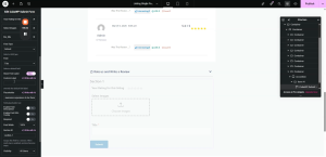
Form Style Settings:
- Disable graphical elements and description text.
- Border Radius: 0. Padding: Top 25px, Right 15px, Bottom 5px, Left 15px.
- Background Color: Match the form container background.
- Display: Flex. Flex Direction: Row. Justify-Content: Center.
- Select Images field width: 50%. Flex Alignment: Start. Gap: 10px.
Label Styling:
- Label Color: As per design. Font: Open Sans, 15px, Weight 600, Capitalize, Line Height 26px.
- Label Margin Bottom: 5px. Label Margin Top: 8px.
Input Field Styling:
- Font: Open Sans, 13px, Weight 500, Line Height 19px. Text Color: As per design.
- Background Color: As per design. Border: Solid. Border Color: As per design.
- Border Radius: 5px. Field Height: 14px (total padding). Textarea Height: 120px.
- Padding: 15px. Margin: As per design.
Placeholder Styling:
- Placeholder Color Opacity: 1 (fully visible).
- Focus Text Color: As per design. Focus Border Color: As per design.
- Focus Background: White. Box shadow on focus: Set color as per design.
Media Upload Field Styling:
- Border Radius: 4px. Background Color: As per design. Background Hover Color: As per design.
- Border: None. Border Radius: 5px. Padding: 0. Margin: Top 25px, Bottom 20px.
- Width: 120px. Upload Icon Font Size: 0 (hide icon, show text only).
- Upload Icon Color: White.
- Upload Text Font: Open Sans, 13px, Weight 500, Capitalize, Line Height 37px. Text Color: White.
- Text Margin Top: -40 pixels (adjusts position due to icon being hidden).
- Media Preview Border Radius: 5px. Preview Height and Width: Set as per design.
- Caption Font: Open Sans, 13px, Weight 400, Normal, Line Height 13px.
Rating Stars Styling:
- Remove justify property. Align-Items: Top. Flex-Direction: Column.
- Padding: 0. Margin: 0. Border Type: None. Border Radius: 0.
- Label Color: As per design. Label Font: Open Sans, 12px, Weight 600, Normal, Line Height 26px.
- Stars Container Gap: 3 pixels. Star Size: 28px.
- Active Star Color: As per design. Hover Star Color: As per design.
- Margin: 0. Padding: 0. Border Radius: 0.
Submit Button Styling:
- Padding: 0. Border: 0. Margin: 0.
- Button Width: 210px.
- Font: Open Sans, 13px, Weight 500, Capitalize, Line Height 26px.
- Border Radius: 3px.
- Padding: Top & Bottom 9px, Right 20px, Left 30px.
- Alignment: Center.
- Button Text: Change to ‘Submit Review’ (set in Content > Form Settings > Submit Button Text).
8. Review Section — Scroll Anchor & Styling
8.1 Scroll-to-Review Anchor
To make the review section accessible by scroll when a user clicks ‘Write a Review’ button from the top of the page:
- Go to the reviews main container’s Advanced settings.
- Add a CSS ID (e.g., ‘reviews-section’) to the container.
- In the ‘Write a Review’ button’s link field, add ‘#reviews-section’ as the URL.
- This creates an anchor link — clicking the button smoothly scrolls the page down to the reviews section.
Note: Reload the page after publishing to verify the scroll-to-reviews functionality works correctly.
8.2 Main Reviews Container Background & Border
- Set the main reviews container background color to White.
- Add a Border Radius of 7 pixels to both the reviews header container and the reviews body container.
- This gives the reviews section a clean, rounded card appearance.
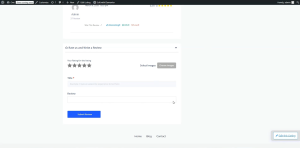
Here is the video tutorial for taxonomy widget, announcement, FAQs and Coupons
Here is the video tutorial for reviews and reviews form