
Archive & Search Page Builder
Archive Template Setup, Page Layout Structure & Search Filter Builder
| Document Overview
Scope: Creating a new archive/search page template, building the two-column layout, configuring Sort By dropdown, and adding Search Filter Builder widgets Tools: Elementor, CubeWP Theme Builder, WordPress |
1. Introduction & Overview
This guide covers the complete process of building a custom archive and search results page using Elementor and the Cube WP plugin. The archive page is used for displaying search results, taxonomy pages, and any post type listing pages. The Archive page includes a professionally designed two-column layout featuring an interactive map, dynamic filters, and sort options. In this tutorial, we will learn how to add the Sort By dropdown, List/Grid switcher, search filters (Near Me, Open Now, Best Match, All Categories) on the archive page.
2. Creating the Archive Template
2.1 Navigating to the Theme Builder
- Log in to the WordPress backend.
- Navigate to Cube WP Theme Builder.
- An existing archive template may already be present — a new one will be added alongside it.
2.2 Adding a New Archive Template
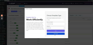
- Click ‘Add New Template.’
- From the template type dropdown, select ‘Archive.’
- Give the template a descriptive name (e.g., ‘New Archive Page’ or ‘New Archive’).
- For ‘Display On’, set it to ‘All Archives’ so it applies to all search queries, taxonomy pages, and any archive page type globally.
Note: If you only want the template to apply to a specific page type (e.g., only search results or only a specific taxonomy), you can set ‘Display On’ to that specific condition instead. Templates can later be copied and assigned to different conditions.
- Click ‘Save and Edit’ — this redirects you to the Elementor editing screen for the new archive template.
3. Page Layout Structure
The archive page uses a specific two-container layout: a fixed-width left container (815px) for filters and results, and a flexible right container that takes the remaining width (calc(100% – 815px)) for the map.
3.1 Outer Wrapper Container
- Add a new container inside the Elementor editor.
- Set the width to Full Width — this is the outer wrapper for the entire row.
- Set the flex direction to Row (horizontal layout).
- Set padding to the required values. Set border radius as per design.
- Set margin to 0.
3.2 Left Content Container (815px)
- Add a nested container inside the outer wrapper.
- Set the width to exactly 815 pixels.
- Set padding: 25px on the left side, 25px on the right side.
- This container will hold all the search filters, sort options, and post card results.
Note: The 815px container is the inner content column. Its padding of 25px on each side provides visual breathing room for the filter and results content within it.
3.3 Right Map Container (Remaining Width)
- Add a second container alongside the left container inside the outer wrapper.
- Set the width using a calculated value: 100% minus 815 pixels (i.e., calc(100% – 815px)).
- Set all gap values to 0.
- Remove all default padding.
- This container will hold the Archive Map widget and spans the remainder of the horizontal space.
3.4 Inner Structure of the Left Container
Inside the 815px left container, there are two main sections stacked vertically:
Top Section (Filter Row): Contains the dynamic page title, Sort By heading, Sort By dropdown, and the List/Grid View Switcher.
Bottom Section (Results Row): Contains the filter buttons (Near Me, Open Now, Best Match, All Categories) and the post card results grid.
Both sections use nested containers with all default padding and gap values removed for precise alignment control.
3.5 Top Filter Row Container
- Add a new row/container inside the left content container.
- This row organizes the filter section at the top and the post results directly below.
- Set all initial values (gap, padding, margin) to 0.
- Inside this top row, add three separate sub-containers: one for the page title area, one for the Sort By section, and one for the List/Grid Switcher.
- Remove all default padding from each sub-container.
4. Page Title & Sort By Label
4.1 Page Title Container
The top-left section of the filter row shows the current page title dynamically.
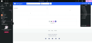
- Add two containers inside the title section: one for the ‘Most Recent’ label and one for the dynamic page title.
- Set both containers to ‘fit-content’ width.
- Set space-between for the parent container alignment.
- Gap between the two title elements: 4 pixels.
‘Most Recent’ Label (Static Heading):
- Add a Heading element. Set text to ‘Most Recent’.
- HTML Tag: H3.
- Font Family: Open Sans.
- Font Size: 14px. Font Weight: 400.
- Text Transform: Capitalize.
- Line Height: 13px (as per design).
- Text Color: As per design.
Dynamic Page Title:
- Add a dedicated Heading widget.
- This widget uses the ‘Dynamic Page Title’ tag, available under Value Pack Custom Tags within the Cube WP value section.
- No matter which archive or search page is loaded, this heading will automatically update to show the current page’s title.
- HTML Tag: H3. Copy and paste the same styling as the ‘Most Recent’ label above (use ‘Paste Style’ to apply identical formatting).
5. Sort By Dropdown Widget
The Sort By section allows users to sort search results. It uses the CubeWP Search Filter Builder widget configured specifically for sorting functionality, displayed as a dropdown.
5.1 Sort By Container Setup
- Add a container for the Sort By section inside the top filter row.
- Set container alignment to center. Set gap: 40px (four-zero, between Sort By label and the dropdown).
- Inside this container, add the ‘Sort By’ label heading and the Search Filter Builder widget.
5.2 Sort By Label
- Add a Heading element with text ‘Sort By’.
- Font Family: Open Sans. Font Size: 13px. Font Weight: Semi-Bold (600).
- Line Height: 27px. Text Color: As per design.
- HTML Tag: H3.
5.3 Search CubeWP Search Filter Builder Widget (Sort By Dropdown)
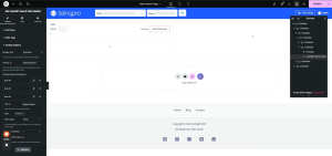
- Search for ‘CubeWP Search Filter Builder’ in the Elementor widget panel.
- Drag and drop it into the Sort By container.
- Set Post Type to ‘Listings’.
- Show Layout: Desktop only (the mobile version is handled separately).
Sort Items Configuration:
- Filter Type: Sorting.
- Display Type: Dropdown (not buttons).
- Default Sort Option: ‘Most Reviewed’ (set as the default/selected value).
Add the following sort items to the dropdown one by one:
Item 1 — Most Viewed: Sort by view count. Set the operation to ‘equal’. (Used for filtering by total view count — e.g., equal to, less than, greater than a specific number.)
Item 2 — Highest Rated: Sort by rating score. Field: ‘Post Rated’ (not Reviews Count — that is the total number of reviews, not the rating score itself).
Item 3 — Most Reviewed: Sort by number of reviews received. This is the default selected option.
Note: The ‘Most Viewed’ field uses a comparison operator (equal, less than, greater than). This is useful if you want to filter by a specific view threshold. For a standard sort-by-views, set it to ‘equal’ with no specific value, which will display all posts sorted by view count.
5.4 Sort By Dropdown Styling
Navigate to the Style tab of the Search Filter Builder widget to apply the following styles to the Sort By dropdown button and its dropdown menu items.
Dropdown Button Styling:
- Custom Icon: Select the desired icon for the dropdown trigger button (e.g., a sort icon). Icon Offset: Top -2px, Right 5px.
- Text Color: As per design. Text Hover Color: Blue.
- Background Color: As per design. Background Hover Color: As per design.
- Typography: Open Sans, 13px, Semi-Bold (600), Capitalize, Line Height 27px.
- Padding: 0. Border Radius: 0. Border Type: None.
Dropdown Menu Styling:
- Background Color: White.
- Min Width: Default (not manually set).
- Padding: 10px. Border Radius: 6px.
- Box Shadow: Enabled. Vertical Offset: 10px. Color: As per design.
Dropdown Item Styling:
- Text Color: As per design. Background Color: White.
- Typography: Open Sans, 13px, Weight 500, Capitalize, Line Height 19px.
- Border Radius: 7px.
- Padding: Bottom 14px, Left & Right 10px.
- Hover Text Color: As per design. Hover Background: White.
- Selected/Active Background: Bright Blue.
6. List/Grid View Switcher
The List/Grid Switcher allows users to toggle between a card grid layout and a list layout for the search results.
6.1 Switcher Container Setup
- Add a new container inside the top filter row for the switcher.
- Set container padding: 0. Width: Fit Content.
- Set alignment to center. Gap: 8px.
- Margin Left: 20px (to create visual separation from the Sort By section).
6.2 Archive Post List/Grid Switcher Widget
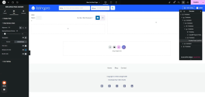
- Search for ‘Archive Post List Grid Switcher’.
- Add it to the switcher container.
- In the widget settings, for the Grid item: remove the default text label.
Switcher Styling:
- Item Padding: 13px right, 12px top, 12px bottom, 13px left.
- Border: None (set border type to none). Border Radius: 7px.
- Box Shadow: Enable. Color: As per design. Vertical Offset: 12px. Blur: 26px.
- Icon Color: White (copy and paste the specific hex code).
- Icon Size: 18px. Icon Spacing: 0 (no text displayed, spacing not needed).
- Active Background Color: As per design (copy and paste hex code).
7. Search Filter Builder — Near Me Filter
Below the top filter row, a secondary filter row contains quick-access filter buttons and dropdowns. The first filter is the ‘Near Me’ button, which searches listings by geographic proximity to the user.
7.1 Near Me Filter Container
- Add a new container for the filter row below the top sort/title row.
- Remove default padding. Set direction to Row. Justify-Content: Space-Between. Align-Items: Center.
- Add two inner containers: one for the filter buttons (left side) and one for the ‘All Filters’ button (right side).
- Left container: Width Fit-Content. Gap: 8px (between individual filter buttons). Direction: Row.
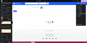
7.2 CubeWP Search Filter Builder Widget (Near Me)
- Add a CubeWP Search Filter Builder widget inside the left filter container.
- Post Type: Listings.
- Show Layout: Both (mobile and desktop).
- Filter Type: Filters.
- How to show filter: Select “Show simple field” option
- Field Type: Custom Fields. Field: Address.
- Enable ‘Near Me’ option: Yes.
- Filter Label: ‘Near Me’. Button Text: ‘Near Me’.
- Icon: Location/map pin icon. Icon Position: Left.
Near Me Button Styling:
- Field Icon Style: Icon Position — Absolute. Icon Color: White.
- Button Type: Switch button (primary switch).
- Text Color: As per design. Background Color: #FFFFFF (White).
- Padding: 10px. Border Radius: 7px.
- Box Shadow: Vertical 10–12px, Blur 26px. Color: As per design.
- Flex Direction: Row. Gap: 0. Icon Size: 13px. Row Spacing: 7px.
- Icon Color: As per design.
- Hover/Active Text Color: White. Hover/Active Background: Blue.
- Hover/Active Icon Color: White.
8. CubeWP Search Filter Builder — Open Now Filter
8.1 Open Now Filter Setup
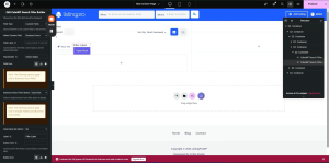
- Add another CubeWP Search Filter Builder widget next to the Near Me filter.
- Post Type: Listings.
- Filter Type: Filters.
- How to show filter: Select “Show simple field” option
- Field Type: Custom Fields. Field: Business Hours.
- Filter Label: ‘Open Now’.
- Feature: This filter shows only businesses that are currently open at the time of the search.
- Button Icon: Clock icon (select from icon library).
Open Now Button Styling:
- Typography: Open Sans, 13px, Weight 600, Capitalize, Line Height 27px.
- Background Color: White. Border Type: None.
- Padding: Top & Bottom 10px, Left & Right 18px. Border Radius: 7px.
- Box Shadow: Vertical 12px, Blur 26px. Color: As per design.
- Icon Size: 13px. Icon Spacing: 8px.
- Hover/Active Text Color: White. Hover/Active Background: Blue.
- Hover/Active Icon Color: White. Active Text Color: White.
9. CubeWP Search Filter Builder — Best Match Filter
9.1 Best Match Filter Setup
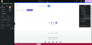
- Add a CubeWP Search Filter Builder widget for the Best Match sorting option.
- Filter Type: Sorting. Display Type: Button (not dropdown — this appears as a clickable button, not a dropdown list).
- Sort By: Relevance. Button Text: ‘Best Match’ .
- Button Icon: Upload a custom icon file representing ‘best match’.
Best Match Button Styling:
- Text Color: As per design. Background Color: White.
- Typography: Open Sans, 13px, Weight 600, Capitalize, Line Height 21px.
- Padding: Top & Bottom 13px, Left & Right 20px. Margin: 0.
- Border Radius: 7px. Border: None.
- Icon Color: As per design. Icon Size: 13px. Icon Spacing: 8px.
- Hover Text Color: White. Hover Background: Blue. Hover Icon Color: White.
10. CubeWP Search Filter Builder — All Categories Dropdown
10.1 All Categories Filter Setup
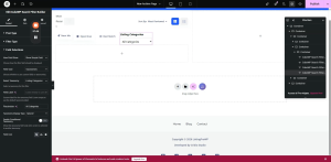
- Add a new CubeWP Search Filter Builder widget inside a dedicated container.
- Post Type: Listings.
- Filter Type: Filters.
- How to show filter: Select “Show simple field” option
- Field Type: Taxonomy. Taxonomy: ‘Listing Categories’.
- Display Type: Select 2 (a searchable, styled dropdown — not a plain select).
- Label: Remove (not needed in this context).
- Placeholder: Set to ‘All Categories’ to guide the user.
- Field Icon: Search for ‘list’ icon in the icon library and select it.
All Categories Dropdown Styling:
- Field Label: Disabled (turned off in Style settings).
- Typography (Input & Select): Open Sans, 13px, Weight 600, Capitalize, Line Height 27px.
- Text Color: As per design.
- Placeholder Typography: Open Sans, 13px, Weight 600, Capitalize, Line Height 27px.
- Padding: Top & Bottom 10px, Left 39px (extra left space for the icon), Right 18px.
- Input Height: 47px.
- Margin: 0. Border Type: None. Border Radius: 7px.
- Box Shadow: Remove (set to 0). Vertical 12, Blur 26px.
- Focus Text Color: White. Focus Background: Blue. Focus Border Color: Blue.
- Enable Custom Select Icon: Yes. Upload custom SVG down-arrow icon.
- Custom Icon Size: 16px.
Custom SVG Select Icon Configuration:
- Upload the custom SVG file for the dropdown arrow (down-angle icon).
- Size: 16px. Right offset: 53px (to position the arrow correctly inside the dropdown).
- Field Icon Styling: Color — copy and paste the specific hex code used in the design.
11. All Filters Popup
The ‘All Filters’ button opens a side popup that exposes advanced filter fields: Delivery, Takeout, Price Range, and Gender. This popup uses the Search Filter Builder widget configured as a popup trigger.
11.1 All Filters Container Setup
- Add a new container next to the filter buttons (left side) — this will be the right portion of the filter row.
- Padding: Right side — 3 pixels.
- This container holds the ‘All Filters’ Search Filter Builder widget.
11.2 CubeWP Search Filter Builder Widget (All Filters Popup)
- Add a CubeWP Search Filter Builder widget inside this container.
- Post Type: Listings.
- Show Layout: Both (mobile and desktop).
- Filter Type: Filters.
- How filed show: Show in Popup (when clicked, opens a popup — NOT a dropdown).
Note: The key distinction here is: the All Filters trigger uses a popup (side panel), not a standard dropdown. Ensure ‘popup’ is selected, not ‘dropdown’, so the filters slide in from the side.
Add the following four custom fields to the popup, one by one using ‘Add New’:
Field 1 — Delivery: Custom field type. Select the ‘Delivery’ custom field. Default option: Allow/No.
Field 2 — Takeout: Custom field type. Select the ‘Takeout’ custom field.
Field 3 — Price Range: Click ‘Add New’, then select the ‘Price Range’ custom field.
Field 4 — Gender: Click ‘Add New’, then select the ‘Gender’ custom field.
11.3 Popup Configuration Settings
- Button Label: ‘All Filters’.
- Button Icon: Select the standard filter icon from the icon library. Icon Position: Left side.
- Popup Header Text: Filters
- Popup Close Button: Enabled.
- Show Apply Button: Enabled — labeled ‘Apply Filters’.
- Popup Icon: No specific icon for the Apply button (left blank).
- Popup Origin/Position: Configure which side the popup opens (left, right, etc.) and its left/top position.
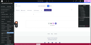
11.4 All Filters Popup Styling
Popup Style:
- Background Color: As per design.
- Text Color: As per design.
- Typography: Open Sans, 13px, Weight 600, Capitalize, Line Height 27px.
- Padding: As per design. Border Radius: 9. Box Shadow: Add box shadow — Color as per design, Vertical 12px, Blur 26px.
- Background Overlay: Select the overlay option and choose the overlay color.
Popup Content Area:
- Background Color: White.
- Width: 300px.
- Padding: Top 60px, Right 40px, Bottom 30px, Left 27px.
- Margin: 0. Border Type: Default. Border Radius: 0.
- Z-Index: Set (increase to ensure it overlays correctly).
- Box Shadow: Add — Color as per design, Vertical 12px, Blur 26px.
Popup Header:
- Padding: Top 40px, Right 0, Bottom 20px, Left 0.
- Text Color: As per design.
- Typography: Open Sans, 20px, Weight 700 (Bold). Line Height 22px.
Popup Close Button:
- Color: As per design. Hover Color: Blue. Hover Background Color: As per design.
- Icon Size: 18px. Padding: 0. Border Type: None. Border Radius: 0.
- Position from Top: 35px. Position from Right: 30px.
- Z-Index: Set (to ensure the close button renders above all content).
Popup Footer (Apply Button):
- Enable Footer: Yes (to show the Apply Filters button). (Note: if not needed, disable it.)
- Background Color: Blue (custom added).
- Typography: Open Sans, 30px (or as per design), Weight 600, Line Height 27px.
- Border Radius: 7.
11.5 Hover & Active States for Popup Trigger Button
- Hover Background Color: Blue. Hover Text Color: White. Hover Icon Color: White.
- Active Background Color: Blue. Active Text Color: White. Active Icon Color: White.
11.6 Switch Field Styling (Delivery/Takeout Toggles)
Inside the popup, the Delivery and Takeout fields use toggle switch components:
- Switch: Set space-between layout. Border Type: None. Switch Border Radius: 4px.
- Slider Handle Border Radius: 4px.
- Background Color: White. Handle Background Color: White.
- Handle Text Color: As per design. Main Text Color: As per design.
Label Styling (for switch labels):
- Font Family: Open Sans. Font Size: 16px. Font Weight: 400. Line Height: 28px.
- Label Color: As per design.
- Remove default margin and padding from label. Z-Index: 1.
11.7 Input Field Styling Inside Popup
Input Typography:
- Font Family: Open Sans. Font Size: 13px. Font Weight: 500.
- Text Transform: Capitalize. Line Height: 27px. Text Color: As per design.
- Text Hover Color: White.
Button Text (Apply / Place Order):
- Font Family: Open Sans. Font Size: 13px. Font Weight: 500. Line Height: 27px.
- Background Color: As per design. Text Color: White.
Input Options / Select Styling:
- Color: White (for selected option text).
- Padding: Top & Bottom 8px, Left 18px. Margin: Right 0, Left 0, Top 10px, Bottom 20px.
- Border: Solid, 1px width. Border Color: As per design. Border Radius: 7px.
- Focus Text Color: White. Focus Background: Blue. Focus Border: Blue.
- Box Shadow: Not applied during focus state.
11.8 Checkbox Styling Inside Popup
- Enable custom checkbox styling.
- Background Color: White. Border: Solid 1px. Border Color: As per design. Border Radius: 2px.
- Font Size: 25px.
Checkbox Label Styling:
- Font Family: Open Sans. Font Size: 14px. Text Transform: Capitalize. Line Height: 27px.
- Label Color: As per design.
- Spacing: 33px. Letter Spacing: 38px. List Item Style Width: 100%. Margin Bottom: 10px.
- Icon Size: 17px. Icon Top Spacing: 6px. Icon Left Spacing: 4px.
- Parent container Align-Items: flex-start (so items align to the top, not stretch).
Here is the complete video tutorial