
SINGLE PAGE LAYOUT BUILDER
| Document Type | Technical Implementation Guide |
| Scope | Single-page post detail layout — header section |
| Subject | Container structure, breadcrumbs, post title, ratings display, submit review and post share button |
| Builder Tool | Elementor (WordPress page builder), CubeWP, ListingPro Theme |
1. Overview
This guide documents the step-by-step construction of the header section of a single-page post detail layout. The header encompasses the post title, breadcrumb navigation, user ratings display, and interactive action buttons (save & share). All components are built using a nested container structure within a page builder environment.
2. Layout Architecture
The header section is organised as a two-tier container hierarchy:
2.1 Outer (Full-Width) Container
The outermost container spans the full viewport width and provides the section background.
| Property | Value | Notes |
| Width | Full-screen (100%) | Spans entire viewport |
| Background | Custom hex color | Applied to match design theme |
| Margin | 0 px (all sides) | Advanced > reset to 0 |
| Padding Top | 15 px | Default spacing preserved |
| Padding Other | 0 px | All other sides reset |
2.2 Inner (Fixed-Width) Container
Nested inside the outer container; centres and constrains content to the design grid.
| Property | Value | Notes |
| Width | 1,170 px | Fixed pixel width |
| Margin | 0 px | Default reset |
| Padding | 0 px | Default reset |
| Children | 2 columns | Left content + right widget area |
3. Two-Column Structure
Inside the 1,170 px container, two side-by-side child containers create the left content column and the right rating/action column.
3.1 Column Specifications
| Column | Width | Padding (L/R) | Content |
| Column 1 (Left) | 66.6% | 15 px each side | Breadcrumbs · Post Title · Claim Icon · Ratings |
| Column 2 (Right) | 33.3% | 15 px each side | Overall Rating Score · Stars · Review Count · Action Buttons |
The gap between the two columns and the outer container gap are both set to 0 px.
4. Left Column Components
4.1 Breadcrumb Navigation
The breadcrumb bar provides contextual page navigation at the top of the left column.
Container Settings
- Minimum height: 20 px
- Direction: Row (horizontal)
- Padding & margin: 0 px (all sides)
Home Button
- First add a button to the container and set its text to ‘home’.
- Link target: From the dynamic tags of link, select the custom link and then Homepage link
Home Button — Typography
| Property | Value | Notes |
| Font Family | Open Sans | Applied via Style panel |
| Font Size | 13 px | — |
| Font Weight | 400 (Regular) | — |
| Text Transform | Capitalize | — |
| Line Height | 19 px | Matches font size |
| Letter Spacing | 0% | — |
- Border style: Solid, positioned on bottom edge only
- Border width: 1 px
- Border color: As per design hex code
- Border radius: 0 px
- Internal padding: 0 px
- Transparent background color
Listing category Breadcrumb Button
A duplicate of the Home button is created and repositioned. Under the content tab, we will select Post Term from the dynamic tag then we will select Listing Category from the taxonomy select.
Similarly we will select the dynamic link.
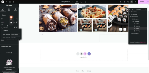
Post Title Breadcrumb Button
A duplicate of the Home button is created and repositioned. Its label is bound to the dynamic post title field so it automatically reflects the current post name. The custom link is removed from this instance.
Hover state configuration (applied to all breadcrumb buttons):
- Text color: Brand blue
- Border color: Brand blue
Separator Spacing
- Margin-right: 13 px — applied to each separator element between breadcrumb items
- Margin-left: set on button elements as required for correct alignment
4.2 Post Title
A dedicated container below the breadcrumbs that displays the post title.
Container Settings
- Margin : 0 px (all sides)
- Padding: 0 px (all sides)
- Set the width of the container to fit content.
The post title is rendered as an H1 heading using a dynamic Post Title tag from the page builder’s single-post data source.
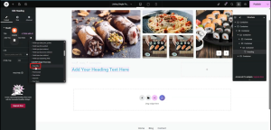
| Property | Value | Notes |
| HTML Tag | H1 | Semantic heading level |
| Data Source | Post Title Tag | Dynamic — pulls from post data |
| Font Family | Open Sans | — |
| Font Size | 35 px | — |
| Font Weight | 500 (Medium) | — |
| Text Transform | Capitalize | — |
| Line Height | 47 px | — |
| Letter Spacing | 0 px | — |
| Word Spacing | 0 px | — |
| Color | Custom hex | As per design spec |
4.3 Business Tagline
Displayed directly below the post title. This is a dynamic custom field sourced from the post’s backend data (From the dynamic tag, select Post Type (text)> Data Source: Post Field> Select custom field: ‘business tagline’). The HTML tag is set to <p> (paragraph).
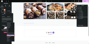
| Property | Value | Notes |
| HTML Tag | p | Paragraph element |
| Field Type | Text | Custom field — dynamic selection |
| Font Family | Open Sans | — |
| Font Size | 36 px | — |
| Font Weight | Normal | — |
| Line Height | 26 px | — |
| Color | Custom hex | Copied from design |
Note: At the time of implementation, the business tagline data had not yet been integrated from the backend. The field mapping was configured in advance to display correctly once data becomes available.
4.4 Ratings Row
A dedicated container below the title and tagline displays the visual rating elements.
Container Settings
- Direction: Row (horizontal)
- Padding: 0 px (all sides)
- Margin : 0 px (all sides)
Rating Score (Numeric)
From the dynamic tag, under the CubeWP Reviews, select Overall Post Rating. Then the rating number will automatically be displayed.
| Property | Value | Notes |
| HTML Tag | p | — |
| Font Family | Open Sans | — |
| Font Size | 16 px | — |
| Font Weight | 400 | — |
| Line Height | 26 px | — |
| Color | Custom hex | Matches design palette |
Star Rating Icons
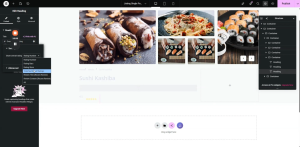
- Duplicate the rating number heading from the show overall rating dropdown we will select Rating Stars.
- Font size: 0 px (hides text, shows stars only)
- Star color: As per design specification
Review Count
- Duplicate the rating number heading from the show overall rating dropdown we will select Total Number of Ratings.
- Formatted with brackets, e.g. (42)
- Margin-right: 10 px (separates from adjacent elements)
5. Right Column Components
The right column (33.3% width) contains the overall rating summary, interactive star display, review count, and the Save / Share action buttons.
Nested Container Structure
5.1 First-Level Inner Container
Add a container inside the outer container and apply the following settings:
| Setting / Parameter | Value / Configuration |
| Margin | 0 (zero) |
| Padding Top | 10 pixels |
| All Other Padding | 0 (zero) |
5.2 Second-Level Inner Container
Add another container inside the first-level inner container:
| Setting / Parameter | Value / Configuration |
| Gap (Column) | 12 pixels |
| Layout Direction | Row |
| Justify Content | flex-end (end alignment) |
| Padding | 0 (zero) |
5.3 Two Sub-Containers
Add two additional sub-containers inside the second-level container:
- Sub-Container 1 — Padding: 0, Margin: 0. Width set to fit content.
- Sub-Container 2 — Configured as a vertical container with a width of 60 pixels.
5.4 Vertical Container (60px Width)
| Setting / Parameter | Value / Configuration |
| Orientation | Vertical |
| Width | 60 pixels |
| Layout Direction | Row |
| Item Alignment | Center |
| Gap | 2 pixels |
| Padding (Top, Right, Left) | 5 pixels each |
| Margin | 0 (zero) |
6. Rating Display Configuration
6.1 Adding the Overall Rating Heading
Inside the vertical container, add a heading element that will display the post’s overall rating.
- Navigate to the Custom Tags section within the heading element.
- Locate the tag named ‘Overall Post Rating’.
- Select the Rating Number option from the menu.
- Manually append a forward slash and the number 5 (i.e., /5) to indicate the rating scale.
- Set the HTML tag for this element to ‘p’ (paragraph format).
6.2 Rating Container Background
After adding the rating heading, set the background color of the container to ensure proper visual contrast and UI consistency. The background color distinguishes the rating component from adjacent elements on the page.
6.3 Second Rating Container — Total Ratings Count
Add a second container for displaying the total number of ratings. Configure its properties as follows:
| Setting / Parameter | Value / Configuration |
| Width | Fit content |
| Layout Direction | Flex-end alignment |
| All Gaps | 0 (zero) |
| Heading Margin-Top | 3 pixels |
6.4 Total Ratings Heading Typography
Add a heading inside the second rating container and apply the following style settings. In the dynamic tag section, under the CubeWP Reviews section, navigate to Overall Post Rating and select the Total Number of Ratings. In the advance setting, inside after input write Ratings to show it after the number.
| Setting / Parameter | Value / Configuration |
| Font Family | Open Sans |
| Font Size | 13 pixels |
| Font Weight | 400 (Normal) |
| Text Transform | Capitalized |
| Line Height | 13 pixels |
| Letter Spacing | 0 (zero) |
| Text Color | Set as required |
| Default Gap | 0 (zero) |
7. Submit Review Button
7.1 Button Container
Set the container that holds the submit review button with the following properties:
| Setting / Parameter | Value / Configuration |
| Container Width | Fit content |
| Gap | 17 pixels |
| Padding (Advanced) | 0 (zero) |
7.2 Button Configuration
- Add a button element inside the container.
- Set the button label text to: Submit Review.
- Select a filled star icon from the media library.
- Position the icon to the left side of the button.
- Set the icon spacing value to 0 (zero).
7.3 Button Positioning
| Setting / Parameter | Value / Configuration |
| Right | 49.8 pixels |
| Bottom | 1.5 pixels |
| Left | 52 pixels |
| Gap | 8 pixels |
7.4 Hover Icon Color
| Setting / Parameter | Value / Configuration |
| Icon Hover Color | White |
8. Save & Share Container
8.1 Container Below Action Buttons
Add a new container directly below the action buttons area:
| Setting / Parameter | Value / Configuration |
| Width | Full width |
| Height | Full width |
| Layout Direction | Row |
| Alignment | Flex-end |
| Gap | 10 pixels |
| Padding | 0 (zero) — reset from 0, 8, 0, 0 |
| Margin Bottom | 10 pixels |
8.2 Locating and Setting the Share Icon
- Locate the VP Social share element from the elementor panel and drag it into the container.
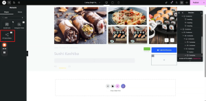
8.3 Setting the Share text & Icon
- Select a new share icon from the integrated icon library.
- Set the share icon and assign the title label as: Share.
8.4 Share Icon Styling
| Setting / Parameter | Value / Configuration |
| Icon Size | 10 pixels |
| Icon Color | Set as required (make highly visible) |
| Text Color | Set as required |
8.5 Typography Settings
| Setting / Parameter | Value / Configuration |
| Font Family | Open Sans |
| Font Size | 12 pixels |
| Font Weight | 400 (Normal) |
| Line Height | 12 pixels |
8.6 Container Background & Border
| Setting / Parameter | Value / Configuration |
| Background Color | Set as required |
| Border Type | Solid |
| Border Width | 1 pixel |
| Border Color | Copy and paste from design |
| Border Radius | 5 pixels |
8.7 Spacing & Alignment
| Setting / Parameter | Value / Configuration |
| Spacing | 5 pixels |
| Alignment | Center |
| Padding (Top & Bottom) | Set as required for balanced layout |
9. CubeWP (Bookmark/Save) Widget
9.1 Initial Padding Setup
Before adding the Save widget, apply the following padding to the existing container:
| Setting / Parameter | Value / Configuration |
| Padding Top | 6 pixels |
| Padding Right | 20 pixels |
| Padding Bottom | 6 pixels |
| Padding Left | 20 pixels |
| Margin | 0 (zero) |
9.2 Adding the CubeWP Save Widget
- Navigate to the widget panel and locate the CubeWP Save widget.
- Add the widget to the current container section.
- Select the bookmark icon within the widget settings.
- Set the icon’s function to Bookmark.
- Enable the Show text toggle and the texts you want to show when the item is saved.
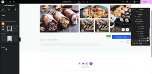
9.3 CubeWP Save Widget Styling
| Setting / Parameter | Value / Configuration |
| Icon Color | Set as required |
| Background Color | White |
| Padding Top | 6 pixels |
| Padding Right | 20 pixels |
| Padding Bottom | 6 pixels |
| Padding Left | 20 pixels |
| Border Style | Solid |
| Border Width | Minimum (1 pixel) |
| Border Color | Copy and paste from design |
| Border Radius | 5 pixels |
| Text Color | Copy and paste from design |
9.4 Typography Settings
| Setting / Parameter | Value / Configuration |
| Font Family | Open Sans (Google Fonts) |
| Font Size | 13 pixels |
| Font Weight | 500 |
| Text Transform | Capitalize |
| Line Height | 19 pixels |
| Letter Spacing | 0 (zero) |
| Word Spacing | 0 (zero) |
9.5 Layout & Alignment
| Setting / Parameter | Value / Configuration |
| Gap Between Elements | 0 (zero) |
| Row Alignment | Center |
| Margin | Center |
9.6 Hover State Settings
Configure hover state properties to provide visual feedback when users interact with the bookmark button:
- Icon Hover Color — Set in the settings panel
- Border Color (hover) — Set to maintain consistency
- Text Hover Color — Set to ensure readability on hover
3. Fixing Spacing Gaps
After publishing the CubeWP Save widget changes and previewing the frontend, you may notice an undesirable gap between the next and previous elements. To fix this:
- Identify the main container causing the gap.
- Navigate to the main container’s Layout properties.
- Set the default gap to 0 (zero) pixels.
- For the individual columns within the container, set the gap to 5 pixels.
- Navigate to the layout panel and set the main container gap to exactly 5 pixels to ensure consistent spacing across the interface.
After making these corrections, verify section visibility settings, then publish the updated changes and preview the live frontend to confirm the gaps are resolved.
Here is the complete video tutorial