
Single Page Builder
Right Sidebar — Business Hours, Map Widget, Phone/Website, contact number, Additional Info Accordion
| Document Overview
Scope: Building the right-side panel of the single listing page, covering Business Hours widget, CubeWP Map widget with custom pin, Phone & Website meta fields and listing meta accordion (Gender, Air Conditioning, Dogs Allowed, 24/7, Wheelchair), Tools: Elementor, CubeWP, ListingPro Value Pack |
1. Introduction
This tutorial covers the right-side sidebar panel of the single listing page. This panel contains several stacked container cards, each displaying specific information about the listing: business operating hours, an embedded interactive map, contact details (phone and website) and listing meta information in an expandable accordion
2. Right Sidebar Container Structure
The right sidebar is a flex column container sitting to the right of the main content area. It contains several independently styled card containers stacked vertically.
- Main right-side container: Display Flex. Gap: 0. Default padding and margin: 0.
- Padding: Right & Left — 15 pixels.
- Each card inside: Add a sub-container. Set margin bottom: 30 pixels. Remove default padding.
3. Business Hours Widget
The CubeWP Business Hours widget displays the listing’s weekly operating schedule, including open/close status, day-specific hours, and a toggle to expand all timings.
3.1 Business Hours Container Setup
- Add a container inside the right sidebar.
- Gap: 0. Padding and margin: 0. Margin Bottom: 30 pixels. Remove default padding.
- Add the CubeWP Business Hours widget (from the CubeWP Value Pack).
3.2 Widget Configuration
- Post Type: Listings.
- Business Hours Field: Select the Business Hours field from the dropdown (the field where listing owners enter their weekly schedule).
- Open/Close Text: Configurable. Default label: ‘Open/Close’. Customize as needed.
- Toggle Labels: ‘Show All Timings’ and ‘Close All Timings’.
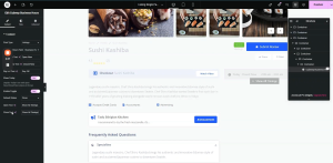
3.3 Basic Style Settings
Main Container Typography:
- Font Family: Open Sans. Font Size: 14px. Font Weight: 400. Text Transform: Capitalize.
- Text Color: As per design. Background Color: As per design (e.g., ‘#FFF’).
- Padding: Top 16px, Right 20px, Bottom 15px, Left 25px. Margin: 0.
- Border: None. Border Radius: 5px.
Today’s Status Icon:
- Icon: Clock (search ‘clock’ in icon library). Font Size: 14px.
- Icon Color: As per design. Icon Spacing: 11px.
- Padding: 0. Border Radius: 0.
- Today’s Label Typography: Font Size set to 0 (hide the ‘Today’ text label — show only the clock icon and hours).
Open Now / Close Now Indicator:
Open Now: Font Family: Open Sans, 13px, Weight 500, Line Height 22px. Color: As per design (green shade). Margin: 0. Padding: 0 (default).
Close Now: Font Family: Open Sans, 13px, Weight 500, Capitalize, Line Height 22px. Color: As per design (red shade). Margin: 0. Padding: 0.
Today Hours Label:
- Font Family: Open Sans. Font Size: 14px. Font Weight: 400. Text Transform: Uppercase.
- Line Height: 22px. Text Color: As per design.
Day Row Styling:
- Padding: Top & Bottom 16px, Right & Left 0.
- Border Type: Solid. Bottom Border Width: 1px. Border Color: As per design (paste hex).
- Last Child Border Width: 0 (remove border from the last day row).
- Last Child Padding: Top & Bottom 15px, Left & Right 0.
Day Name Typography:
- Font Family: Open Sans. Font Size: 13px. Font Weight: 500. Text Transform: Default.
- Line Height: 13px. Text Color: As per design.
Day Hours Typography:
- Font Family: Open Sans. Font Size: 12px. Font Weight: 400. Line Height: 12px.
- Text Color: As per design.
Day Off Typography:
- Font Family: Open Sans. Font Size: 14px. Font Weight: 400. Text Transform: Capitalize.
- Line Height: 14px. Margin: 0. Padding: 0.
Toggle Button (Show All Timings):
- Text Color: As per design. Text Hover Color: Same as text color.
- Font Family: Open Sans. Font Size: 9px. Font Weight: 400. Line Height: 12px. Text Transform: Normal.
- Background Color: As per design. Background Hover Color: As per design.
- Border Color: As per design. Border Radius: 6px.
- Padding: Top 2px, Right 5px, Bottom 2px, Left 5px.
- Position from Bottom: -8px. Position from Left: 36%.
- Icon Size: 9px. Gap: 5px. Z-Index: 999.
4. Map Widget (CubeWP Map)
The CubeWP Map widget displays an interactive map showing the listing’s location, with a custom styled map pin and an address label with a ‘Get Directions’ button.
4.1 Map Container Setup
- Add a container for the map section inside the right sidebar.
- Background Color: As per design. Border Radius: 5px.
- Gap: 0 (remove default 20px gap). Default Padding: Set to 0. Margin Bottom: 0.
- Inside this container, add two sub-containers: one for the map itself, one for the address and directions.
4.2 Map Sub-Container
- Margin: 0. Padding: Top 9px, Right 9px, Bottom 5px, Left 9px.
- Add the CubeWP Map widget inside this container.
CubeWP Map Widget Settings:
Inside Map Options
- Post Type: Listing.
- Select Maps Field: Address.
- Data Source: Current Post (dynamically uses the current listing’s address).
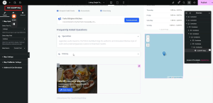
Inside Map Settings
- Map Height: 180 pixels. Zoom Level: 17.
Map Styling:
- Map Height: 180px. Map Width: 100%.
- Border Type: None. Border Radius: 0.
4.3 Custom Map Pin Styling
Inside the Map Pin/Marker settings:
- Enable Custom Map Pin: Yes.
- Select Pin Icon from the menu icons.
- Set icon size to 22px
- Pin anchor point X and Y equals to 0
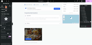
Pin Container (Outer Wrapper):
- Background Color: As per design.
- Width: 50px. Height: 50px. Padding: Top 6px, Left 7px.
- Border Style: Solid. Border Width: 1px. Border Color: As per design (paste hex).
- Border Radius: 50% (circular shape). Rotation: 14 degrees.
- Hover Background Color: As per design.
Icon Wrapper Styling:
- Width: 35px. Height: 35px.
- Padding: Top 6px, Bottom 10px, Left 10px (10px all sides).
- Border Type: Solid. Border Width: 1px. Border Color: As per design (paste hex).
- Border Radius: 50px (circular). Background Color: White.
- Rotation: 45 degrees (counter-rotates to keep the icon upright).
Pin SVG Icon Styling:
- SVG Color: As per design. SVG Size: 14px. SVG Rotation: 14 degrees.
4.4 Address & Get Direction Button Sub-Container
- Padding: Top 10px, Right 13px, Bottom 10px, Left 13px.
- Margin: 0. Flex Direction: Column.
Address and Get Direction Button Configuration:
- Enable ‘Show Address after Map’ and ‘Get Directions Button’ .
- Add the map icon for address and icon is positioned before label
- Remove the ‘Get Directions’ icon
- Disable the open in new tab toggle.
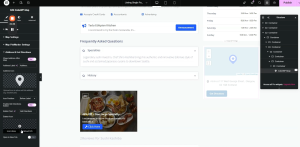
Address Style Typography:
- Font Family: Open Sans. Font Size: 13px. Font Weight: 400. Line Height: 18px.
- Label Color: As per design. Main Text Color: As per design.
- Address Container Padding: Top 13px, Right 0, Bottom 10px, Left 0.
- Icon Size: As per design. Icon Color: As per design. Icon Spacing: 10px.
- Remove default hover colors.
Get Directions Button Styling:
- Font Family: Open Sans. Font Size: 10px. Font Weight: 400. Line Height: 18px.
- Padding: Top 2px, Right 10px, Bottom 2px, Left 10px.
- Margin: 0. Left Margin: 30px.
- Border: 1px solid. Border Color: As per design. Border Radius: 15px.
- Icon Size: 18px. Icon Spacing: Fixed.
- Text Color: As per design. Background Color: Transparent.
- Text Hover Color: As per design. Background Hover Color: As per design.
- Border Glow Color on Hover: As per design.
5. Phone & Website Section (CubeWP Meta Widget)
The phone and website section displays the listing’s contact phone number and website URL using the CubeWP Meta widget. Each field is shown as a clickable button with an icon.
5.1 Phone/Website Container Setup
- Add a new container inside the right sidebar.
- Gap: 0. Background margin and padding: 0.
- Add the ‘CubeWP Meta’ widget — a custom CubeWP Value Pack widget.
5.2 CubeWP Meta Widget — Phone Field
- This widget displays any custom field as a button/link with an optional icon.
- Select Meta Source: ‘Post Meta’
- Post Type: ‘Listings’
- Meta Field: ‘Phone Number’
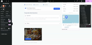
Under the Link/URL Options
- Enable Use Field Value as link functionality.
- For the URL Prefix: Write ‘tel’ to link it to a phone number
- Icon: Add Phone icon. Icon Position: Before.
Phone Field Styling:
- Font Family: Open Sans. Font Size: 13px. Font Weight: 400. Line Height: 18px.
- Text Color: As per design. Background Color: As per design.
- Padding: Top 21px, Right 20px, Bottom 21px, Left 21px. Margin: 0.
- Border Type: None. Border Radius Top: 0.
- Hover Text Color: Blue. Hover Background Color: As per design. Hover Border Color: As per design (not used).
- Icon Size: 16px. Icon Color: As per design. Icon Hover Color: As per design.
- Icon Spacing: 10px.
5.3 Duplicate for Website Field
- Duplicate the CubeWP Meta widget for the website field.
- Change the Mata field to the ‘website’.
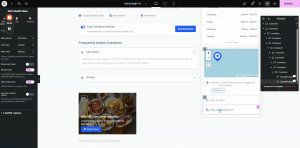
Under the Link/URL Options:
- Icon: Globe icon (search ‘globe’).
- For the URL Prefix: Keep it empty so that website url is set directly.
- Add a Top Border to the website container to separate it from the phone field.
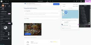
Top Border Configuration (Website Separator):
- Navigate to the Style tab for the website widget’s container.
- Border Type: Solid. Border Width: Top — 1px. Border Color: As per design.
Note: The top border on the website section creates a visual divider between phone and website items.
6. Listing Meta Information (Accordion)
The listing meta section displays additional listing details (such as Gender, Air Conditioning, Dogs Allowed, 24/7 Hours, Wheelchair Accessible) using an accordion with CubeWP Meta elements inside.
6.1 Meta Info Main Container
- Add a new container inside the right sidebar.
- Remove defaults. Margin Bottom: 13px. Padding: 26px.
- Add a container inside this main container.
- Gap: 0. Padding: 0. Margin: 0. Direction: Row, Space-Between.
- Inside this, add two more containers (left section and right section).
6.2 Additional Details Heading
- Add a container. Gap: 0. Margin: 0. Padding: 0.
- Add a heading (H4) element and set the text to additional details.
- Font Family: Open Sans. Font Size: 16px. Font Weight: Standard (400). Line Height: 18px.
- Text Color: As per design (copy-paste hex).
6.3 CubeWP Meta Elements (Grid)
- Add a container for the meta items. Direction: Row, Space-Between.
- Remove default row/column gaps and padding.
- Add the CubeWP Meta widget.
- Meta Source: Post Meta, Post Type Listings, Meta Field: As required (i.e Delivery)
- Set Gap: 20px.
- Paste the styling configuration for the meta widget.
- Duplicate the meta widget and adjust for each field:
Meta Fields to Display (in order):
Field 1: Delivery
Field 2: Take out
Field 3: Gender
Field 4: Air Conditioning
Field 5: Dogs Allowed
Field 6: 24/7 Open
Field 7: Wheelchair Accessible
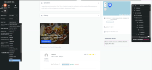
6.4 Meta Accordion (Right Section)
An accordion widget wraps the second set of meta details (the expandable section):
- Add an Accordion widget. One item only. Enable ‘Show All’.
- Set the accordion title. Navigate to Style > set spacing and margins.
- Accordion Border: Solid, 1px width. Border Color: As per design. Border Radius: 3px.
- Padding: Top 3px, Right & Bottom 8px, Left 8px. Bottom: also 3px. Left: 8px.
Accordion Header Styling:
- Font Family: Open Sans. Font Size: 9px. Font Weight: 400. Line Height: 12px.
- Text Color: As per design (paste hex).
- Hover and Active: Same text color. Icon gap: 9px. Gap between elements: 4px.
- Icon Color: As per design (for normal, hover, and active states).
Accordion Content Styling:
- Border Radius: 0. Padding: 0.
- Inside accordion item 1, add the CubeWP Meta widget with the remaining meta fields.
- Gap: 0. Margin: 0. Padding: 0. Copy-paste meta styling from other sections.
Inside Accordion Item 2:
- Add a new container. Set gap, padding, margin to 0.
- Copy-paste the meta container setup for additional fields.
- Fields: Air Conditioning, Dogs Allowed, 24/7 Open, Wheelchair Accessible.
Here is the complete video tutorial