
Banner Search Form
Configuration & Styling Reference
| Platform | WordPress + Elementor + CubeWP |
| Feature | Search Form (Banner Area) |
| Scope | Search form creation, placement, and full styling |
1. Overview
This guide covers the complete process of building, placing, and styling a Search Form widget on the banner section of a homepage using the CubeWP Search Form plugin integrated with WordPress and Elementor. The workflow includes configuring the search form in the dashboard, selecting the appropriate post type, adding fields, and then styling each component to match a custom design.
2. Creating the Search Form in the Dashboard
2.1 Accessing the Search Form Builder
To begin building a search form, navigate to the WordPress Dashboard and follow this path:
- Go to the WordPress Dashboard.
- Hover over CubeWp and then Navigate to Search Forms.
- Select Search Forms.
- Select the post type against which you want to build the search form (e.g., Listing Post Type).
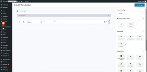
2.2 Configuring Search Form Fields
The search form supports a variety of field types drawn from default WordPress custom fields and custom taxonomy-based fields. The following fields are available:
Default WordPress Custom Fields
- Keyword Field – Allows users to enter free-text keyword searches.
- Search Button Field – Triggers the search and redirects to the search results page.
Taxonomy-Based Fields
These fields are attached to the Listing Post Type and sourced from its taxonomies:
- Locations – Filter listings by geographic location.
- Features – Filter by listing feature attributes.
- Listing Tags – Tag-based filtering.
- Listing Categories – Category-based filtering.
ℹ️ Note: Any field can be selected and reordered based on your design requirements. You can attach any field you desire to complement your search form layout.
2.3 Adding What (Keyword) field
To attach the Keyword (used as the ‘What’ field) to the search form:
- Attach the Keyword field to the designated spot in your form configuration.
- You can change label to What, add class to input or container, and change the placeholder
2.4 Adding the Google Address Field
To attach the Google Address field (used as the ‘Where’ field) to the search form:
- Locate the Google Address field in the available field list.
- Attach it to the designated spot in your form configuration.
- Set its display label — for example, ”Where’.
Drag the search button into the form, change the search button’s name/label. Save all changes before proceeding.
3. Placing the Search Form on the Homepage (Elementor)
3.1 Opening Elementor on the Homepage
After saving the search form in the dashboard, navigate to the homepage and click Edit with Elementor to open the page editor.
3.2 Creating the Container Structure
The search form must be placed inside a properly configured container. Use the following structure:
Outer Container
- Add a new container element to the page.
- Set the background color to white (#FFFFFF).
- Apply a border radius of 6 pixels.
- Add a bottom margin of 40 pixels to ensure proper spacing from surrounding elements.
Inner Container
- Place a second container inside the outer container.
- Set the default padding to 0 for this inner container.
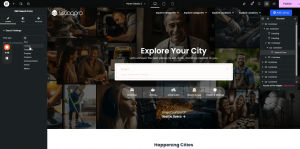
3.3 Adding the Search Form Widget
- In the Elementor widget panel, navigate to the CubeWP category.
- Find the widget named Search Form.
- Drag and drop the Search Form widget into the inner container.
- In the widget settings, select the post type — choose Listings from the dropdown menu.
- All fields previously attached to the Listings post type will now appear in the preview.
4. Styling the Search Form
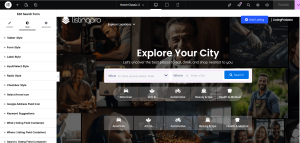
The Search Form widget provides dedicated styling sections for each component. All styling changes are reflected in real-time within the Elementor preview. Below is a comprehensive breakdown of all available styling options.
4.1 General Form Container Styling
| Property | Recommended Value / Notes |
| Padding (default) | 20px top/bottom, 30px left/right |
| Border Radius | 6px (or set to 0 to remove) |
| Box Shadow | Set to fully transparent if not needed |
| Background Color | Customizable per design preference |
4.2 Styling the ‘What’ Field (Keyword Field)
Label Styling
- Set label color as desired — customizable background color and text color are supported.
- Adjust label padding: recommended values are top: 11px, bottom: 16px; set left/right as required.
- Set label border-radius to 0 to remove any rounded corners on the label.
- Use position: absolute to layer the label on top of the input field for a floating label effect.
Input Field Styling
- Set input padding to 8px as a starting value.
- Increase left padding significantly to accommodate the label positioned absolutely on the left side.
- Set width to a fixed pixel value (e.g., 300px) or keep at 100% based on design needs.
- Remove default browser margin by setting margin to 0 — also remove bottom margin.
- Set background color as required by your design.
- Set border type to none to remove the default input border.
Icon Configuration
- An icon can be added to the ‘What’ field if required.
- To remove an icon entirely, simply do not include it in the field configuration.
4.3 Styling the ‘Where’ Field (Google Address Field)
Label Styling
- Apply the same padding values as used for the ‘What’ field label to maintain visual consistency.
- Set label border-radius to 0.
- Set label position to absolute so it appears overlaid on the input field.
Input Field Styling
- Set container width to 300px (or as required by your layout).
- Set border width to 0px and border property to none.
- Set padding to 70–90px (left) to accommodate the Google Address icon displayed inside the field.
- Apply a left margin of 10px to the input for proper spacing.
Google Address Icon Positioning
- The Google Address field automatically displays a location icon inside the input.
- Position the icon using top: 10px from the top edge.
- Apply a left margin of 10–20px to position it correctly within the input.
- Ensure the icon is vertically centered within the input field.
4.4 Styling the Search Listing Field Container
- Set the padding for the sub-label.
- Set the label border-radius to 0.
- Set the container width to 100% (or 99–100px fixed if required).
- Set bottom margin to 0 to remove unwanted spacing.
- Add additional padding as needed based on your design.
4.5 Styling the Search Button
The search button is fully customizable through the widget’s button styling panel. The following properties can be configured:
- Color – Text color of the button label.
- Background Color – Fill color of the button.
- Padding – Internal spacing within the button.
- Margin – Spacing around the button; set left margin to 10px minimum.
- Border – Border type, width, and color.
- Border Radius – Rounded corners configuration.
- Icon – Attach a search icon to the button. Search the icon library and select the appropriate icon.
- Icon Size – Adjust the size of the icon within the button.
- Icon Color – Set the icon color (e.g., black or white depending on the background).
- Typography – Configure font family (e.g., Open Sans), font size (12–14px), and font weight.
Button Default Styling Reset
- Set button padding to 0 to reset default browser styles.
- Set top margin to 0 to remove any unwanted default spacing.
- Ensure the icon is positioned within the button boundaries and visually centered.
4.6 Label Typography
To style the typography of input labels globally across the search form:
- Go to the Label Style section in the widget settings.
- Adjust the Typography settings for the label.
- Set Font Weight to 200–400 depending on desired visual weight (lighter values produce thinner text).
- Monitor live changes in the Elementor preview to select the best weight.
4.7 Input Field Styling (Global)
- Padding – Adjust for all input fields consistently.
- Border Color – Set or remove the input border.
- Background Color – Set a custom background fill.
- Placeholder Color – Set to black (#000000) or any preferred shade.
- Text Color – Configure the color of user-entered text (e.g., #333333).
- Height – Set a fixed height value (e.g., 45px or 46px) for consistent alignment.
- Margin – Set to 0 to remove browser default margins.
5. Keyword Suggestions
5.1 Enabling Keyword Suggestions
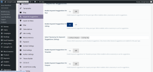
The ‘What’ field supports an autocomplete keyword suggestions feature. To enable it:
- Go to the WordPress dashboard, hover over CubeWP, navigate to the settings and click on it.
- Locate the Keyword Suggestions section.
- Enable keyword suggestions for Listings
- Select the taxonomies whose terms should appear as suggestions — for example, ‘My Listing Category’ and ‘Listing Tag’.
- Save the settings and reload the frontend to verify that suggestions appear in the ‘What’ field.
5.2 Styling the Keyword Suggestions Dropdown
The keyword suggestions dropdown is styled from within the Search Form widget’s Style tab, under the Keyword Suggestions section. The recommended configuration is:
Container / Dropdown Box
- Background Color: #FFFFFF (white)
- Container Padding: 7px
- Border Radius: 7px
- Border from Top: 12px
Individual Suggestion Items
- Text Color: #333333 (dark gray)
- Padding: 15px left and right, 8px top and bottom
- Margin: 0px (all sides)
Typography
- Font Size: 14px
- Font Family: Open Sans
- Font Weight: 300 (Light)
- Line Height: 20p
Images in Suggestions
- Listing images: Set to 30x30px (or 20x20px as preferred).
- Image Border Radius: 0px (square corners).
- Image Margin Bottom: 10px.
- Border between image and title: 10px spacing.
- Taxonomy label images: Can be hidden if not required.
Hover State
- Change the background color on hover to a lighter shade for visual feedback.
- A border effect can also be applied on hover to highlight the selected suggestion.
ℹ️ Note: After configuring all keyword suggestion styles, publish the page and reload the frontend to verify that the suggestions appear and behave as expected when a user clicks inside the ‘What’ field.
6. Publishing and Final Verification
- After completing all styling configurations, click the Publish button in Elementor to save and deploy the changes.
- Navigate to the frontend homepage URL.
- Verify the search form displays correctly with all fields, labels, and the search button.
- Click inside the ‘What’ field to confirm keyword suggestions appear as configured.
- Hover over suggestion items to verify hover state background and border effects.
- If further adjustments are needed, return to Elementor and fine-tune the margin (e.g., increase left margin from 10px to 15px) and padding values as required.
ℹ️ Note: All styling changes should be verified on both desktop and mobile views to ensure responsiveness. The margin adjustments between the label and icon (e.g., 15px from left edge) are critical for visual balance across different screen widths.
Here is the link of the video tutorial