
Post Card Builder
Elementor Setup, CubeWP Posts Widget & Post Card Creation
| Document Overview
Scope: Setting up Elementor page builder, configuring the Cube WP Posts widget, creating a custom post card template Tools: Elementor Page Builder, Cube WP Plugin, WordPress Theme Builder |
1. Introduction & Overview
This tutorial provides a comprehensive, step-by-step walkthrough for building a custom post card using the Elementor page builder integrated with the Cube WP plugin. The guide covers all essential techniques, from accessing the Elementor editor to creating a fully styled, dynamic post card template that displays listings, ratings, pricing, and actionable buttons.
2. Accessing the Elementor Editor
The Elementor editor is the primary interface for designing and customizing pages. The process for accessing it is the same regardless of whether you are editing your main homepage or any subpage.
2.1 Steps to Open Elementor
- Navigate to your WordPress dashboard.
- Locate the page where you want to show posts/listings with the post card. (homepage or any subpage).
- Click the ‘Edit with Elementor’ button at the top of the dashboard.
- Wait for the Elementor editor to fully load.
Once loaded, the full suite of design tools will be visible in the left-hand panel, allowing you to begin customizing layouts and adding elements to ensure a professional appearance.
3. Configuring the CubeWP Posts Widget
The CubeWP Posts widget is the core component used to display posts (listings) on your homepage. It provides extensive filtering, ordering, and display options.
3.1 Adding the Widget
- In the Elementor editor, search for ‘CubeWP Posts’ in the widget panel.
- Drag and drop the widget into the desired section on the page.
- The widget will immediately display default post listing options.
3.2 Post Type Selection
The first setting to configure is the post type. This determines what kind of content the widget will display.
- Click on the widget to open its settings panel.
- Under ‘Post Types’, select the post type whose data you want to display (e.g., listings, videos, custom types).
- Each post type has its own independent settings that can be adjusted accordingly.
Note: You can switch between different post types at any time. Each selection updates the display immediately.
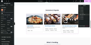
3.3 Post Filtering Options
The widget provides multiple ways to filter which posts are shown:
All Posts: Displays every post of the selected post type.
By Taxonomy: Filters posts to show only those that have a particular taxonomy.
By ID: Allows you to manually specify post IDs to display targeted content.
Related Posts: Shows posts related to the current post being viewed.
Featured / Boosted Posts: Displays promoted posts that are configured to appear at the top.
Nearby Posts: Displays posts that are located in a particular location.
Author Filter: When enabled, only shows posts created by the currently logged-in user (useful for user dashboards).
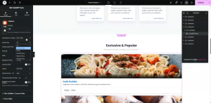
3.4 Ordering & Sorting
Control how posts are ordered using the following options:
Order By: Sort by Most Recent, Title, or Random order.
Number of Posts: Define exactly how many posts to display: 3, 4, 5, 6, or all available.
Grid View: Displays posts in a grid layout. Select the number of columns (e.g., set to 3 for three-column display).
Posts Per Row: In grid mode, set this to ‘auto’ for automatic columns, or specify a fixed number (e.g., 3).
List View: Displays posts in a single vertical list.
3.5 Loading & Display Settings
Load by AJAX: Enable to load posts asynchronously after page load. Disable to show posts immediately on page render.
Hover Effect: Optional visual effect when a user hovers over a post card.
Post Slider: Enable to convert the posts display into an interactive slider/carousel.
3.6 Meta Query & Filtering
For advanced filtering based on custom field values (meta data):
- Navigate to the Meta section within the widget settings.
- Enable Meta Query to filter posts by specific custom field values.
- Filters remain active until manually removed.
- This is particularly useful for fields created within Cube WP.
3.7 Promotional Card Settings
When promotional card settings are enabled, you can configure a featured card and define its position within the item list.
Additional title and content settings are available in this section as well. You can show/hide the title of the section and hide the No Results Template when no results appear on filtering.
4. Creating a New Post Card Template
Rather than using the default listing design, you can create a fully custom post card template through the Cube WP Theme Builder.
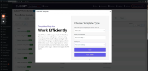
4.1 Setting Up the Template in the Backend
- Navigate to the WordPress backend.
- Go to Cube WP > Theme Builder.
- Click ‘Add New Template.’
- From the ‘Select Post Type’ dropdown, choose ‘Post Card.’
- Name the template (e.g., ‘Post Card Style 1’). This name will appear when selecting the template later.
- Under display conditions, select the applicable post type (e.g., ‘listings’).
- Click ‘Save and Edit’ to be redirected to the Elementor editing screen.
Note: The template name you assign here is what will appear in dropdown menus when applying the card to widget instances.
5. Building the Post Card Structure in Elementor
Once inside the Elementor Post Card Builder, you will construct the card layout from scratch. The card follows a specific structural hierarchy.
5.1 Structural Overview
The post card is composed of the following nested containers:
Container 1 (Image Container): Holds the featured image and an overlay container for the Save and View buttons.
Container 2 (Content Container): Holds the post title, ratings, rating count, location, price, Open/Closed status, and the Call Now button.
5.2 Step 1 — Main Wrapper Container
- Add a new container.
- Set width to full width (100%).
- Set all padding values to 0 pixels.
5.3 Step 2 — Image Container Setup
The image container holds the featured post image and its overlay elements.
Container Properties:
- Width: 100% (full width).
- Padding: 0 pixels.
- Minimum Height: 217 pixels (to maintain consistent card height).
- Border Radius: 5 pixels (to match the design).
Featured Image Configuration:
- Add an Image element inside the container.
- Click the Dynamic Tag icon on the image source field.
- Under the ‘CubeWP Single Post Data ‘ category, select the ‘Featured Image’ dynamic tag.
- Set the image resolution to ‘Large’ by default.
- In the Style section, set the image width to 100%.
- Set the image height to exactly 217 pixels.
- Set object-fit to ‘Cover’ and object-position to ‘Center Center’.
Dynamic Post URL Link:
- In the image link settings, go to Custom URL.
- Open the dynamic tags dropdown.
- Under ‘Cube WP Single Post Data > Category,’ select ‘Post URL.’
- This dynamically links the image to the single listing page.
Anchor Width Fix (Custom CSS):
- Go to the Advanced section of the image element.
- Add custom CSS: selector a { width: 100%; }
- This ensures the anchor tag wrapping the image spans the full container width.
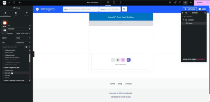
5.4 Step 3 — Save & View Button Overlay
A secondary container inside the image container holds the Save and View action buttons. These are positioned absolutely over the image.
Container Properties:
- Add a new container inside the image container.
- Remove all default padding values.
- Width: Set to ‘Fit Content’.
- Position: Absolute.
- Top: 15 pixels from the top edge.
- Gap between icons: 7 pixels.
CubeWP Save Widget (Wishlist/Save):
- Search for ‘CubeWP Save‘ in the Elementor panel.
- Drag it into the overlay container.
- This element allows users to save/add posts to their wishlist.
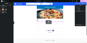
Styling the Save Widget:
- Icon Size: 12 pixels.
- Icon Color: White.
- Border Radius: 120 pixels.
- Border Width: 1 pixel. Border Style: None.
- Padding: 11 pixels on all sides.
- Hover Icon Color: Solid Black.
- Gap between icon and text: 0 pixels.
View Icon Button:
- Search for the ‘Icon’ widget in the Elementor panel.
- Add it to the same overlay container.
- Select the ‘Eye’ icon.
- Assign a dynamic Post URL under the CubeWP single post data as the icon’s link URL.
Styling the View Icon:
- Icon Size: 12 pixels. Width: Auto.
- Container: Set display to Flex, direction to Row.
- Padding: 5 pixels on all sides.
- Border Radius: 120 pixels. Border: None.
- Icon Color: White. Hover Color: Black.
- Hover Background Color: White.
6. Content Area Below the Image
The content area contains the post title, ad label, claim status, ratings, category, price, and location — all displayed below the image.
6.1 Content Container Setup
- Add a new container below the image container.
- Set width to full (100%).
- Padding: Right — 14px, Left — 19px. Top/Bottom — 0px.
- Gap: 0 pixels.
- Margin Top: 7 pixels.
6.2 Ad Label (Boosted Post Tag)
When a post is boosted/promoted, an ‘Ad’ label should appear at the top of the content area.
- Add a Heading element to the content container.
- Set the HTML tag to a Span element.
- Open the Dynamic Tag settings.
- Under ‘Cube WP Single > Boosted Label’, select the boosted status tag.
- Set the label text to ‘Ad’.
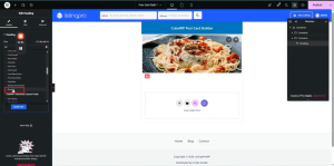
Ad Label Styling:
- Text Alignment: Center.
- Font Size: 13 pixels. Font Weight: 500.
- Letter Spacing: 0. Text Color: White.
- Padding: 0. Custom Width: 20 x 28 pixels.
- Background Color: As per design.
- Border Radius: 3 pixels.
6.3 Post Title
- Add a Heading element.
- Set the dynamic tag to ‘Post Title’ (under CubeWP Single Post Data).
- Set the HTML tag to H4.
- Add a link using the dynamic ‘Post URL’ tag.
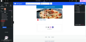
Title Typography:
- Font Size: 19 pixels. Font Weight: 700 (Bold).
- Line Height: 24 pixels. Letter Spacing: 0.
- Color: As specified in the design.
6.4 Claim Status Widget
- Search for the ‘Claim Status’ widget in the Elementor panel.
- Add it below the title.
- Configure the ‘Claimed’ and ‘Not Claimed’ label text.
- Select ‘Tooltip’ to display the claim info as a tooltip.
Claim Status Styling:
- Not Claimed Text Color: Red.
- Icon Size: 15 pixels.
Tooltip Styling:
- Background Color: As per design.
- Text Color: White. Font: Quicksand.
- Font Weight: 700. Line Height: 22 pixels.
- Font Size: 12 pixels.
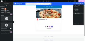
6.5 Ratings Container
A dedicated container displays the numerical rating, star icons, and total review count.
Container Properties:
- Width: Full. Padding: 0 pixels.
- Margin Top: 12 pixels. Margin Bottom: 8 pixels.
- Direction: Row. Align Items: Center.
- Gap: 5 pixels.
Rating Number (Heading 1):
- Add a Heading element.
- Dynamic Tag: Under ‘CubeWP Reviews > Overall Post Rating’, select ‘Rating Number’.
- Wrap in a P tag. Font: Open Sans, 13 pixels.
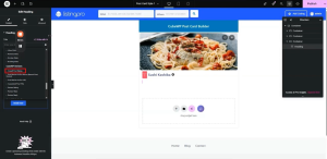
Rating Stars (Heading 2 — Duplicate):
- Duplicate the rating number heading.
- Change the dynamic tag to ‘Rating Stars’.
- Star Size: 13 pixels. Gap between stars: 0.
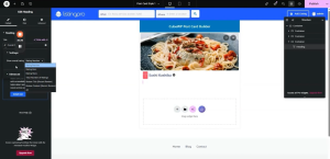
Total Review Count (Heading 3):
- Add another Heading.
- Dynamic Tag: Total number of ratings received.
- Display in brackets (configure before/after labels as needed).
6.6 Category & Price Container
This container holds the post category icon, category name (term), and the listing price.
Container Properties:
- Padding: Top — 14px, Bottom — 4px, Sides — 18px.
- No shadow effects.
- Direction: Row. Gap: 9 pixels.
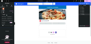
Category Icon (Custom Term Meta):
- Add a Heading element.
- Open Dynamic Tag settings.
- Under ‘CubeWP Single Post Data > Post Term’
- Select the listing categories taxonomy from the taxonomy dropdown.
- Choose ‘Custom Term Meta’ as the term field.
- Enter the slug of the icon field from the backend in the Custom Meta Field ID
- Wrap the icon in the appropriate HTML tag. Set icon width to 13 pixels.
- Link: Use ‘Post URL’ from Cube WP Single Post Data.
Configuring Term Meta in Backend:
- Go to WordPress backend > Cube WP > Custom Fields > Taxonomies.
- Add icon fields for taxonomy terms here.
- The field value uses standard Font Awesome icon classes.
- Copy the field slug; paste it into the ‘Custom Meta Field ID’ in the dynamic tag settings.
Category Name:
- Duplicate the category icon heading.
- Change the term field to ‘Term Name’.
- Link: Use ‘Term URL’.
- Line Height: 19 pixels. Align: Center.
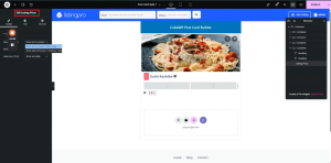
Listing Price Element:
- Search for ‘Listing Price’ in the Elementor panel.
- Add it to the price container.
- Configure the dropdown to select how price symbols are displayed (e.g., 4 symbols, 2 active).
- Tooltip configuration: show or hide the label. Tooltip can display full pricing details.
Price Styling:
- Font Weight: 600. Line Height: 24 pixels. Color: Slate.
- Letter Spacing: 1 pixel. Font: Open Sans, 13 pixels.
Tooltip Styling:
- Font: Open Sans, 12 pixels. Font Weight: 500.
- Line Height: 22 pixels. Text Color: White.
- Background Color: Blue. Padding: 11 pixels (left/right).
- Border Radius: 5 pixels. Arrow color: Blue.
6.7 Location Container
Displays the listing location using an icon and the location term name.
- Add a container. Set width to ‘Fit Content’.
- Direction: Row. Align Items: Center. Gap: 3 pixels.
Location Icon:
- Add an Icon element. Select the map/location pin icon.
- Style the icon color as per the design.
Location Name (Term Name):
- Add a Heading element.
- Dynamic Tag: Under ‘Single Post Data > Post Term’.
- Select taxonomy as ‘Listing Location’. Term field: ‘Term Name’.
- Font: Open Sans, 13 pixels. Font Weight: 500.
- Color: As per design.
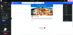
6.8 Business Hours (Open/Closed Status)
- Add a Heading element.
- Open Dynamic Tag settings.
- Select ‘Business Hours’ field type from the dropdown.
Status Color Configuration:
Open Now: Set to bright green.
Closed Now: Set to red.
24 Hours / Day Off: Set to the default design color for consistency.
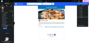
7. Bottom Action Row: Buttons Container
The bottom section of the post card contains two main action areas: a ‘Call Now’ button with click-to-call functionality, and a ‘Directions’ button that triggers a popup map.
7.1 Bottom Container Layout
- Add a new container below the category/price row.
- Set padding: Margin — 0. Padding — Top: 9px, Right: 21px, Bottom: 10px, Left: 21px.
- Direction: Row. Space-between justification. Align Items: Center.
- Inside this container, add two child containers.
7.2 Child Container Configuration
- Container 1 (Call Now side): Width — Fit Content.
- Container 2 (Directions side): Width — Fit Content.
- Both containers: Set width to custom ‘fit-content’.
- Set parent container row direction with space-between and center alignment.
- Inside each child container, add two more containers as needed.
7.3 Call Now Button
The Call Now button triggers a phone call using the listing’s phone number via a dynamic tel: link.
- Add a Button element inside the first child container.
- Set the button text to ‘Call Now’.
- Add a call/phone icon from the icon library.
Call Now Button Styling:
- Container padding: 4 pixels (can be increased).
- Font Size: 13 pixels. Font Weight: 500.
- Text Color: As per design. Background Color: As per design.
- Border Type: None. Border Radius: 0. Padding: 0 (left: 1px).
- Icon Hover Color: Blue. Text Hover Color: Blue.
7.4 Click-to-Reveal Popup Options (Show Number)
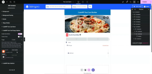
A popup mechanism can be used to initially show the Call Now button, and upon clicking, reveal the actual phone number. This uses CubeWP Post Card Popup options.
How it works:
- The initial ‘Call Now’ button container is shown by default.
- Clicking it hides this container and shows the phone number container.
- A CSS class called ‘show-number’ is assigned to the phone number container.
Configuring the Initial Button (Hide on Click):
- Open the container’s Style settings.
- Navigate to ‘CubeWP Post Card Popup Options.’
- Enable click effects.
- Set Trigger: Custom.
- Set ‘Show class’: Enter ‘show-number’ — this will open the container with the matching class.
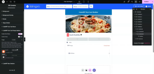
Phone Number Button Configuration:
- Add a new container for the phone number display.
- Add a button element inside the phone number container.
- Set the button text field to use a dynamic post field (Field type(text)).
- Set the data source “Post fields”
- Select “Phone Number” as the custom field.
- For the link, use the dynamic tag and set “Field type(text)”.
- Select Custom field “Phone Number”
- Add ‘tel:’ prefix in the link’s ‘before’ attribute in Advanced settings.
Note: If the phone field in Elementor is showing as a text field, convert it to a number/phone field type and update the dynamic tag selection accordingly.
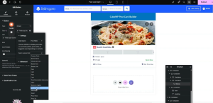
Phone Number Button Styling:
- Border Radius: 4 pixels.
- Font Size: 13 pixels. Font Weight: 500.
- Text Color: As per design.
- Background Color: Transparent.
- Hover Text Color: Blue. Hover Icon Color: Blue.
Configuring the Phone Number Container (Open on Trigger ):
- Navigate to ‘CubeWP Post Card Popup Options.’
- Enable click effects.
- Set Trigger: Custom.
- Set ‘Custom class’ to ‘show-number’. On click, the ‘show’ class is toggled.
- This container opens when the initial button is clicked, revealing the phone number.
8. Completing the Bottom Action Row Styling
Before finalizing the popup map, the bottom action row containers require specific padding and layout adjustments to match the target design.
8.1 Bottom Row Container Padding
- Confirm margin is set to 0 for the outer bottom container.
- Padding configuration: Top — 9px, Right — 21px, Bottom — 10px, Left — 21px.
- Verify direction is set to Row with space-between justification and center alignment.
8.2 Child Containers for Actions
- Both child containers (Call Now side and Directions side) should have their widths set to ‘fit-content’.
- Go to each container’s width settings, select ‘Custom’, and type ‘fit-content’.
- For the parent container, also verify the row direction, space-between, and center alignment are still correctly applied.
8.3 Sub-containers for Each Action
Inside each child container, additional sub-containers are used for fine-grained layout control.
- Add two sub-containers inside the Call Now child container and two inside the Directions child container.
- Each sub-container should also use ‘fit-content’ width.
- Ensure these containers are set to fit-content so they wrap tightly around their inner content.
9. ‘Get Directions’ Heading & Popup Container Setup
The ‘Get Directions’ button consists of a map icon and a text heading, housed within a container that triggers the fullscreen map popup.
9.1 Adding the Get Directions Heading
- Inside the directions sub-container, add a new Heading element.
- Type ‘Get Directions’ as the heading text.
- Select the Paragraph tag from the element settings.
Get Directions Typography:
- Font Family: Open Sans.
- Font Size: 13 pixels.
- Color: Apply the specific hex code from the design (as required).
Note: Once applied, the text should appear clearly and match the design layout. If the font size appears incorrect in the editor, verify the correct value is entered in the typography settings.
9.2 Popup Trigger Container (Directions Side)
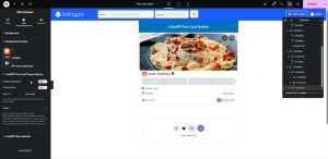
The container holding the directions icon and heading is configured as a popup trigger. This uses the CubeWP Post Card Popup Options settings.
- The primary visible container (holding icon + heading) has a custom class ‘show-map’ assigned to it.
- This container is configured to be open/visible by default.
- All necessary popup configuration options are enabled within this container’s settings.
- A secondary container inside this one will hold the actual trigger elements and other options.
- Navigate to ‘CubeWP Post Card Popup Options.’
- Enable click effects.
- Enable Custom Class
- Assign Show-map class to it
10. Fullscreen Map Popup: Complete Configuration
The fullscreen popup is a fixed-position overlay that appears when the user clicks the Directions button. It contains a close button and the interactive map widget.
10.1 Outer Popup Container (Fixed Overlay)
This container forms the base layer of the fullscreen overlay:
- Add a new container outside all existing post card containers.
- Set margin to 0.
- Set Position to Fixed.
- This removes the container from the document flow and anchors it to the viewport.
- Set the background color for the overlay (typically semi-transparent dark color for modal effect).
- We want to show this container when the Get Direction Button is clicked and want to hide this container when times icon is clicked that why in style section we will navigate to CubeWP Post Card Popup Options
- Enable Click effect. From the trigger dropdown, select custom.
- Give ‘show-map’ class in the Show class field. The same class was given to the Get direction button
- Give ‘hide-map’ to the Remove field. The same class given to the times icon.
Note: Because this container’s position is ‘fixed’, it will overlay the entire screen when shown. This is the intended behavior for the fullscreen map popup.
10.2 Inner Viewport-Filling Container
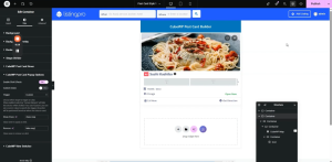
Nested inside the fixed outer container, this container fills the entire visible screen area:
- Width: 100vw (full viewport width).
- Height: 100vh (full viewport height).
- Flex Direction: Column (or Row as needed).
- Justify Content: Center.
- Align Items: Center.
- Gap: 0 pixels.
10.3 Map Wrapper Container (Max Width Constraint)
A third nested container constrains the maximum display width of the map:
- Add this container inside the viewport-filling container.
- Set Max Width: 1170 pixels.
- This ensures the map does not stretch too wide on large screens while remaining responsive.
- Add the map widget directly inside this container.
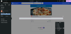
10.4 Add CubeWP Map Widget
- When the map widget container is grouped, reset padding values to default.
- Set the inner container width to ‘fit-content’ so it wraps around the map.
- Drag the CubeWP Map inside the container.
- The map widget is linked to the address custom field of the listing post type.
- Post Type: Listings.
- Address Field: The specific custom field used to store the listing’s physical address.
10.5 Close Button Configuration (Final)
The close button is an icon positioned in the top-right corner of the popup:
- Add a container inside the map popup, separate from the map wrapper.
- Width: Fit Content.
- Add an Icon element to this container. Select the ‘Times’ (X close) icon.
- Set Position to Absolute. Top: 0. Right: 0.
Close Icon Styling:
- Icon Color: White.
- Font Size: 20 pixels.
- Padding: 10 pixels on all sides.
- Background Color: Configured to match design (typically a semi-transparent dark or branded color).
- Border Radius: Applied for rounded appearance.
Close Interaction:
- Assign CSS class ‘hide map’ to the close container.
- Set trigger to Mouse Click.
- Action: Close the popup.
- Configure the show/hide settings to close the fullscreen overlay when this icon is clicked.
Note: Verify that the close button correctly removes the ‘show’ class from the popup overlay, hiding it from view. Test on the live frontend.
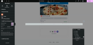
10.6 Custom Delay & Transition Options
- Optionally, a custom delay can be configured for the popup open/close transition.
- The ‘show/hide’ options in the Cube WP Post Card Builder settings allow configuring how the popup appears.
- Height customization of the popup can be set from these options.
- Additional switches and delivery options can be adjusted as needed within the popup settings.
11. Final Styling Adjustments
After all containers and widgets are in place, a final pass of styling refinements is required to ensure the card fully matches the target design.
Note: If the ‘#’ hash is left in place, clicking the Directions button will cause the page to scroll to the top before the popup opens. Always remove the hash after testing is complete.
11.1 Applying the Custom Post Card Style to the Homepage
- After publishing the post card template, navigate to the homepage in Elementor.
- Click on the Cube WP Posts widget.
- In the widget settings, find the ‘Card Style for Listings’ option.
- Select ‘Post Card Style 1’ from the dropdown.
- Save and publish the homepage.
- Reload the homepage to verify the new post card style is applied to all listings.
11.2 Remaining Spacing & Layout Fixes
After the initial frontend review, fine-tune any remaining spacing discrepancies:
- If extra padding is visible around the Call Now button, set that button’s padding to 0 to remove the default spacing.
- Verify the gap between the action buttons matches the design (approximately 4-7 pixels).
- If elements appear misaligned, check the container’s align-items and justify-content properties.
- Reload and verify after each adjustment.
This concludes the complete technical guide for building a fully dynamic, interactive post card using Elementor and CubeWP. The card includes a featured image with save/view overlays, post title, ad label, claim status, ratings, category, pricing, location, business hours, a click-to-reveal call button, and a fullscreen interactive map popup for directions.
Here is the complete video tutorial