To optimize your directory pages and deliver a different behavior over mobile devices, we can customize them through the Visual Composer.
Each Column will have its own Responsive Options available.
As an example, let’s go to the Pages > All Pages > and select the Home
Let’s choose one common element added, and click on the Edit Column
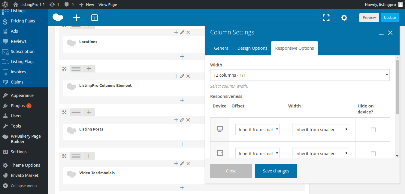
Here, you’ll have access to each Device, Offset and Width options and each should hide on the device.
It’s an experimental section where you need to test how each setting will behave.
But if you have experience, you can customize it the way you want.
ListingPro is already a Directory focused on Responsive UI/UX. From the ground up, ListingPro was built to offer the best user experience from multiple devices. Use this option with caution, and always make a backup of your previous settings.