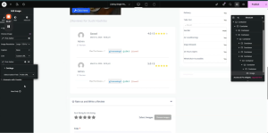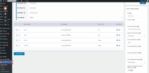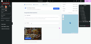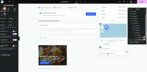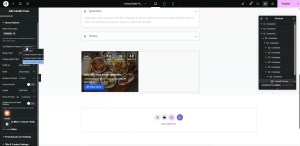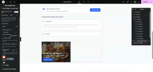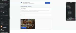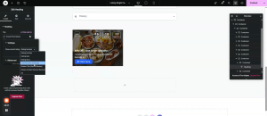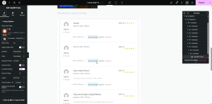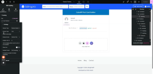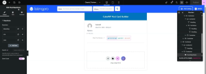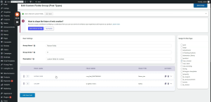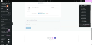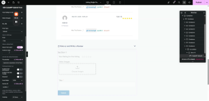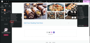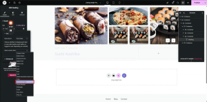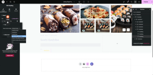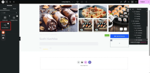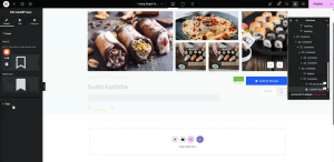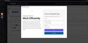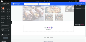
How to add author stats, contact form, price range, claim form and booking form to the single detail page?


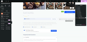
Single Page Builder

Author Info, Price Range Widget, Claim Now Button, Booking Form, Contact Form & Claim Form

Document Overview

Scope: Configuring Author Info, the Price Range widget with tooltip and symbol styling, the Claim Now button with popup form, the CubeWP Booking form with time slot configuration and calendar switcher, the contact/lead form

Tools: Elementor, CubeWP Plugin, ListingPro Value Pack, 


 Introduction

This section concludes the Single Page Builder series by covering the final right-side sidebar sections: The Author Info, the Price Range display card, the Claim Now button with its modal popup form, the CubeWP Booking form (with time slot selection and calendar switcher) and the lead contact form embedded in the author section.

1. Author Section (Listing Author & Contact Form)

The author section is a card that displays the listing author’s profile (avatar, name, stats, and a View Profile button) alongside a lead contact form.

1.1 Author Section Main Container

  • Add a new container inside the right sidebar.
  • Remove default styles. Gap: 40px. Background Color: White.
  • Border Radius: 7px. Margin Bottom: 30px. Padding: 20px.
  • Padding Left: 27px. Direction: Flex. Align-Items: As per design.
  • Add two child containers: Avatar container (left side, 21% width) and Info container (right side, 80% width).

1.2 Avatar Container (Left Side)

  • Width: 21px (set to custom width). Padding: 0. Margin: 0.
  • Add a nested container inside. Remove defaults.

Author Avatar Image:

  • Add an Image element.
  • Dynamic Image: Go to Dynamic Tags > CubeWP Single Post Data > Single Post Data > Post Author.   In the settings, set the avatar.
  • For the link, select the custom URL.  From the dynamic tags, select Post Author and in the settings set ‘Profile URL


  • Width: 52px. Max Width: 100%.
  • Height: 52px.
  • Padding: 0. Margin: 0.
  • Border Radius: 120px (fully circular avatar).

1.3 Author Info Container (Right Side, 80%)

  • Width: 80% (remaining space after 21% avatar). Remove defaults.
  • Justify-Content: Space-Between. Padding: 0. Margin: 0.
  • Add two sub-containers for the name row and the stats row.

Author Name Container:

  • Set defaults. Gap: 0. Margin: 0. Padding: 0.
  • Add a primary Heading element.
  • Dynamic Tag: Under Single Post Data > Post Author > Display Name.
  • URL: Author Profile URL (set dynamically under Post Author > Profile URL).
  • H4 tag.
  • Font Family: Open Sans. Font Size: 18px. Font Weight: 600. Text Transform: Capitalize. Line Height: 22px.
  • Text Color: As per design.

View Profile Button:

  • Add a Button element in the same container.
  • Dynamic Link: Post Author > Profile URL.
  • Button Text: ‘View Profile’ .
  • Font Family: Open Sans. Font Size: 10px. Font Weight: 400. Line Height: 55px.
  • Text Color: As per design. Background Color: As per design.
  • Border Type: Solid. Border Width: 1px. Border Color: As per design.
  • Border Radius: 21px. Padding: Left 10px, Right 10px. Margin: 0.

1.4 Author Stats (Icon List)

  • Add a container below the name container. Remove defaults.
  • Add an Icon List widget.
  • Remove label display for the icon list items.
  • Select icon for each list item.

Icon List Item 1 — Total Listings Count:

  • From Dynamic Tag of text: Under CubeWP User Data > User Statistics.
  • Within the User Statistics tag: Select ‘Specific Post Type Count’ for ‘Listings’.
  • This shows the total number of listings the author has added.
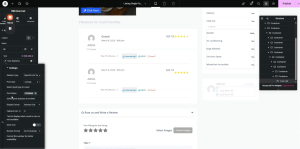
 

Icon List Item 2 — Total Reviews:

  • Dynamic Tag: User Statistics. Statistics Type: Reviews Submitted  Reviews Type: Post 
  • Remove the default icon; select Star icon.
  • This shows the total number of reviews received by this author.
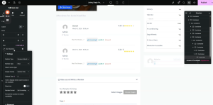
 

Icon List Styling:

  • Navigate to the Style tab. Gap/vertical spacing: 20px.
  • Icon Size: 13px. Icon Spacing: 0. Icon Hover Color: Default (leave as-is).
  • Text Color: As per design (copy-paste). Apply to icon list styling.

1.5 Lead Contact Form (CubeWP Forms)

A contact form is embedded in the author section to allow users to send a message directly to the listing author.

Form Container Setup:

  • Add a container below the icon list. Direction: Row, Space-Between. Set defaults to 0.
  • Inside this container, add another container with direction Row, Space-Between, padding/margin 0.
  • Add the CubeWPForms widget inside.

CubeWP Forms Plugin Setup:

  • Navigate to Backend > CubeWP Forms.
  • Create or select an existing form named ‘Contact Form’.
  • Form fields: Name, Email, Phone, Message.
  • Configure button text.
  • Set CSS ID for custom styling if required.
  • Optional: Restrict submission to logged-in users only.
  • Optional: Show/hide form name or description on frontend.
  • Save the form.


CubeWP Forms Widget in Elementor:

  • In the widget settings, select ‘Contact Form’ from the Select form dropdown.
  • Default form styling will be shown.
  • Navigate to the Style tab to customize: fields, inputs, labels, and buttons.
  • Copy-paste the styling you want to give to your form.

Form Style Tab — Main Container:

  • In the Style tab, the first set of options controls the overall form container appearance.
  • You can style form section content, tab content, field container, Labels, Input and Select Fields, and Submit Button from the style section. 
  • Publish and verify the default border is removed on the frontend.

Note: After setting borders to ‘none’ and publishing, the contact form will display cleanly without default borders, matching the overall card design of the author section.

2. Price Range Display Section

The Price Range card displays the listing’s price tier using the Listing Price widget along with price symbol indicators and a tooltip for additional context.

2.1 Price Range Container Setup

  • Add a new container inside the right sidebar.
  • Margin Bottom: 13 pixels.
  • Padding: Top 24px, Right 28px, Bottom 8px, Left 30px.
  • Navigate to Style. Set Background Color. Set Border Radius: 7 pixels.

2.2 Inner Container Structure

  • Add a container inside. Set justify-content: center. Align-items: center. Gap: 0. Padding: 0. Margin: 0.
  • Add two more child containers inside this central container.

Child Container 1 — Price Widget:

  • Width: Fit-Content. Remove default gap and padding.
  • Set right positioning: 10 pixels. Remove default padding.
  • Add the Listing Price widget inside this container.

2.3 Listing Price Widget

  • This widget displays the price range using symbol indicators (e.g., $, $$, $$$, $$$$).
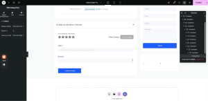
 

  • Style the widget to avoid showing as a plain tooltip.
  • Navigate to Style settings and configure as follows:

Main Price Text Styling:

  • Font Family: Open Sans. Font Size: 14px. Font Weight: 600. Line Height: 22px.
  • Text Color: As per design (paste hex).

Price Symbols Styling:

  • Font Family: Open Sans. Font Size: 14px. Font Weight: 600. Line Height: 22px.
  • Symbol Color: As per design.

Tooltip Styling:

  • Font Family: Open Sans. Font Size: 12px. Font Weight: 500. Line Height: 22px.
  • Text Color: White. Background Color: As per design (paste hex).
  • Padding: 5 pixels. Left: 5 pixels. Border Radius: 5 pixels.
  • Arrow Color: As per design (paste hex).

2.4  Heading tags for the price range

  • Inside the second child container, add a heading element (H5).
  • Set text as the price range.
  • Font Family: Open Sans. Font Size: 14px. Font Weight: Standard. Line Height: 24px.
  • Text Color: As per design.
  • Add duplicate headings for the price range display.
  • Set margin: 2 pixels on left and right sides.
  • The price range is displayed using a dynamic field type in the heading’s content.
  • Select Field Type (Text) from dynamic tags In the settings,   Data Source: Post Fields   Select Custom Field: ‘Price From’   and  ‘Price To’ for each field respectively.
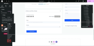
 

  • You can change the styling as required.

Note: After publishing and reloading the page, the listing price will appear correctly in the price range card.

2.5 Divider After Price Section

  • Add a Divider widget below the price container.
  • Width: 100%.
  • Set divider color as per design.


3. Claim Now Button & Popup Form

The Claim Now feature allows users to claim ownership of a listing. It uses a button that opens a modal popup containing a claim form.

3.1 Claim Button Container

  • Add a new container inside the price section area.
  • Width: Fit-Content. Gap: 0. Padding: 0. Margin: 0.
  • Add another nested container inside. Set width to fit-content. Gap: 0. Padding: 0. Margin: 0.
  • Add an Icon List widget inside for the claim item.

Icon List — Claim Item:

  • Configure one item in the icon list.
  • Copy the existing item text and paste it into the designated area.
  • Select the icon of the building .

Icon List Text Styling:

  • Text Color: As per design (paste hex). Hover Color: Same.
  • Font Family: Open Sans. Font Size: 14px. Font Weight: 500.
  • Text Transform: Normal. Line Height: 20px.

3.2 Claim Now Button Widget

  • Add a nested container inside the claim section container.
  • Add another container inside this (for the button). Set width to fit-content.
  • Set default padding and width. Adjust width to fit content.

Place the ‘Claim Now’ widget inside it.

Claim Form Integration Methods (Two Options):

There are two ways to add the claim form:

Option 1 — CubeWP Builder:  Manage it through the CubeWP Builder. 

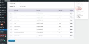
To create the form:  Navigate to Dashboard >CubeWP> Post Type Form > Select Claim > Save Changes.
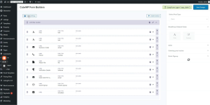
 

Option 2 — Page Content: Create a WordPress page named ‘Claim Popup’. Here the claim form is managed through the CubeWP Submit Form Widget.

Claim Popup Page Configuration:

  • Navigate to Pages in the WordPress dashboard.
  • Edit with elementor the ‘Claim Popup’ page .
  • Select ‘Post Form’ from the Post Type in Form settings.
  • In the Post Form Settings, select the ‘Claim’ post type. Also you can add fields or edit form fields from here.
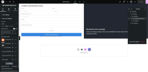
 

  • The claim form is associated with the ‘Claim’ post type in the backend.
  • Custom fields have been created and attached to the Claim post type as a field group.
  • The form can be customized (field text, labels) via the claim fields group in the backend.
 

Claim Button Text Styling:

  • Font Family: Open Sans. Font Size: 14px. Font Weight: 700. Line Height: 20px.
  • Background Color: As per design. Hover Background Color: As per design.
  • Text Color: As per design. Hover Text Color: As per design.
  • Button Text: ‘Claim Now’.

Claim Popup Modal Styling:

  • Navigate to the claim popup page’s Elementor editor.
  • Modal Padding: 0. Max Width: 730px.
  • Background Color: As per design (paste hex). Overlay Color: As per design.
  • Remove default modal padding and margin.

Close Button Styling:

  • Width: 20px. Height: 20px. Padding: 20px. Margin: 0.
  • Background Color: As per design (paste hex). Border: None.
  • Border Radius: 100px (fully circular). Text Color: As per design.
  • Font Size: 15px.
  • Position: Absolute. Top: -5px. Right: -5px.
  • Left Side Container: Image + Background Color + Dynamic Tags.


4. Booking Form (CubeWP Booking)

The CubeWP Booking form allows users to book appointments or time slots for the listing. It is embedded in the single page using a container with the CubeWP Booking widget.

4.1 Booking Form Container Setup

  • Add a new container inside the right sidebar main container.
  • Gap: 0. Padding and margin: 0.
  • Add another container inside. Direction: Row, Space-Between. Padding/Margin: 0.
  • Add the CubeWP Booking widget inside.
  • The booking form setup can use the Form Builder Configuration or a manual configuration

4.2 For Form Builder Configuration

  • Navigate to Plugins > CubeWP > CubeWP Post Type Forms.
  • Here you can select Booking in the post type and add fields here

4.3 For Manual Configuration

  • In manual configuration, select Default booking fields from the field type.
  • Booking field: Set the booking type.
  • Field Width: Configurable.

4.4 Booking Style Configuration

Select the booking style — this determines how users interact with the date/time picker:

Option 1 — Number of Tickets: Simple ticket quantity selector.

Option 2 — Time Slot: Recommended. Time slots are generated based on business hours.

Option 3 — Date Range: Simple date selection with buttons.

Time Slot Configuration (Recommended):

  • Booking Type : Time Slot.
  • Business Hours Field: Select the Business Hours. Timings are generated automatically based on the listing’s configured business hours.
  • Duration: 30 minutes (or as required).
  • Slot Style: ‘Single Date Slider with Calendar Switcher’ — provides a date slider with an option to switch to a full calendar view.
  • Price Field: Leave empty for free bookings. Set a number field here if the booking has a cost.

Note: In Elementor’s Edit mode, the calendar may not load in the preview. The booking form will render correctly on the frontend after publishing.
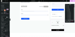
4.5 Booking Form Styling

  • Navigate to the Style tab of the CubeWP Booking widget.
  • Style the button: Typography, colors, border, padding, etc.
  • Style the switcher (calendar/slider toggle).
  • Style the time slots display.
  • Applied styles: Padding adjusted, labels styled, input fields styled, single date slider styled.

4.6 Frontend Booking Verification

  • After publishing, navigate to the frontend listing page.
  • Business hours and time slots are displayed based on the listing’s business hours field.
  • If business hours show ‘Closed’ or ‘No Hours’, zero slots will be available for that day.
  • Navigate to a day with open hours to see available time slot options.
  • Clicking ‘Book Now’ submits the booking request.

Connecting Booking to a Listing (User Dashboard):

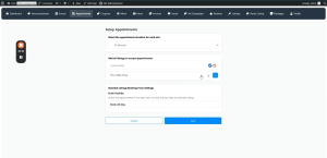
  • Navigate to Frontend User Dashboard > Appointments > Start Now.
  • Bookings are configured against specific listings.
  • Once a listing has been assigned business hours, the booking form will display slots automatically.
  • Verify from the frontend that the booking form appears alongside the listing.

Note: If the booking form is not appearing on a listing, ensure the listing is enabled in the Booking Appointments tab within the user dashboard, and that business hours are properly configured for the listing.
 

This tutorial of the single listing page includes:  author profile section with stats and contact form, price range widget with tooltip, claim now popup form, and a fully configured CubeWP booking form with time slot selection.

Here is the complete video tutorial
How to add business hours, map, address, contact info, and Additional details on single detail page?

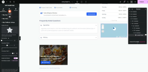
Single Page Builder

Right Sidebar — Business Hours, Map Widget, Phone/Website, contact number, Additional Info Accordion 

Document Overview

Scope: Building the right-side panel of the single listing page, covering Business Hours widget, CubeWP Map widget with custom pin, Phone & Website meta fields and listing meta accordion (Gender, Air Conditioning, Dogs Allowed, 24/7, Wheelchair),  Tools: Elementor, CubeWP, ListingPro Value Pack


1. Introduction

This tutorial covers the right-side sidebar panel of the single listing page. This panel contains several stacked container cards, each displaying specific information about the listing: business operating hours, an embedded interactive map, contact details (phone and website) and listing meta information in an expandable accordion

2. Right Sidebar Container Structure

The right sidebar is a flex column container sitting to the right of the main content area. It contains several independently styled card containers stacked vertically.

  • Main right-side container: Display Flex. Gap: 0. Default padding and margin: 0.
  • Padding: Right & Left — 15 pixels.
  • Each card inside: Add a sub-container. Set margin bottom: 30 pixels. Remove default padding.


3. Business Hours Widget

The CubeWP Business Hours widget displays the listing’s weekly operating schedule, including open/close status, day-specific hours, and a toggle to expand all timings.

3.1 Business Hours Container Setup

  • Add a container inside the right sidebar.
  • Gap: 0. Padding and margin: 0. Margin Bottom: 30 pixels. Remove default padding.
  • Add the CubeWP Business Hours widget (from the CubeWP Value Pack).

3.2 Widget Configuration

  • Post Type: Listings.
  • Business Hours Field: Select the Business Hours field from the dropdown (the field where listing owners enter their weekly schedule).
  • Open/Close Text: Configurable. Default label: ‘Open/Close’. Customize as needed.
  • Toggle Labels: ‘Show All Timings’ and ‘Close All Timings’.


3.3 Basic Style Settings

Main Container Typography:

  • Font Family: Open Sans. Font Size: 14px. Font Weight: 400. Text Transform: Capitalize.
  • Text Color: As per design. Background Color: As per design (e.g., ‘#FFF’).
  • Padding: Top 16px, Right 20px, Bottom 15px, Left 25px. Margin: 0.
  • Border: None. Border Radius: 5px.

Today’s Status Icon:

  • Icon: Clock (search ‘clock’ in icon library). Font Size: 14px.
  • Icon Color: As per design. Icon Spacing: 11px.
  • Padding: 0. Border Radius: 0.
  • Today’s Label Typography: Font Size set to 0 (hide the ‘Today’ text label — show only the clock icon and hours).

Open Now / Close Now Indicator:

Open Now: Font Family: Open Sans, 13px, Weight 500, Line Height 22px. Color: As per design (green shade). Margin: 0. Padding: 0 (default).

Close Now: Font Family: Open Sans, 13px, Weight 500, Capitalize, Line Height 22px. Color: As per design (red shade). Margin: 0. Padding: 0.

Today Hours Label:

  • Font Family: Open Sans. Font Size: 14px. Font Weight: 400. Text Transform: Uppercase.
  • Line Height: 22px. Text Color: As per design.

Day Row Styling:

  • Padding: Top & Bottom 16px, Right & Left 0.
  • Border Type: Solid. Bottom Border Width: 1px. Border Color: As per design (paste hex).
  • Last Child Border Width: 0 (remove border from the last day row).
  • Last Child Padding: Top & Bottom 15px, Left & Right 0.

Day Name Typography:

  • Font Family: Open Sans. Font Size: 13px. Font Weight: 500. Text Transform: Default.
  • Line Height: 13px. Text Color: As per design.

Day Hours Typography:

  • Font Family: Open Sans. Font Size: 12px. Font Weight: 400. Line Height: 12px.
  • Text Color: As per design.

Day Off Typography:

  • Font Family: Open Sans. Font Size: 14px. Font Weight: 400. Text Transform: Capitalize.
  • Line Height: 14px. Margin: 0. Padding: 0.

Toggle Button (Show All Timings):

  • Text Color: As per design. Text Hover Color: Same as text color.
  • Font Family: Open Sans. Font Size: 9px. Font Weight: 400. Line Height: 12px. Text Transform: Normal.
  • Background Color: As per design. Background Hover Color: As per design.
  • Border Color: As per design. Border Radius: 6px.
  • Padding: Top 2px, Right 5px, Bottom 2px, Left 5px.
  • Position from Bottom: -8px. Position from Left: 36%.
  • Icon Size: 9px. Gap: 5px. Z-Index: 999.


4. Map Widget (CubeWP Map)

The CubeWP Map widget displays an interactive map showing the listing’s location, with a custom styled map pin and an address label with a ‘Get Directions’ button.

4.1 Map Container Setup

  • Add a container for the map section inside the right sidebar.
  • Background Color: As per design. Border Radius: 5px.
  • Gap: 0 (remove default 20px gap). Default Padding: Set to 0. Margin Bottom: 0.
  • Inside this container, add two sub-containers: one for the map itself, one for the address and directions.

4.2 Map Sub-Container

  • Margin: 0. Padding: Top 9px, Right 9px, Bottom 5px, Left 9px.
  • Add the CubeWP Map widget inside this container.

CubeWP Map Widget Settings:

Inside Map Options

  • Post Type: Listing.
  • Select Maps Field: Address.
  • Data Source: Current Post (dynamically uses the current listing’s address).


Inside Map Settings

  • Map Height: 180 pixels. Zoom Level: 17.

Map Styling:

  • Map Height: 180px. Map Width: 100%.
  • Border Type: None. Border Radius: 0.

4.3 Custom Map Pin Styling

Inside the Map Pin/Marker settings:

  • Enable Custom Map Pin: Yes.
  • Select Pin Icon from the menu icons.
  • Set icon size to 22px
  • Pin anchor point X and Y equals to 0


Pin Container (Outer Wrapper):

  • Background Color: As per design.
  • Width: 50px. Height: 50px. Padding: Top 6px, Left 7px.
  • Border Style: Solid. Border Width: 1px. Border Color: As per design (paste hex).
  • Border Radius: 50% (circular shape). Rotation: 14 degrees.
  • Hover Background Color: As per design.

Icon Wrapper Styling:

  • Width: 35px. Height: 35px.
  • Padding: Top 6px, Bottom 10px, Left 10px (10px all sides).
  • Border Type: Solid. Border Width: 1px. Border Color: As per design (paste hex).
  • Border Radius: 50px (circular). Background Color: White.
  • Rotation: 45 degrees (counter-rotates to keep the icon upright).

Pin SVG Icon Styling:

  • SVG Color: As per design. SVG Size: 14px. SVG Rotation: 14 degrees.

4.4 Address & Get Direction Button Sub-Container

  • Padding: Top 10px, Right 13px, Bottom 10px, Left 13px.
  • Margin: 0. Flex Direction: Column.

Address and Get Direction Button Configuration:

  • Enable ‘Show Address after Map’ and ‘Get Directions Button’ .
  • Add the map icon for address and icon is positioned before label
  • Remove the ‘Get Directions’ icon
  • Disable the open in new tab toggle.


Address Style Typography:

  • Font Family: Open Sans. Font Size: 13px. Font Weight: 400. Line Height: 18px.
  • Label Color: As per design. Main Text Color: As per design.
  • Address Container Padding: Top 13px, Right 0, Bottom 10px, Left 0.
  • Icon Size: As per design. Icon Color: As per design. Icon Spacing: 10px.
  • Remove default hover colors.

Get Directions Button Styling:

  • Font Family: Open Sans. Font Size: 10px. Font Weight: 400. Line Height: 18px.
  • Padding: Top 2px, Right 10px, Bottom 2px, Left 10px.
  • Margin: 0. Left Margin: 30px.
  • Border: 1px solid. Border Color: As per design. Border Radius: 15px.
  • Icon Size: 18px. Icon Spacing: Fixed.
  • Text Color: As per design. Background Color: Transparent.
  • Text Hover Color: As per design. Background Hover Color: As per design.
  • Border Glow Color on Hover: As per design.


5. Phone & Website Section (CubeWP Meta Widget)

The phone and website section displays the listing’s contact phone number and website URL using the CubeWP Meta widget. Each field is shown as a clickable button with an icon.

5.1 Phone/Website Container Setup

  • Add a new container inside the right sidebar.
  • Gap: 0. Background margin and padding: 0.
  • Add the ‘CubeWP Meta’ widget — a custom CubeWP Value Pack widget.

5.2 CubeWP Meta Widget — Phone Field

  • This widget displays any custom field as a button/link with an optional icon.
  • Select Meta Source: ‘Post Meta’
  • Post Type: ‘Listings’
  • Meta Field: ‘Phone Number’


Under the Link/URL Options

  • Enable Use Field Value as link functionality.
  • For the URL Prefix: Write ‘tel’ to link it to a phone number
  • Icon: Add Phone icon. Icon Position: Before.

Phone Field Styling:

  • Font Family: Open Sans. Font Size: 13px. Font Weight: 400. Line Height: 18px.
  • Text Color: As per design. Background Color: As per design.
  • Padding: Top 21px, Right 20px, Bottom 21px, Left 21px. Margin: 0.
  • Border Type: None. Border Radius Top: 0.
  • Hover Text Color: Blue. Hover Background Color: As per design. Hover Border Color: As per design (not used).
  • Icon Size: 16px. Icon Color: As per design. Icon Hover Color: As per design.
  • Icon Spacing: 10px.

5.3 Duplicate for Website Field

  • Duplicate the CubeWP Meta widget for the website field.
  • Change the Mata field to the ‘website’.


Under the Link/URL Options: 

  • Icon: Globe icon (search ‘globe’).
  • For the URL Prefix: Keep it empty so that website url is set directly.
  • Add a Top Border to the website container to separate it from the phone field.


Top Border Configuration (Website Separator):

  • Navigate to the Style tab for the website widget’s container.
  • Border Type: Solid. Border Width: Top — 1px. Border Color: As per design.

Note: The top border on the website section creates a visual divider between phone and website items.


6. Listing Meta Information (Accordion)

The listing meta section displays additional listing details (such as Gender, Air Conditioning, Dogs Allowed, 24/7 Hours, Wheelchair Accessible) using an accordion with CubeWP Meta elements inside.

6.1 Meta Info Main Container

  • Add a new container inside the right sidebar.
  • Remove defaults. Margin Bottom: 13px. Padding: 26px.
  • Add a container inside this main container.
  • Gap: 0. Padding: 0. Margin: 0. Direction: Row, Space-Between.
  • Inside this, add two more containers (left section and right section).

6.2 Additional Details Heading

  • Add a container. Gap: 0. Margin: 0. Padding: 0.
  • Add a heading (H4) element and set the text to additional details.
  • Font Family: Open Sans. Font Size: 16px. Font Weight: Standard (400). Line Height: 18px.
  • Text Color: As per design (copy-paste hex).

6.3 CubeWP Meta Elements (Grid)

  • Add a container for the meta items. Direction: Row, Space-Between.
  • Remove default row/column gaps and padding.
  • Add the CubeWP Meta widget. 
  • Meta Source: Post Meta,  Post Type Listings, Meta Field: As required (i.e Delivery)
  • Set Gap: 20px.
  • Paste the styling configuration for the meta widget.
  • Duplicate the meta widget and adjust for each field:

Meta Fields to Display (in order):

Field 1: Delivery
Field 2: Take out

Field 3: Gender

Field 4: Air Conditioning

Field 5: Dogs Allowed

Field 6: 24/7 Open

Field 7: Wheelchair Accessible


6.4 Meta Accordion (Right Section)

An accordion widget wraps the second set of meta details (the expandable section):

  • Add an Accordion widget. One item only. Enable ‘Show All’.
  • Set the accordion title. Navigate to Style > set spacing and margins.
  • Accordion Border: Solid, 1px width. Border Color: As per design. Border Radius: 3px.
  • Padding: Top 3px, Right & Bottom 8px, Left 8px. Bottom: also 3px. Left: 8px.

Accordion Header Styling:

  • Font Family: Open Sans. Font Size: 9px. Font Weight: 400. Line Height: 12px.
  • Text Color: As per design (paste hex).
  • Hover and Active: Same text color. Icon gap: 9px. Gap between elements: 4px.
  • Icon Color: As per design (for normal, hover, and active states).

Accordion Content Styling:

  • Border Radius: 0. Padding: 0.
  • Inside accordion item 1, add the CubeWP Meta widget with the remaining meta fields.
  • Gap: 0. Margin: 0. Padding: 0. Copy-paste meta styling from other sections.

Inside Accordion Item 2:

  • Add a new container. Set gap, padding, margin to 0.
  • Copy-paste the meta container setup for additional fields.
  • Fields: Air Conditioning, Dogs Allowed, 24/7 Open, Wheelchair Accessible.


Here is the complete video tutorial
How to add taxonomy Features, Announcements, FAQs, Coupons, Reviews Section & Review Submission Form in single detail page

Single Page Builder

Features Display, Announcements, FAQ, Coupons, Reviews Section & Review Submission Form

Document Overview

Scope: Displaying listing features via Keyword Update Taxonomy widget, adding Announcements section with meta query, adding FAQ with CubeWP Repeater, displaying Coupons with expiry meta query, and building the Reviews section with dynamic post ratings and a full review submission form

Tools: Elementor, CubeWP Plugin, Listing Pro Value Pack, Theme Builder


1. Introduction

This part of the Single Page Builder series covers the content sections that appear in the lower portion of the single listing page. These include: the listing features display using a custom term card, the listing announcements section fetched via meta query, the FAQ accordion section using the CubeWP Repeater, the coupons/deals section with expiry date filtering, and the full reviews section including the display of existing reviews and the review submission form.


2. Displaying Listing Features

Features are taxonomy terms associated with the current listing post. They are displayed using the ‘CubeWP Taxonomy widget with a custom term card template.

2.1 Container Setup for Features Section

  • Add a new container inside the main single page container.
  • Remove the default padding.
  • Set padding: Top — 22 pixels, Bottom — 20 pixels. No left or right padding (padding comes from the parent).

2.2 CubeWP Taxonomy Widget (Features)

  • Inside the features container, add the CubeWP Taxonomy widget.
  • This widget fetches and displays taxonomy terms associated with the post.

Widget Configuration:

  • Select ‘Features’ from the select taxonomy dropdown — This fetches all terms from the features taxonomy that are assigned to the current listing being viewed.
  • Term Style: Select the term style created for features — ‘Classic Two  Listing Features Style 1’.
  • Grid Display: Set to 4 items per row.
  • Gap between terms: 10 pixels (vertical), 32 pixels (horizontal row gap).

2.3 Creating the Term Card Template (Classic 2 Listing Features Style 1)

To create this term card template in the Theme Builder:

  • Navigate to WordPress backend > CubeWP > Theme Builder.
  • Click ‘Add New’ and select ‘Term Card’ as the template type.
  • Name it (e.g., ‘Classic Two Listing Feature Style 1’).
  • Select the appropriate taxonomy (Features).
  • Click ‘Save and Edit’ to open the Elementor editor.

Term Card Structure:

  • The main container holds a nested inner container set to ‘fit content’ width.
  • Inside the inner container: an Icon element and a ‘Term Name’ heading.
  • For the icon, enable the icon option and set its width.
  • Field Source: CubeWP field — select ‘Feature Term Icon’ from the custom term meta.
  • The icon field retrieves the term’s custom icon 

Note: The icon field must be configured in the backend under CubeWP > Custom Fields > Taxonomies. The field should be attached to the ‘Features’ taxonomy with an icon field type.

  • From the dynamic tags, select the ‘Term Name’. Also set a dynamic url to it called ‘Term URL’.
  • From the CubeWP Taxonomy Widget options, enable the Post Associated Terms to show the terms associated only to the selected post.


3. Listing Announcements Section

The announcements section displays announcement posts that have been linked to the current listing via a custom meta field. This requires a CubeWP Post widget with a meta query filter.

3.1 Container Setup for Announcements

  • Add a new container inside the main single page container.
  • Set margin to 0. Padding: Top — 11 pixels, Bottom — 20 pixels.
  • Add a nested inner container inside this. Remove its default padding and margin (set both to 0).

3.2 CubeWP Post Widget (Announcements)

  • Inside the inner container, add the CubeWP Post widget.
  • Post Type: Select ‘Announcements’ (the custom post type created for listing announcements).
  • Number of Posts: 1 (only show the single associated announcement).
  • Title: ‘Listing Announcements’.
  • Inside the Title and Content settings, Enable ‘Hide When No Results Found’: — this hides the entire section if no announcement is attached to the current listing.


Meta Query Configuration:

  • Navigate to CubeWP Post widget settings > Filter by Meta/custom fields — enable it.
  • Select the relation: ‘AND’.
  • Add Item: Set Custom Key to ‘lp_announcement_listing’ (the exact slug of the custom field).
  • Meta Value Source: Current Post ID (dynamically links to the current listing being viewed).
  • Condition: ‘Like is equal to’.

This meta query finds all announcement posts where the ‘lp_announcement_listing’ field equals the ID of the current listing. Only announcements assigned to this specific listing will be shown.

Note: The custom field ‘lp_announcement_listing’ is added to announcement posts in the backend to link announcements to a specific listing.


3.3 Announcement Post Card (ListingPro Announcements)

A dedicated post card template named ‘ListingPro Announcements’ is used to display each announcement. The card contains:

  • An Icon element (custom icon added for the announcement type).
  • Post Title — displayed dynamically.
  • Post Content — the announcement body text submitted by the user displayed dynamically using ‘Post Content’ dynamic tag.
  • A functional Button — its link is set using a dynamic tag linked to a ‘button link’ custom field inside the Announcements post type.

Note: Both the button text and button link are fetched dynamically from custom fields through the text field type. This allows each announcement to have its own unique button label and destination URL.


4. Frequently Asked Questions (FAQ) Section

The FAQ section uses the CubeWP Repeater widget, which can display data as an accordion, static list, or tabs. This section displays questions and answers associated with the listing.

4.1 Container Setup for FAQ

  • Add a new container inside the main single page container.
  • Set margin to 0. Padding: Top — 15 pixels, Bottom — 30 pixels.
  • Add a nested inner container. Set its default width and margin to 0.
  • Inside this inner container, add a Heading element with text ‘Frequently Asked Questions’.

FAQ Heading Styling:

  • HTML Tag: H4.
  • Font Family: Open Sans. Font Size: 20px. Font Weight: 600.
  • Text Transform: Capitalize. Line Height: 24px.
  • Text Color: As per design (paste hex code).

4.2 CubeWP Repeater Widget (FAQ)

  • Add another container below the heading. Set padding and margin to 0.
  • Inside this container, add the CubeWP Repeater widget.
  • Post Type: Listing.
  • Display Style: Accordion (or static / tabs depending on preference).
  • The Repeater supports accordion, static, and tab display modes — select as required.
  • Each item in the repeater should use the appropriate icon from the style section.
  • Field Padding: 0. Field Margin: 0.

Note: TheCubeWP Repeater fetches associated FAQ data from the listing’s custom fields. Configure the repeater’s field source according to your FAQ field group in the CubeWP custom fields settings.


5. Coupons & Deals Section

The coupons section displays active coupon/deal posts linked to the current listing, with an additional expiry date meta query to exclude expired coupons automatically.

5.1 Container Setup for Coupons

  • Add a new container inside the main single page container.
  • Set margin to 0. Padding: Top — 11 pixels, Bottom — 20 pixels.
  • Add a nested inner container. Set default padding and margin to 0.
  • Inside this inner container, add the QWP Post widget.

5.2 CubeWP Post Widget (Coupons)

  • Post Type: Coupons (custom post type created for deals and coupons).
  • Post Card Style: Select ‘Listings Coupon Style 1’ (or any available coupon card style from the Theme Builder).
  • Layout: 2 columns (for a two-column display of coupons).

Note: Multiple coupon card styles can be created in the Theme Builder. Select whichever style matches your design. Each style can be previewed by selecting it from the dropdown in the widget settings.


Meta Query for Coupons (Two Conditions — AND Relation):

Two meta queries are applied simultaneously to filter coupons correctly:

Meta Query 1 — Link to Current Listing:

  • Filter Type: Filter by Meta. Relation: AND.
  • Add Item: Custom Field Type.
  • Custom Key: The slug of the ‘Open Listing’ field (e.g., ‘lp_open_listing’ — copy the exact slug from the backend under CubeWP > Custom Fields).
  • Meta Value Source: Current Post ID.
  • Condition: Equal to.


Meta Query 2 — Exclude Expired Coupons:

  • Add a second item to the meta query.
  • Custom Key: The slug of the ‘Open End Date’ field (the coupon expiry date field — copy from backend).
  • Meta Value Source: Current Timestamp.
  • Condition: Greater than or equal to the current timestamp.

This ensures that only coupons whose end date is today or in the future are shown. Expired coupons are automatically filtered out.


6. Reviews Section — Display

The reviews section shows all user-submitted reviews for the current listing, with a summary header showing the review count and listing name.

6.1 Reviews Header Container

  • Add a new container inside the main single page container.
  • Set padding to 0, margin to 0. Margin Top: 30 pixels.
  • Add two child containers side by side:
  • Container 1 (Review Count): Margin 0. Padding: Top 10px, Bottom 10px.
  • Container 2 (Title ‘Reviews for’): Gap between elements: 2 pixels.

Review Count Heading (Dynamic):

  • Add a Heading element inside Container 1.
  • Dynamic Tag: Under ‘Overall Post Rating’ settings, select the dynamic option — ‘Total Number of Ratings’ (the cumulative count of all reviews submitted for this post).
  • This displays the total number of reviews dynamically.


‘Reviews for [Listing Name]’ Heading:

  • Add a second Heading element.
  • Dynamic Tag: Post Title — this shows the listing name.
  • HTML Tag: H3.
  • In the Advanced section > ‘Before’ field: add the text ‘Reviews for ‘ — this prepends the static text before the dynamic post title.
  • The combined output reads: ‘Reviews for [Listing Name]’.

Reviews Header Typography:

  • Font Family: Open Sans. Font Size: 20px. Font Weight: 600. Line Height: 24px.
  • Text Color: As per design. Copy and paste styling between the two headings for consistency.


6.2 Reviews Body Container

  • Add a new container below the reviews header.
  • Set margin to 0. Padding: Top 8px, Right 20px, Bottom 30px, Left 20px.
  • Background Color: White.
  • Inside this container, add the CubeWP Post widget.

CubeWP Post Widget (Reviews):

  • Post Type: Reviews (the review post type built into CubeWP Reviews).
  • Card Style: Select ‘Classic2 Review Style 1’ (or the equivalent review card style from the Theme Builder).
  • Number of Posts: All Posts (show all reviews for the listing).
  • Columns: As per design.

Reviews Meta Query (Two Conditions — AND Relation):

Meta Query 1 — Link Reviews to Current Listing:

  • Filter by Meta: AND relation.
  • Custom Key: The meta key from the CubeWP Reviews plugin that stores which post the review was submitted against (copy from backend).
  • Meta Value Source: Current Post ID. Condition: Equal to.


Meta Query 2 — Filter by Review Type (Post Reviews):

  • Custom Key: ‘cwp_review_type’.
  • Custom Value: ‘post’.
  • Condition: Equal to.

This ensures only reviews submitted against this specific listing (post reviews, not user reviews) are displayed. If you also want to show user reviews, remove this second meta query condition.


Note: CubeWP Reviews supports two review types: Post Reviews (reviews left on listing posts) and User Reviews (reviews left on user profiles). The ‘cwp_review_type’ meta key distinguishes between them.

6.3 Classic2 Review Style1 — Post Card Structure

The review post card displays each review’s details. The card template ‘Classic2 Review Style1’ contains:

  • Author Avatar — set using the dynamic ‘Post Author’ tag.
  • Post Title — the review’s title.
  • Post Date — formatted date with a specific date format.
  • Post Info (Time) — shows the review’s publish time.
  • User Statistics —In Heading’s dynamic tag, select ‘User Statistics’. Configured to show ‘Post Reviews’ count (number format only).
  • Static Heading for section label.


  • Post Reactions widget (from ListingPro Value Pack) — allows users to react to individual reviews. Three default reactions are pre-configured; additional reactions can be added.
  • Divider — separator between review sections.


7. Review Submission Form

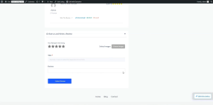
The review form is embedded inside an accordion widget, allowing users to expand the form to submit a review. The form is built using the CubeWP Submit Form widget .

7.1 Accordion Container Setup

  • Add a new container inside the main single page container. Set padding to 0, margin to 0.
  • Add a nested container inside this. Padding: 15px all sides. Margin Bottom: 30px.
  • Inside, add an Elementor Accordion widget.
  • Configure the accordion to have only one item.
  • Item Position: Stretch.
  • Expand Icon: Angle Up icon. Collapse Icon: Angle Down icon.

Accordion Styling:

  • Border: Solid, Bottom border only — 1 pixel. Border Color: As per design (paste hex).
  • Border Radius: 0. Padding: Top & Bottom 0, Right 10px, Bottom 15px.

Accordion Header Styling:

  • Font Family: Open Sans. Font Size: 16px. Font Weight: 600. Text Transform: Normal.
  • Line Height: 24px. Text Color: As per design.
  • Icon Size: 20px. Icon Color: As per design.
  • Icon Hover Color and Active Color: As per design.

Accordion Content Styling:

  • Border: Solid, 1px from top. Border Color: As per design. Border Radius: 0.
  • Padding: 0 (Top 0, Bottom 15px from top edge).

7.2 CubeWP Submit Form Widget (Review Form)

  • Inside Accordion Item 1, add the ‘ CubeWP Submit Form‘ widget.
  • From the Form settings, select Post Form from the Form Type field.
  • In the Post Form settings, select Reviews from the Post Type field.

Review Form Fields Configuration:

Navigate to CubeWP > Custom Fields > Reviews Fields to configure the fields required for the review submit form. Title and description are the defaults fields of the reviews Post Type. Now we will add just 2 fields one for rating stars and the other for the gallery.


Now in the CubeWP Submit Form widget we will add all four fields of the submit form.

Field 1 — Rating Stars: Field Type:CubeWP Custom Field,  Field: Rating Stars. Custom Label: ‘Your Listing Rating for Listing’. Width: 50%.

Field 2 — Gallery (Images): Field Type:CubeWP Custom Field,  Field: Gallery. Label: ‘Select Images’. Width: 50%. Visibility: All Users.

Field 3 — Title: Default field. Width: 100%. Add placeholder text.

Field 4 — Content (Review Body): Default Field Width: 100%. Label: ‘Review’.

Note: Remove any unnecessary fields from the form layout. Only the Rating Stars, Gallery, Title, and Review Content fields are required for this design.


Form Style Settings:

  • Disable graphical elements and description text.
  • Border Radius: 0. Padding: Top 25px, Right 15px, Bottom 5px, Left 15px.
  • Background Color: Match the form container background.
  • Display: Flex. Flex Direction: Row. Justify-Content: Center.
  • Select Images field width: 50%. Flex Alignment: Start. Gap: 10px.

Label Styling:

  • Label Color: As per design. Font: Open Sans, 15px, Weight 600, Capitalize, Line Height 26px.
  • Label Margin Bottom: 5px. Label Margin Top: 8px.

Input Field Styling:

  • Font: Open Sans, 13px, Weight 500, Line Height 19px. Text Color: As per design.
  • Background Color: As per design. Border: Solid. Border Color: As per design.
  • Border Radius: 5px. Field Height: 14px (total padding). Textarea Height: 120px.
  • Padding: 15px. Margin: As per design.

Placeholder Styling:

  • Placeholder Color Opacity: 1 (fully visible).
  • Focus Text Color: As per design. Focus Border Color: As per design.
  • Focus Background: White. Box shadow on focus: Set color as per design.

Media Upload Field Styling:

  • Border Radius: 4px. Background Color: As per design. Background Hover Color: As per design.
  • Border: None. Border Radius: 5px. Padding: 0. Margin: Top 25px, Bottom 20px.
  • Width: 120px. Upload Icon Font Size: 0 (hide icon, show text only).
  • Upload Icon Color: White.
  • Upload Text Font: Open Sans, 13px, Weight 500, Capitalize, Line Height 37px. Text Color: White.
  • Text Margin Top: -40 pixels (adjusts position due to icon being hidden).
  • Media Preview Border Radius: 5px. Preview Height and Width: Set as per design.
  • Caption Font: Open Sans, 13px, Weight 400, Normal, Line Height 13px.

Rating Stars Styling:

  • Remove justify property. Align-Items: Top. Flex-Direction: Column.
  • Padding: 0. Margin: 0. Border Type: None. Border Radius: 0.
  • Label Color: As per design. Label Font: Open Sans, 12px, Weight 600, Normal, Line Height 26px.
  • Stars Container Gap: 3 pixels. Star Size: 28px.
  • Active Star Color: As per design. Hover Star Color: As per design.
  • Margin: 0. Padding: 0. Border Radius: 0.

Submit Button Styling:

  • Padding: 0. Border: 0. Margin: 0.
  • Button Width: 210px.
  • Font: Open Sans, 13px, Weight 500, Capitalize, Line Height 26px.
  • Border Radius: 3px.
  • Padding: Top & Bottom 9px, Right 20px, Left 30px.
  • Alignment: Center.
  • Button Text: Change to ‘Submit Review’ (set in Content > Form Settings > Submit Button Text).


8. Review Section — Scroll Anchor & Styling

8.1 Scroll-to-Review Anchor

To make the review section accessible by scroll when a user clicks ‘Write a Review’ button from the top of the page:

  • Go to the reviews main container’s Advanced settings.
  • Add a CSS ID (e.g., ‘reviews-section’) to the container.
  • In the ‘Write a Review’ button’s link field, add ‘#reviews-section’ as the URL.
  • This creates an anchor link — clicking the button smoothly scrolls the page down to the reviews section.

Note: Reload the page after publishing to verify the scroll-to-reviews functionality works correctly.

8.2 Main Reviews Container Background & Border

  • Set the main reviews container background color to White.
  • Add a Border Radius of 7 pixels to both the reviews header container and the reviews body container.
  • This gives the reviews section a clean, rounded card appearance.


Here is the video tutorial for taxonomy widget, announcement, FAQs and Coupons


Here is the video tutorial for reviews and reviews form


How to add description and watch video button in the single detail page?

Single Page Builder

Document Overview

Scope: Displaying description, post title and watch video button and attach youtube video url to it using the CubeWP Meta Widget.
Tools: Elementor, CubeWP Plugin, ListingPro Value Pack, Theme Builder


1. Introduction

This part of the Single Page Builder series covers the content sections that appear in the lower portion of the single listing page. These include: Displaying description, post title and watch video button and attach youtube video url to it using the CubeWP Meta Widget.

2. Body Content Layout Structure

2.1  Outer Full-Width Container

Add a new container for the main body content area below the action buttons:

Setting / Parameter Value / Configuration
Container Width 100%
Padding 0 (zero)
Margin 0 (zero)


2.2  Inner Container

Add a second container nested inside the full-width container:

Setting / Parameter Value / Configuration
Container Width 1,170 pixels
Layout Direction Row
Alignment Flex-start
Margin 0 (zero)
Padding 0 (zero)
Margin Top 7 pixels
Background Color Match the main container background color


2.3  Two-Column Layout

Inside the inner container, the layout is split into two columns — a left section and a right section. Add two separate sub-containers:

Setting / Parameter Value / Configuration
Left Container Width 66.66%
Right Container Width 33.66%
Default Gap (Div) 0 (zero)
Main Container Gap 0 (zero)
Default Padding (Both) 0 (zero)


3. Left Column — Description Area

3.1  Description Container

Inside the left column container, add a container specifically for the description text:

Setting / Parameter Value / Configuration
Layout Gap 0 (zero)
Padding 0 (zero)
Margin Bottom 34 pixels


3.2  Inner Description Container

Add a nested container inside the description container:

Setting / Parameter Value / Configuration
Gap 0 (zero)
Margin 0 (zero)
Padding Top 10 pixels
Padding Right 10 pixels
Padding Bottom 10 pixels
Padding Left 25 pixels
Background Color Set from style panel


3.3  Inner Content Row Container

Within the description container, add a container with ‘space-between’ layout alignment:

Setting / Parameter Value / Configuration
Alignment Space-between
Padding 0 (zero)
Margin 0 (zero)


3.4  Left and Right Sub-Containers

Insert two sub-containers inside the space-between container — one for the left side and one for the right side:

Setting / Parameter Value / Configuration
Width (Both) Fit content
Layout Direction Row
Item Alignment Center
Gap 1 pixel
Padding 0 (zero)


4. Play Icon Configuration

4.1  Adding the Icon

  • Add an icon element to the left sub-container.
  • Select the Play icon from the icon library.
  • Set the icon color to the primary theme color.

4.2  Icon Styling

Setting / Parameter Value / Configuration
Icon Color Primary theme color
Font Size 26 points
Text Alignment Center
Padding 11 pixels
Parent Container Padding & Margin 0 (zero)


5. Video Title Heading Typography

Add a heading element alongside the play icon for the video section title and change the content of the heading to ‘Checkout’. Apply the following typography and style settings:

Setting / Parameter Value / Configuration
Font Family Quicksand
Font Size 18 pixels
Font Weight 500
Text Transform Capitalize
Line Height 33 pixels
Text Color Copy and paste from design
Margin Top -8 pixels (negative offset for alignment)
Padding Right 4 pixels

6. Dynamic Post Title Heading

Add another heading element to display the dynamic single post title:

  • Go to the Single Post Title section within the builder.
  • From the Dynamic tags, select the Post Title under the CubeWP Single Post Data .
  • Navigate to the Style section and apply the same style settings used for the video title heading.
  • Paste the style attributes and select the span tag for the HTML tag setting.


6.1  Icon Color Override

If the icon next to the dynamic title is displaying in the global primary color, override it with a specific shade of blue:

  • Copy the exact blue hex code required for this design.
  • Paste it into the icon color field to apply the custom primary blue color.

7. CubeWP Meta Widget (Watch Video Button)

7.1  Adding the Widget

The CubeWP Meta widget provides a video watch button linked to a YouTube post field. Add a new container for this element, then:

  • Add the CubeWP Meta widget inside the container.
  • Set Post Meta to the Meta Source Field.
  • Set Post Type to: Listings.
  • Set the Post Field for Mata to: YouTube video URL.


7.2  Link/URL Options

Setting / Parameter Value / Configuration
Use Field Value as URL Yes (enabled)
Link Text Custom — set to ‘watch video’
Open in Popup Enabled
Use iFrame Enabled


7.3  Watch Button Typography

Navigate to the Style section and configure the typography for the watch button:

Setting / Parameter Value / Configuration
Font Family Open Sans
Font Size 13 pixels
Font Weight 500
Line Height 26 pixels


7.4  Watch Button Visual Styling

Setting / Parameter Value / Configuration
Text Color Blue
Background Color White
Padding Top & Bottom 2 pixels each
Padding Left & Right 22 pixels each
Margin 0 (zero)
Border Type Solid
Border Width 1 pixel
Border Color As specified in design (hex value)


7.5  Hover State Settings

Define the hover interaction for the watch button so it provides clear visual feedback to users:

Setting / Parameter Value / Configuration
Text Color (Hover) White
Background Color (Hover) Blue
Border Color (Hover) Blue (match background)


7.6  Final Widget Settings

Setting / Parameter Value / Configuration
Visibility Enabled
Width Fit content
Margin 0 (zero)
Padding 0 (zero)
Line Item Alignment Center


8. Post Description Text Area

8.1  Container Setup

Add a new container for the post description text block:

Setting / Parameter Value / Configuration
Outer Container Width 100%
Outer Container Padding 0 (zero)
Outer Container Margin 0 (zero)
Inner Container Padding 0 (zero)
Inner Container Margin 0 (zero)
Inner Container Border 2 pixels


8.2  Description Typography

Add the heading element in the description container.

  • From the Dynamic tags, select the Post Content under the CubeWP Single Post Data .


8.3  Description Typography

Configure the typography for the description content area:

Setting / Parameter Value / Configuration
Font Family Open Sans
Font Size 15 pixels
Font Weight 400 (Normal)
Line Height 27 pixels
Text Color Set from the style panel

Once the typography is configured and the description text color is applied, the dynamic post description will display correctly in the layout.


9. Publishing & Final Verification

After completing all configurations, follow these steps to finalize and publish:

  • Click the Publish button in the Elementor editor.
  • Navigate to the frontend and preview the live page.
  • Verify the CubeWP Save (Bookmark) button displays correctly with all hover states.
  • Confirm the body content layout shows correctly in both columns.
  • Check that the Play icon, video title heading, and dynamic post title align properly.
  • Confirm the Watch Video button opens the YouTube popup correctly.


Here is the complete video tutorial
How to add breadcrumbs, post title, rating stars, submit review button and share button on single detail page?

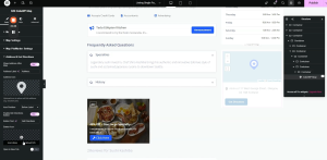
SINGLE PAGE LAYOUT BUILDER

Document Type Technical Implementation Guide


Scope Single-page post detail layout — header section


Subject Container structure, breadcrumbs, post title, ratings display, submit review and post share button


Builder Tool Elementor (WordPress page builder), CubeWP, ListingPro Theme


1.  Overview

This guide documents the step-by-step construction of the header section of a single-page post detail layout. The header encompasses the post title, breadcrumb navigation, user ratings display, and interactive action buttons (save & share). All components are built using a nested container structure within a page builder environment.


2.  Layout Architecture

The header section is organised as a two-tier container hierarchy:


2.1  Outer (Full-Width) Container

The outermost container spans the full viewport width and provides the section background.


Property Value Notes
Width Full-screen (100%) Spans entire viewport
Background Custom hex color Applied to match design theme
Margin 0 px (all sides) Advanced > reset to 0
Padding Top 15 px Default spacing preserved
Padding Other 0 px All other sides reset


2.2  Inner (Fixed-Width) Container

Nested inside the outer container; centres and constrains content to the design grid.


Property Value Notes
Width 1,170 px Fixed pixel width
Margin 0 px Default reset
Padding 0 px Default reset
Children 2 columns Left content + right widget area


3.  Two-Column Structure

Inside the 1,170 px container, two side-by-side child containers create the left content column and the right rating/action column.

3.1  Column Specifications

Column Width Padding (L/R) Content
Column 1 (Left) 66.6% 15 px each side Breadcrumbs · Post Title · Claim Icon · Ratings
Column 2 (Right) 33.3% 15 px each side Overall Rating Score · Stars · Review Count · Action Buttons


The gap between the two columns and the outer container gap are both set to 0 px.

4.  Left Column Components

4.1  Breadcrumb Navigation

The breadcrumb bar provides contextual page navigation at the top of the left column.

Container Settings

  • Minimum height: 20 px
  • Direction: Row (horizontal)
  • Padding & margin: 0 px (all sides)

Home Button 

  • First add a button to the container and set its text to ‘home’.
  • Link target: From the dynamic tags of link, select the custom link and then Homepage link

Home Button — Typography

Property Value Notes
Font Family Open Sans Applied via Style panel
Font Size 13 px
Font Weight 400 (Regular)
Text Transform Capitalize
Line Height 19 px Matches font size
Letter Spacing 0%


  • Border style: Solid, positioned on bottom edge only
  • Border width: 1 px
  • Border color: As per design hex code
  • Border radius: 0 px
  • Internal padding: 0 px
  • Transparent background color

Listing category Breadcrumb Button

A duplicate of the Home button is created and repositioned.  Under the content tab, we will select Post Term from the dynamic tag then we will select Listing Category from the taxonomy select.
Similarly we will select the dynamic link. 

Post Title Breadcrumb Button

A duplicate of the Home button is created and repositioned. Its label is bound to the dynamic post title field so it automatically reflects the current post name. The custom link is removed from this instance.

Hover state configuration (applied to all breadcrumb buttons):

  • Text color: Brand blue 
  • Border color: Brand blue

Separator Spacing

  • Margin-right: 13 px — applied to each separator element between breadcrumb items
  • Margin-left: set on button elements as required for correct alignment


4.2  Post Title

A dedicated container below the breadcrumbs that displays the post title.

Container Settings

  • Margin : 0 px (all sides)
  • Padding: 0 px (all sides)
  • Set the width of the container to fit content.

The post title is rendered as an H1 heading using a dynamic Post Title tag from the page builder’s single-post data source.

Property Value Notes
HTML Tag H1 Semantic heading level
Data Source Post Title Tag Dynamic — pulls from post data
Font Family Open Sans
Font Size 35 px
Font Weight 500 (Medium)
Text Transform Capitalize
Line Height 47 px
Letter Spacing 0 px
Word Spacing 0 px
Color Custom hex As per design spec

4.3  Business Tagline

Displayed directly below the post title. This is a dynamic custom field sourced from the post’s backend data (From the dynamic tag, select Post Type (text)> Data Source: Post Field> Select custom field: ‘business tagline’). The HTML tag is set to <p> (paragraph).

Property Value Notes
HTML Tag p Paragraph element
Field Type Text Custom field — dynamic selection
Font Family Open Sans
Font Size 36 px
Font Weight Normal
Line Height 26 px
Color Custom hex Copied from design


Note: At the time of implementation, the business tagline data had not yet been integrated from the backend. The field mapping was configured in advance to display correctly once data becomes available.


4.4  Ratings Row

A dedicated container below the title and tagline displays the visual rating elements.

Container Settings

  • Direction: Row (horizontal)
  • Padding: 0 px (all sides)
  • Margin : 0 px (all sides)

Rating Score (Numeric)

From the dynamic tag, under the CubeWP Reviews, select Overall Post Rating. Then the rating number will automatically be displayed. 

Property Value Notes
HTML Tag p
Font Family Open Sans
Font Size 16 px
Font Weight 400
Line Height 26 px
Color Custom hex Matches design palette


Star Rating Icons

  • Duplicate the rating number heading from the show overall rating dropdown we will select Rating Stars.
  • Font size: 0 px (hides text, shows stars only)
  • Star color: As per design specification

Review Count

  • Duplicate the rating number heading from the show overall rating dropdown we will select Total Number of Ratings.
  • Formatted with brackets, e.g.  (42)
  • Margin-right: 10 px  (separates from adjacent elements)

5.  Right Column Components

The right column (33.3% width) contains the overall rating summary, interactive star display, review count, and the Save / Share action buttons.

Nested Container Structure

5.1  First-Level Inner Container

Add a container inside the outer container and apply the following settings:

Setting / Parameter Value / Configuration
Margin 0 (zero)
Padding Top 10 pixels
All Other Padding 0 (zero)

5.2  Second-Level Inner Container

Add another container inside the first-level inner container:

Setting / Parameter Value / Configuration
Gap (Column) 12 pixels
Layout Direction Row
Justify Content flex-end (end alignment)
Padding 0 (zero)

5.3  Two Sub-Containers

Add two additional sub-containers inside the second-level container:

  • Sub-Container 1 — Padding: 0, Margin: 0. Width set to fit content.
  • Sub-Container 2 — Configured as a vertical container with a width of 60 pixels.

5.4  Vertical Container (60px Width)

Setting / Parameter Value / Configuration
Orientation Vertical
Width 60 pixels
Layout Direction Row
Item Alignment Center
Gap 2 pixels
Padding (Top, Right, Left) 5 pixels each
Margin 0 (zero)

6. Rating Display Configuration

6.1  Adding the Overall Rating Heading

Inside the vertical container, add a heading element that will display the post’s overall rating. 

  1. Navigate to the Custom Tags section within the heading element.
  2. Locate the tag named ‘Overall Post Rating’.
  3. Select the Rating Number option from the menu.
  4. Manually append a forward slash and the number 5 (i.e., /5) to indicate the rating scale.
  5. Set the HTML tag for this element to ‘p’ (paragraph format).

6.2  Rating Container Background

After adding the rating heading, set the background color of the container to ensure proper visual contrast and UI consistency. The background color distinguishes the rating component from adjacent elements on the page.

6.3  Second Rating Container — Total Ratings Count

Add a second container for displaying the total number of ratings. Configure its properties as follows:

Setting / Parameter Value / Configuration
Width Fit content
Layout Direction Flex-end alignment
All Gaps 0 (zero)
Heading Margin-Top 3 pixels

6.4  Total Ratings Heading Typography

Add a heading inside the second rating container and apply the following style settings. In the dynamic tag section, under the CubeWP Reviews section, navigate to Overall Post Rating and select the Total Number of Ratings. In the advance setting, inside after input write Ratings to show it after the number.

Setting / Parameter Value / Configuration
Font Family Open Sans
Font Size 13 pixels
Font Weight 400 (Normal)
Text Transform Capitalized
Line Height 13 pixels
Letter Spacing 0 (zero)
Text Color Set as required
Default Gap 0 (zero)

7. Submit Review Button

7.1  Button Container

Set the container that holds the submit review button with the following properties:

Setting / Parameter Value / Configuration
Container Width Fit content
Gap 17 pixels
Padding (Advanced) 0 (zero)

7.2  Button Configuration

  1. Add a button element inside the container.
  2. Set the button label text to: Submit Review.
  3. Select a filled star icon from the media library.
  4. Position the icon to the left side of the button.
  5. Set the icon spacing value to 0 (zero).

7.3  Button Positioning

Setting / Parameter Value / Configuration
Right 49.8 pixels
Bottom 1.5 pixels
Left 52 pixels
Gap 8 pixels

7.4  Hover Icon Color

Setting / Parameter Value / Configuration
Icon Hover Color White

8. Save & Share Container

8.1  Container Below Action Buttons

Add a new container directly below the action buttons area:

Setting / Parameter Value / Configuration
Width Full width
Height Full width
Layout Direction Row
Alignment Flex-end
Gap 10 pixels
Padding 0 (zero) — reset from 0, 8, 0, 0
Margin Bottom 10 pixels

8.2  Locating and Setting the Share Icon

  1. Locate the VP Social share element from the elementor panel and drag it into the container. 


8.3  Setting the Share text & Icon

  1. Select a new share icon from the integrated icon library.
  2. Set the share icon and assign the title label as: Share.

8.4  Share Icon Styling

Setting / Parameter Value / Configuration
Icon Size 10 pixels
Icon Color Set as required (make highly visible)
Text Color Set as required

8.5  Typography Settings

Setting / Parameter Value / Configuration
Font Family Open Sans
Font Size 12 pixels
Font Weight 400 (Normal)
Line Height 12 pixels

8.6  Container Background & Border

Setting / Parameter Value / Configuration
Background Color Set as required
Border Type Solid
Border Width 1 pixel
Border Color Copy and paste from design
Border Radius 5 pixels

8.7  Spacing & Alignment

Setting / Parameter Value / Configuration
Spacing 5 pixels
Alignment Center
Padding (Top & Bottom) Set as required for balanced layout


9. CubeWP (Bookmark/Save) Widget

9.1  Initial Padding Setup

Before adding the Save widget, apply the following padding to the existing container:

Setting / Parameter Value / Configuration
Padding Top 6 pixels
Padding Right 20 pixels
Padding Bottom 6 pixels
Padding Left 20 pixels
Margin 0 (zero)


9.2  Adding the CubeWP Save Widget

  • Navigate to the widget panel and locate the CubeWP Save widget.
  • Add the widget to the current container section.
  • Select the bookmark icon within the widget settings.
  • Set the icon’s function to Bookmark.
  • Enable the Show text toggle and the texts you want to show when the item is saved. 

9.3  CubeWP Save Widget Styling

Setting / Parameter Value / Configuration
Icon Color Set as required
Background Color White
Padding Top 6 pixels
Padding Right 20 pixels
Padding Bottom 6 pixels
Padding Left 20 pixels
Border Style Solid
Border Width Minimum (1 pixel)
Border Color Copy and paste from design
Border Radius 5 pixels
Text Color Copy and paste from design


9.4  Typography Settings

Setting / Parameter Value / Configuration
Font Family Open Sans (Google Fonts)
Font Size 13 pixels
Font Weight 500
Text Transform Capitalize
Line Height 19 pixels
Letter Spacing 0 (zero)
Word Spacing 0 (zero)


9.5  Layout & Alignment

Setting / Parameter Value / Configuration
Gap Between Elements 0 (zero)
Row Alignment Center
Margin Center


9.6  Hover State Settings

Configure hover state properties to provide visual feedback when users interact with the bookmark button:

  • Icon Hover Color — Set in the settings panel
  • Border Color (hover) — Set to maintain consistency
  • Text Hover Color — Set to ensure readability on hover

3. Fixing Spacing Gaps

After publishing the CubeWP Save widget changes and previewing the frontend, you may notice an undesirable gap between the next and previous elements. To fix this:

  • Identify the main container causing the gap.
  • Navigate to the main container’s Layout properties.
  • Set the default gap to 0 (zero) pixels.
  • For the individual columns within the container, set the gap to 5 pixels.
  • Navigate to the layout panel and set the main container gap to exactly 5 pixels to ensure consistent spacing across the interface.


After making these corrections, verify section visibility settings, then publish the updated changes and preview the live frontend to confirm the gaps are resolved.


Here is the complete video tutorial
How to add Gallery Widget/Slider on the single details Page?

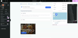
Single Page Setup 

CubeWP Gallery Widget Configuration

1. Overview

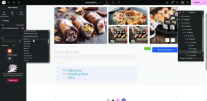
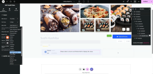
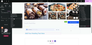
This guide provides step-by-step instructions for setting up a custom single page template for a post type listing using theCubeWP Theme Builder and Elementor page builder. The tutorial covers the complete workflow from creating the template to configuring the CubeWp Gallery widget with a custom grid/slider layout.
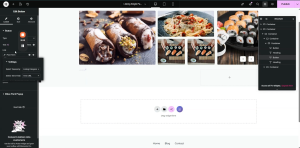
 

2. Prerequisites & Navigation

2.1  Accessing the Theme Builder

To begin creating a custom single page, navigate through the following path in the WordPress dashboard:

  • Go to Dashboard
  • Navigate to CubeWP
  • Select Theme Builder
  • Click on the Single section

2.2  Creating a New Single Page Template

Once inside the Single section of the Theme Builder:

  1. Click the Add New button to begin creating a new template.
  2. Select the template type “Single”.
  3. Name your template for example  ‘Listing Single Page’
  4. From the display on dropdown, select ‘Single Listings’
  5. Click the save and edit button to open edit with elementor.

Important: When creating content in the new template, you must carefully select it for both the listing view and the single page view before publishing.

3. Edit with Elementor Workflow

3.1  Preview Settings

Before building, configure the preview settings in Elementor:

  • Select the specific post type from the dropdown menu — the listing data of which post you want to show here.

4. Gallery Container Setup

4.1  Adding the Gallery Container

Begin by adding the primary container for the gallery section within the main page layout:

  1. Add a new container element to the main page layout.
  2. Set the container type to Flexbox.
  3. Configure all sizing and spacing properties as specified below.


4.2  Container Configuration Settings

Setting / Parameter Value / Configuration
Container Type Flexbox
Container Width 1,150 pixels
Background Color Set to the designated background color
Default Padding 0 (zero)
Margin 0 (zero)


5. CubeWP Gallery Widget

5.1  Adding the Widget

Locate the CubeWP Gallery widget in the Elementor sidebar panel:

  1. Find the CubeWP Gallery widget in the sidebar.
  2. Perform a drag-and-drop action to place it inside the gallery container.
  3. Verify that the post type is set to Listings and the gallery field is correctly assigned.

Once the widget is dropped and configured correctly, the image gallery will begin populating automatically on the screen.

5.2  Content Settings

Setting / Parameter Value / Configuration
Post Type Listings
Gallery Field Designated gallery field
Display Size Full-size
Image Gap 0 (zero)
Lightbox Enabled
‘See All’ Button Hidden (disabled — a slider is used instead)


6. Layout Configuration: Grid & Slider

6.1  Enabling the Slider Layout

The default gallery layout is a standard grid. Since a slider element is incorporated into this design, the slider layout must be enabled:

  1. Navigate to the Layout settings of the CubeWP Gallery widget.
  2. Change the layout from the default Grid format to Slider.

6.2  Grid Layout Settings

Setting / Parameter Value / Configuration
Grid Row Template 2 rows
Grid Gap 7 pixels
Total Items 5 items
Grid Gap (Advanced) 14 pixels


7. Advanced Grid Item Configuration

Configure each of the 5 grid items individually with the following column span, row span, column start, row start, width, and height settings:

Item Col Span Row Span Col Start Row Start Width (px) Height (px)
Item 1 2 2 1 1 488 344
Item 2 2 1 3 1 360 165
Item 3 1 1 3 2 173 165
Item 4 1 1 4 2 173 165
Item 5 1 2 5 1 260 343


All grid items are contained within a single unified grid. Ensure that column and row start positions are set correctly for proper image staggering.

8. Slider & Sidebar Settings

8.1  Image & Sidebar Styling

Setting / Parameter Value / Configuration
Image Spacing (Sidebar) 0 (zero)
Autoplay False (disabled)
Playback Speed 500 milliseconds
Infinite Loop True (enabled)


8.2  Navigation Arrows Configuration

Setting / Parameter Value / Configuration
Icon Size 11 pixels
Icon Colors 3 colors configured
Icon Hover Effect Not required — leave as default
Arrow Width (HCG) 36 pixels
Arrow Border Type None
Arrow Border Radius 6 pixels
Arrow Padding (Top) 12.5px / 15px
Arrow Padding (Bottom) 12.5px
Arrow Padding (Right & Left) 15 pixels each


8.3  Arrow Positioning

Configure the absolute position of the navigation arrows using the following values:

Setting / Parameter Value / Configuration
Bottom Position 6.9%
Left Position 90%
Right Position 2.2%

The container’s position must be set to absolute to ensure the arrows remain within the frame and do not overflow outside the gallery.

9. Image Styling

9.1  Image Style Settings

Navigate to the Style tab of the CubeWP  Gallery widget, then open the Image Styling section and apply the following configuration:

Setting / Parameter Value / Configuration
Image Width 100%
Image Height 100%
Unit Percentage (%) — not pixels
Object Fit Cover
Object Position Center
Border Radius 5 pixels
Padding 0 (zero)
Margin 0 (zero)
Hover Styling None — default image appearance maintained


Here is the complete video tutorial