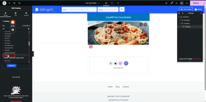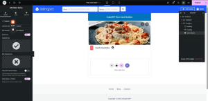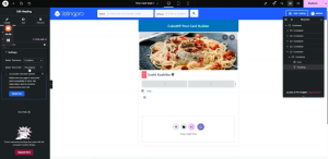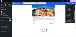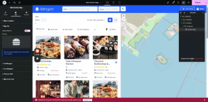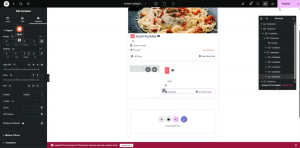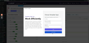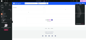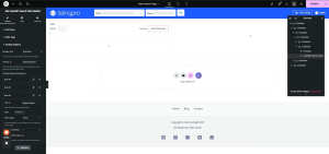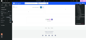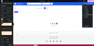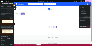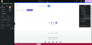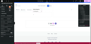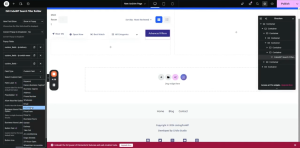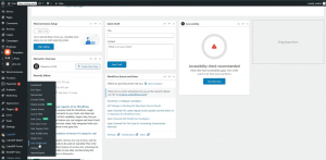
How to design a post card and show listings using post card?

Post Card Builder

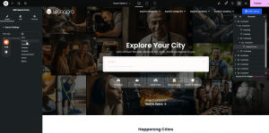
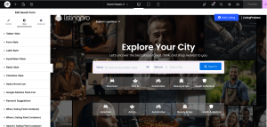
Elementor Setup, CubeWP Posts Widget & Post Card Creation

Document Overview

Scope: Setting up Elementor page builder, configuring the Cube WP Posts widget, creating a custom post card template

Tools: Elementor Page Builder, Cube WP Plugin, WordPress Theme Builder


1. Introduction & Overview

This tutorial provides a comprehensive, step-by-step walkthrough for building a custom post card using the Elementor page builder integrated with the Cube WP plugin. The guide covers all essential techniques, from accessing the Elementor editor to creating a fully styled, dynamic post card template that displays listings, ratings, pricing, and actionable buttons.


2. Accessing the Elementor Editor

The Elementor editor is the primary interface for designing and customizing pages. The process for accessing it is the same regardless of whether you are editing your main homepage or any subpage.

2.1 Steps to Open Elementor

  • Navigate to your WordPress dashboard.
  • Locate the page where you want to show posts/listings with the post card. (homepage or any subpage).
  • Click the ‘Edit with Elementor’ button at the top of the dashboard.
  • Wait for the Elementor editor to fully load.

Once loaded, the full suite of design tools will be visible in the left-hand panel, allowing you to begin customizing layouts and adding elements to ensure a professional appearance.


3. Configuring the CubeWP Posts Widget

The CubeWP Posts widget is the core component used to display posts (listings) on your homepage. It provides extensive filtering, ordering, and display options.

3.1 Adding the Widget

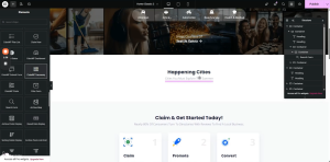
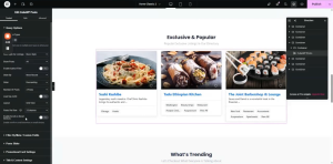
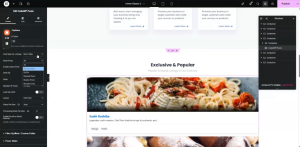
  • In the Elementor editor, search for ‘CubeWP Posts’ in the widget panel.
  • Drag and drop the widget into the desired section on the page.
  • The widget will immediately display default post listing options.

3.2 Post Type Selection

The first setting to configure is the post type. This determines what kind of content the widget will display.

  • Click on the widget to open its settings panel.
  • Under ‘Post Types’, select the post type whose data you want to display (e.g., listings, videos, custom types).
  • Each post type has its own independent settings that can be adjusted accordingly.

Note: You can switch between different post types at any time. Each selection updates the display immediately.
 

3.3 Post Filtering Options

The widget provides multiple ways to filter which posts are shown:

All Posts: Displays every post of the selected post type.

By Taxonomy: Filters posts to show only those that have a particular taxonomy.

By ID: Allows you to manually specify post IDs to display targeted content.

Related Posts: Shows posts related to the current post being viewed.

Featured / Boosted Posts: Displays promoted posts that are configured to appear at the top.
Nearby Posts: Displays posts that are located in a particular location.

Author Filter: When enabled, only shows posts created by the currently logged-in user (useful for user dashboards).
 

3.4 Ordering & Sorting

Control how posts are ordered using the following options:

Order By: Sort by Most Recent, Title, or Random order.

Number of Posts: Define exactly how many posts to display: 3, 4, 5, 6, or all available.

Grid View: Displays posts in a grid layout. Select the number of columns (e.g., set to 3 for three-column display).
Posts Per Row: In grid mode, set this to ‘auto’ for automatic columns, or specify a fixed number (e.g., 3).
List View: Displays posts in a single vertical list.

3.5 Loading & Display Settings

Load by AJAX: Enable to load posts asynchronously after page load. Disable to show posts immediately on page render.

Hover Effect: Optional visual effect when a user hovers over a post card.

Post Slider: Enable to convert the posts display into an interactive slider/carousel.

3.6 Meta Query & Filtering

For advanced filtering based on custom field values (meta data):

  • Navigate to the Meta section within the widget settings.
  • Enable Meta Query to filter posts by specific custom field values.
  • Filters remain active until manually removed.
  • This is particularly useful for fields created within Cube WP.

3.7 Promotional Card Settings

When promotional card settings are enabled, you can configure a featured card and define its position within the item list.
Additional title and content settings are available in this section as well. You can show/hide the title of the section and hide the No Results Template when no results appear on filtering.


4. Creating a New Post Card Template

Rather than using the default listing design, you can create a fully custom post card template through the Cube WP Theme Builder.

4.1 Setting Up the Template in the Backend

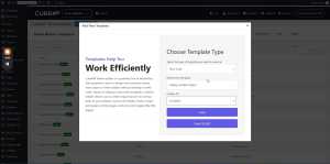
  • Navigate to the WordPress backend.
  • Go to Cube WP > Theme Builder.
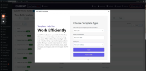
  • Click ‘Add New Template.’
  • From the ‘Select Post Type’ dropdown, choose ‘Post Card.’
  • Name the template (e.g., ‘Post Card Style 1’). This name will appear when selecting the template later.
  • Under display conditions, select the applicable post type (e.g., ‘listings’).
  • Click ‘Save and Edit’ to be redirected to the Elementor editing screen.

Note: The template name you assign here is what will appear in dropdown menus when applying the card to widget instances.
5. Building the Post Card Structure in Elementor

Once inside the Elementor Post Card Builder, you will construct the card layout from scratch. The card follows a specific structural hierarchy.

5.1 Structural Overview

The post card is composed of the following nested containers:

Container 1 (Image Container): Holds the featured image and an overlay container for the Save and View buttons.

Container 2 (Content Container): Holds the post title, ratings, rating count, location, price, Open/Closed status, and the Call Now button.

5.2 Step 1 — Main Wrapper Container

  • Add a new container.
  • Set width to full width (100%).
  • Set all padding values to 0 pixels.

5.3 Step 2 — Image Container Setup

The image container holds the featured post image and its overlay elements.

Container Properties:

  • Width: 100% (full width).
  • Padding: 0 pixels.
  • Minimum Height: 217 pixels (to maintain consistent card height).
  • Border Radius: 5 pixels (to match the design).

Featured Image Configuration:

  • Add an Image element inside the container.
  • Click the Dynamic Tag icon on the image source field.
  • Under the ‘CubeWP Single Post Data ‘ category, select the ‘Featured Image’ dynamic tag.
  • Set the image resolution to ‘Large’ by default.
  • In the Style section, set the image width to 100%.
  • Set the image height to exactly 217 pixels.
  • Set object-fit to ‘Cover’ and object-position to ‘Center Center’.

Dynamic Post URL Link:

  • In the image link settings, go to Custom URL.
  • Open the dynamic tags dropdown.
  • Under ‘Cube WP Single Post Data > Category,’ select ‘Post URL.’
  • This dynamically links the image to the single listing page.

Anchor Width Fix (Custom CSS):

  • Go to the Advanced section of the image element.
  • Add custom CSS: selector a { width: 100%; }
  • This ensures the anchor tag wrapping the image spans the full container width.
5.4 Step 3 — Save & View Button Overlay

A secondary container inside the image container holds the Save and View action buttons. These are positioned absolutely over the image.

Container Properties:

  • Add a new container inside the image container.
  • Remove all default padding values.
  • Width: Set to ‘Fit Content’.
  • Position: Absolute.
  • Top: 15 pixels from the top edge.
  • Gap between icons: 7 pixels.

CubeWP Save Widget (Wishlist/Save):

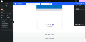
  • Search for ‘CubeWP Save‘  in the Elementor panel.
  • Drag it into the overlay container.
  • This element allows users to save/add posts to their wishlist.
Styling the Save Widget:

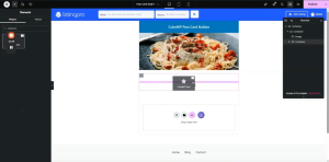
  • Icon Size: 12 pixels.
  • Icon Color: White.
  • Border Radius: 120 pixels.
  • Border Width: 1 pixel. Border Style: None.
  • Padding: 11 pixels on all sides.
  • Hover Icon Color: Solid Black.
  • Gap between icon and text: 0 pixels.

View Icon Button:

  • Search for the ‘Icon’ widget in the Elementor panel.
  • Add it to the same overlay container.
  • Select the ‘Eye’ icon.
  • Assign a dynamic Post URL  under the CubeWP single post data as the icon’s link URL.

Styling the View Icon:

  • Icon Size: 12 pixels. Width: Auto.
  • Container: Set display to Flex, direction to Row.
  • Padding: 5 pixels on all sides.
  • Border Radius: 120 pixels. Border: None.
  • Icon Color: White. Hover Color: Black.
  • Hover Background Color: White.


6. Content Area Below the Image

The content area contains the post title, ad label, claim status, ratings, category, price, and location — all displayed below the image.

6.1 Content Container Setup

  • Add a new container below the image container.
  • Set width to full (100%).
  • Padding: Right — 14px, Left — 19px. Top/Bottom — 0px.
  • Gap: 0 pixels.
  • Margin Top: 7 pixels.

6.2 Ad Label (Boosted Post Tag)

When a post is boosted/promoted, an ‘Ad’ label should appear at the top of the content area.

  • Add a Heading element to the content container.
  • Set the HTML tag to a Span element.
  • Open the Dynamic Tag settings.
  • Under ‘Cube WP Single > Boosted Label’, select the boosted status tag.
  • Set the label text to ‘Ad’.

Ad Label Styling:

  • Text Alignment: Center.
  • Font Size: 13 pixels. Font Weight: 500.
  • Letter Spacing: 0. Text Color: White.
  • Padding: 0. Custom Width: 20 x 28 pixels.
  • Background Color: As per design.
  • Border Radius: 3 pixels.

6.3 Post Title

  • Add a Heading element.
  • Set the dynamic tag to ‘Post Title’ (under CubeWP Single Post Data).
  • Set the HTML tag to H4.
  • Add a link using the dynamic ‘Post URL’ tag.
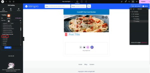
Title Typography:

  • Font Size: 19 pixels. Font Weight: 700 (Bold).
  • Line Height: 24 pixels. Letter Spacing: 0.
  • Color: As specified in the design.

6.4 Claim Status Widget

  • Search for the ‘Claim Status’ widget in the Elementor panel.
  • Add it below the title.
  • Configure the ‘Claimed’ and ‘Not Claimed’ label text.
  • Select ‘Tooltip’ to display the claim info as a tooltip.

Claim Status Styling:

  • Not Claimed Text Color: Red.
  • Icon Size: 15 pixels.

Tooltip Styling:

  • Background Color: As per design.
  • Text Color: White. Font: Quicksand.
  • Font Weight: 700. Line Height: 22 pixels.
  • Font Size: 12 pixels.

6.5 Ratings Container

A dedicated container displays the numerical rating, star icons, and total review count.

Container Properties:

  • Width: Full. Padding: 0 pixels.
  • Margin Top: 12 pixels. Margin Bottom: 8 pixels.
  • Direction: Row. Align Items: Center.
  • Gap: 5 pixels.

Rating Number (Heading 1):

  • Add a Heading element.
  • Dynamic Tag: Under ‘CubeWP Reviews > Overall Post Rating’, select ‘Rating Number’.
  • Wrap in a P tag. Font: Open Sans, 13 pixels.
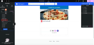
Rating Stars (Heading 2 — Duplicate):

  • Duplicate the rating number heading.
  • Change the dynamic tag to ‘Rating Stars’.
  • Star Size: 13 pixels. Gap between stars: 0.

Total Review Count (Heading 3):

  • Add another Heading.
  • Dynamic Tag: Total number of ratings received.
  • Display in brackets (configure before/after labels as needed).
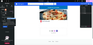
6.6 Category & Price Container

This container holds the post category icon, category name (term), and the listing price.

Container Properties:

  • Padding: Top — 14px, Bottom — 4px, Sides — 18px.
  • No shadow effects.
  • Direction: Row. Gap: 9 pixels.

Category Icon (Custom Term Meta):

  • Add a Heading element.
  • Open Dynamic Tag settings.
  • Under ‘CubeWP Single Post Data > Post Term’
  • Select the listing categories taxonomy from the taxonomy dropdown.
  • Choose ‘Custom Term Meta’ as the term field.
  • Enter the slug of the icon field from the backend in the Custom Meta Field ID
  • Wrap the icon in the appropriate HTML tag. Set icon width to 13 pixels.
  • Link: Use ‘Post URL’ from Cube WP Single Post Data.

Configuring Term Meta in Backend:

  • Go to WordPress backend > Cube WP > Custom Fields > Taxonomies.
  • Add icon fields for taxonomy terms here.
  • The field value uses standard Font Awesome icon classes.
  • Copy the field slug; paste it into the ‘Custom Meta Field ID’ in the dynamic tag settings.
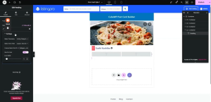
Category Name:

  • Duplicate the category icon heading.
  • Change the term field to ‘Term Name’.
  • Link: Use ‘Term URL’.
  • Line Height: 19 pixels. Align: Center.

Listing Price Element:

  • Search for ‘Listing Price’ in the Elementor panel.
  • Add it to the price container.
  • Configure the dropdown to select how price symbols are displayed (e.g., 4 symbols, 2 active).
  • Tooltip configuration: show or hide the label. Tooltip can display full pricing details.

Price Styling:

  • Font Weight: 600. Line Height: 24 pixels. Color: Slate.
  • Letter Spacing: 1 pixel. Font: Open Sans, 13 pixels.

Tooltip Styling:

  • Font: Open Sans, 12 pixels. Font Weight: 500.
  • Line Height: 22 pixels. Text Color: White.
  • Background Color: Blue. Padding: 11 pixels (left/right).
  • Border Radius: 5 pixels. Arrow color: Blue.
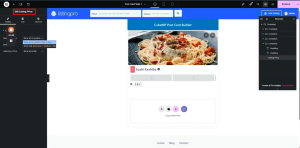
6.7 Location Container

Displays the listing location using an icon and the location term name.

  • Add a container. Set width to ‘Fit Content’.
  • Direction: Row. Align Items: Center. Gap: 3 pixels.

Location Icon:

  • Add an Icon element. Select the map/location pin icon.
  • Style the icon color as per the design.

Location Name (Term Name):

  • Add a Heading element.
  • Dynamic Tag: Under ‘Single Post Data > Post Term’.
  • Select taxonomy as ‘Listing Location’. Term field: ‘Term Name’.
  • Font: Open Sans, 13 pixels. Font Weight: 500.
  • Color: As per design.

6.8 Business Hours (Open/Closed Status)

  • Add a Heading element.
  • Open Dynamic Tag settings.
  • Select ‘Business Hours’ field type from the dropdown.

Status Color Configuration:

Open Now: Set to bright green.

Closed Now: Set to red.

24 Hours / Day Off: Set to the default design color for consistency.
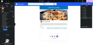
7. Bottom Action Row: Buttons Container

The bottom section of the post card contains two main action areas: a ‘Call Now’ button with click-to-call functionality, and a ‘Directions’ button that triggers a popup map.

7.1 Bottom Container Layout

  • Add a new container below the category/price row.
  • Set padding: Margin — 0. Padding — Top: 9px, Right: 21px, Bottom: 10px, Left: 21px.
  • Direction: Row. Space-between justification. Align Items: Center.
  • Inside this container, add two child containers.

7.2 Child Container Configuration

  • Container 1 (Call Now side): Width — Fit Content.
  • Container 2 (Directions side): Width — Fit Content.
  • Both containers: Set width to custom ‘fit-content’.
  • Set parent container row direction with space-between and center alignment.
  • Inside each child container, add two more containers as needed.

7.3 Call Now Button

The Call Now button triggers a phone call using the listing’s phone number via a dynamic tel: link.

  • Add a Button element inside the first child container.
  • Set the button text to ‘Call Now’.
  • Add a call/phone icon from the icon library.

Call Now Button Styling:

  • Container padding: 4 pixels (can be increased).
  • Font Size: 13 pixels. Font Weight: 500.
  • Text Color: As per design. Background Color: As per design.
  • Border Type: None. Border Radius: 0. Padding: 0 (left: 1px).
  • Icon Hover Color: Blue. Text Hover Color: Blue.

7.4 Click-to-Reveal Popup Options (Show Number)

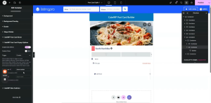
A popup mechanism can be used to initially show the Call Now button, and upon clicking, reveal the actual phone number. This uses CubeWP Post Card Popup options.

How it works:

  • The initial ‘Call Now’ button container is shown by default.
  • Clicking it hides this container and shows the phone number container.
  • A CSS class called ‘show-number’ is assigned to the phone number container.

Configuring the Initial Button (Hide on Click):

  • Open the container’s Style settings.
  • Navigate to ‘CubeWP Post Card Popup Options.’
  • Enable click effects.
  • Set Trigger: Custom.
  • Set ‘Show class’: Enter ‘show-number’ — this will open the container with the matching class.
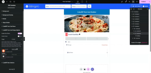
Phone Number Button Configuration:

  • Add a new container for the phone number display.
  • Add a button element inside the phone number container.
  • Set the button text field to use a dynamic post field (Field type(text)).
  • Set the data source “Post fields”
  • Select “Phone Number” as the custom field.
  • For the link, use the dynamic tag and set “Field type(text)”.
  • Select Custom field “Phone Number”
  • Add ‘tel:’ prefix in the link’s ‘before’ attribute in Advanced settings.

Note: If the phone field in Elementor is showing as a text field, convert it to a number/phone field type and update the dynamic tag selection accordingly.
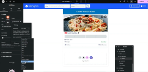
 Phone Number Button Styling:

  • Border Radius: 4 pixels.
  • Font Size: 13 pixels. Font Weight: 500.
  • Text Color: As per design.
  • Background Color: Transparent.
  • Hover Text Color: Blue. Hover Icon Color: Blue.

Configuring the Phone Number Container (Open on Trigger ):

  • Navigate to ‘CubeWP Post Card Popup Options.’
  • Enable click effects.
  • Set Trigger: Custom.
  • Set ‘Custom class’ to ‘show-number’. On click, the ‘show’ class is toggled.
  • This container opens when the initial button is clicked, revealing the phone number.
8. Completing the Bottom Action Row Styling

Before finalizing the popup map, the bottom action row containers require specific padding and layout adjustments to match the target design.

8.1 Bottom Row Container Padding

  • Confirm margin is set to 0 for the outer bottom container.
  • Padding configuration: Top — 9px, Right — 21px, Bottom — 10px, Left — 21px.
  • Verify direction is set to Row with space-between justification and center alignment.

8.2 Child Containers for Actions

  • Both child containers (Call Now side and Directions side) should have their widths set to ‘fit-content’.
  • Go to each container’s width settings, select ‘Custom’, and type ‘fit-content’.
  • For the parent container, also verify the row direction, space-between, and center alignment are still correctly applied.

8.3 Sub-containers for Each Action

Inside each child container, additional sub-containers are used for fine-grained layout control.

  • Add two sub-containers inside the Call Now child container and two inside the Directions child container.
  • Each sub-container should also use ‘fit-content’ width.
  • Ensure these containers are set to fit-content so they wrap tightly around their inner content.

9. ‘Get Directions’ Heading & Popup Container Setup

The ‘Get Directions’ button consists of a map icon and a text heading, housed within a container that triggers the fullscreen map popup.

9.1 Adding the Get Directions Heading

  • Inside the directions sub-container, add a new Heading element.
  • Type ‘Get Directions’ as the heading text.
  • Select the Paragraph tag from the element settings.

Get Directions Typography:

  • Font Family: Open Sans.
  • Font Size: 13 pixels.
  • Color: Apply the specific hex code from the design (as required).

Note: Once applied, the text should appear clearly and match the design layout. If the font size appears incorrect in the editor, verify the correct value is entered in the typography settings.

9.2 Popup Trigger Container (Directions Side)

The container holding the directions icon and heading is configured as a popup trigger. This uses the CubeWP Post Card Popup Options settings.

  • The primary visible container (holding icon + heading) has a custom class ‘show-map’ assigned to it.
  • This container is configured to be open/visible by default.
  • All necessary popup configuration options are enabled within this container’s settings.
  • A secondary container inside this one will hold the actual trigger elements and other options.
  • Navigate to ‘CubeWP Post Card Popup Options.’
  • Enable click effects.
  • Enable Custom Class 
  • Assign Show-map class to it

10. Fullscreen Map Popup: Complete Configuration

The fullscreen popup is a fixed-position overlay that appears when the user clicks the Directions button. It contains a close button and the interactive map widget.

10.1 Outer Popup Container (Fixed Overlay)

This container forms the base layer of the fullscreen overlay:

  • Add a new container outside all existing post card containers.
  • Set margin to 0.
  • Set Position to Fixed.
  • This removes the container from the document flow and anchors it to the viewport.
  • Set the background color for the overlay (typically semi-transparent dark color for modal effect).
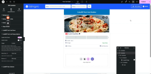
  • We want to show this container when the Get Direction Button is clicked and want to hide this container when times icon is clicked that why in style section we will navigate to CubeWP Post Card Popup Options
  • Enable Click effect. From the trigger dropdown, select custom.
  • Give ‘show-map’ class in the Show class field. The same class was given to the Get direction button
  • Give ‘hide-map’ to the Remove field. The same class given to the times icon.

Note: Because this container’s position is ‘fixed’, it will overlay the entire screen when shown. This is the intended behavior for the fullscreen map popup.
10.2 Inner Viewport-Filling Container

Nested inside the fixed outer container, this container fills the entire visible screen area:

  • Width: 100vw (full viewport width).
  • Height: 100vh (full viewport height).
  • Flex Direction: Column (or Row as needed).
  • Justify Content: Center.
  • Align Items: Center.
  • Gap: 0 pixels.

10.3 Map Wrapper Container (Max Width Constraint)

A third nested container constrains the maximum display width of the map:

  • Add this container inside the viewport-filling container.
  • Set Max Width: 1170 pixels.
  • This ensures the map does not stretch too wide on large screens while remaining responsive.
  • Add the map widget directly inside this container.

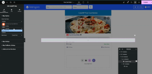
10.4  Add CubeWP Map Widget 

  • When the map widget container is grouped, reset padding values to default.
  • Set the inner container width to ‘fit-content’ so it wraps around the map.
  • Drag the CubeWP Map inside the container.
  • The map widget is linked to the address custom field of the listing post type.
  • Post Type: Listings.
  • Address Field: The specific custom field used to store the listing’s physical address.
10.5 Close Button Configuration (Final)

The close button is an icon positioned in the top-right corner of the popup:

  • Add a container inside the map popup, separate from the map wrapper.
  • Width: Fit Content.
  • Add an Icon element to this container. Select the ‘Times’ (X close) icon.
  • Set Position to Absolute. Top: 0. Right: 0.

Close Icon Styling:

  • Icon Color: White.
  • Font Size: 20 pixels.
  • Padding: 10 pixels on all sides.
  • Background Color: Configured to match design (typically a semi-transparent dark or branded color).
  • Border Radius: Applied for rounded appearance.

Close Interaction:

  • Assign CSS class ‘hide map’ to the close container.
  • Set trigger to Mouse Click.
  • Action: Close the popup.
  • Configure the show/hide settings to close the fullscreen overlay when this icon is clicked.

Note: Verify that the close button correctly removes the ‘show’ class from the popup overlay, hiding it from view. Test on the live frontend.
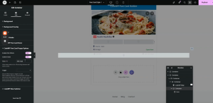
10.6 Custom Delay & Transition Options

  • Optionally, a custom delay can be configured for the popup open/close transition.
  • The ‘show/hide’ options in the Cube WP Post Card Builder settings allow configuring how the popup appears.
  • Height customization of the popup can be set from these options.
  • Additional switches and delivery options can be adjusted as needed within the popup settings.


11. Final Styling Adjustments

After all containers and widgets are in place, a final pass of styling refinements is required to ensure the card fully matches the target design.

Note: If the ‘#’ hash is left in place, clicking the Directions button will cause the page to scroll to the top before the popup opens. Always remove the hash after testing is complete.

11.1 Applying the Custom Post Card Style to the Homepage

  • After publishing the post card template, navigate to the homepage in Elementor.
  • Click on the Cube WP Posts widget.
  • In the widget settings, find the ‘Card Style for Listings’ option.
  • Select ‘Post Card Style 1’ from the dropdown.
  • Save and publish the homepage.
  • Reload the homepage to verify the new post card style is applied to all listings.

11.2 Remaining Spacing & Layout Fixes

After the initial frontend review, fine-tune any remaining spacing discrepancies:

  • If extra padding is visible around the Call Now button, set that button’s padding to 0 to remove the default spacing.
  • Verify the gap between the action buttons matches the design (approximately 4-7 pixels).
  • If elements appear misaligned, check the container’s align-items and justify-content properties.
  • Reload and verify after each adjustment.


This concludes the complete technical guide for building a fully dynamic, interactive post card using Elementor and CubeWP. The card includes a featured image with save/view overlays, post title, ad label, claim status, ratings, category, pricing, location, business hours, a click-to-reveal call button, and a fullscreen interactive map popup for directions.


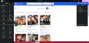
Here is the complete video tutorial
How to add listing posts and interactive map on the archive page?

Archive & Search Page Builder

 Archive Map · Post Results · Post Card Templates · List/Grid View 

Document Overview
Scope Archive Map widget with custom pins; Archive Posts widget, Archive post card template; list/grid view toggle; horizontal list layout; common layout fixes
Tools Elementor, CubeWP Theme Builder, WordPress 

Introduction

This tutorial covers the Archive Map widget for the right-side panel, the Archive Posts/Results widget, and final page publishing. This tutorial also includes creating a dedicated post card template specifically for the archive listing page, configuring the list view and grid view display modes using the CubeWP View Switcher, restructuring the post card layout to support horizontal (list) display, and resolving layout issues such as image sizing, container wrapping, and alignment.


1. Archive Map Widget

The right-side panel contains the Archive Map widget, which displays all listing locations on an interactive map. The map spans the full viewport height alongside the search results.

1.1 Map Container Setup

  • Inside the right-side container (calc(100% – 815px) width), add a nested container.
  • Set this container height to 100VH (full viewport height) — the map should fill the entire visible browser height.
  • Add another nested container inside it with width: 100%.
  • Remove default padding from this inner container.
  • Inside this container, add the Archive Map widget.

1.2 Archive Map Widget

  • Search for ‘Archive Map’ in the Elementor widget panel — this is a custom widget within the CubeWP.
  • Add it inside the map container.
  • Show in Popup: Disable (we want the map always visible on desktop, not hidden in a popup). On mobile, popups are used instead.
  • Show Layout: Desktop only.


Archive Map Styling:

  • Map Height: 100VH (full viewport height).
  • Map Width: 100%.
  • Border Type: None. Border Radius: 0.

1.3 Custom Map Pin Configuration

The archive map uses a custom pin design instead of the default map marker.

  • Enable Custom Map Pin: Yes.
  • Select the pin icon from the menu icon options.

Pin Wrapper (Outer Wrapper) Styling:

  • Background Color: As per design (specific hex code for the pin background).
  • Width: 50px. Height: 50px.
  • Padding: Top 6px, Left 7px.
  • Border: Solid, 1px width. Border Color: As per design (paste hex). Border Radius: 50%.
  • Rotation: 315 degrees (rotates the pin to appear as a diamond/arrow shape pointing down).

Hover State for Pin Container:

  • Background Color: As per design (set hover background).

Icon Wrapper Styling:

  • Width: 35px. Height: 35px.
  • Padding: Top 6px, Bottom 10px, Left 10px (10px all sides).
  • Border Type: Solid. Border Width: 1px. Border Color: As per design (paste hex).
  • Border Radius: 50% (creates circular icon wrapper).
  • Background Color: White.
  • Rotation: 33 degrees (counter-rotation to keep the icon upright despite the container being rotated 315 degrees).

Pin SVG Styling:

  • SVG Color: As per design.
  • SVG Size: 14px. SVG Rotation: 14px (adjust to align icon correctly).

1.4 Map Post Card Styling

When a user clicks a pin on the map, a small post card appears. This card can be custom styled.

  • Margin: 0. Padding: 0.
  • Content Width: 330px.
  • Border Radius: 5px.
  • Image Width: Full (set to 100% of the card width). Height: 200px. Min-Height: 42px.
  • Object Fit: Cover. Image Border Radius: 0.
  • Title Padding: 15px. Top: 20px. Bottom: 20px.
  • Title Color: As per design. Title Hover Color: Blue (copy hex).
  • Title Typography: Open Sans, 18px.


2. Archive Posts Widget

The left-side results area uses a dedicated Archive Posts widget that dynamically displays the search and filter results as post cards.

2.1 Adding the Archive Posts Display Widget

  • Inside the results area of the left container (below the filter row), add the dedicated Archive Posts Display widget.
  • This is a specialized widget available in the CubeWP  specifically designed for archive page post display.
  • Select which post types to display from the widget settings i.e listing for our case.


2.2 Styling the Archive Posts Widget

  • Navigate to the Style section of the widget.
  • Configure the styling options (card layout, spacing, columns) as required.
  • A custom CSS class can be assigned here for further custom styling.

Note: The Archive Posts widget automatically links to the active filters, sort options, and the archive map. When a user applies a filter or clicks a map pin, the results update dynamically without a page reload.

2.3 Container Height for Archive Results

  • Set the main archive results container height to 100VH so it fills the viewport alongside the map.
  • This ensures the left panel and right map panel are the same height visually.


3. Publishing the Archive Template

3.1 Publishing Steps

  • After completing all widget configurations and styling, click ‘Publish’ in the Elementor editor. All the changes made now will be published now and visible to everyone.


4. Creating the Archive Listing Post Card Template

The archive page requires its own dedicated post card template, separate from the general post card (Post Card Style 1) built previously. This ensures the archive can have its own unique layout, dimensions, and column arrangement.

4.1 Adding a New Post Card Template

  • Navigate to the WordPress backend > Cube WP > Theme Builder.
  • Click ‘Add New Template.’
  • From the template type dropdown, select ‘Post Card.’
  • Name the template: ‘Archive Listing Post Card Style’ (or a similar descriptive name).
  • Click ‘Save and Edit’ — the Elementor editor will open, initially showing an empty canvas.

Note: A separate template is created here (rather than reusing the existing post card) so that the archive page can display two cards per row by default and support a dedicated list view layout without affecting other pages that use the original post card.

4.2 Copying Existing Post Card Content

Since the archive post card design matches the existing post card (built in the Post Card tutorial), the content can be copied directly rather than rebuilt from scratch:

  • Open the previously built post card template (Post Card Style 1).
  • Select all content inside it and copy it entirely.
  • Return to the new ‘Archive Listing Post Card Style’ template.
  • Paste the copied content directly into the new template.
  • All widgets, dynamic tags, and styling from the original post card are now replicated in the archive post card.

Note: The copy-paste approach saves significant time. However, the archive post card will require structural adjustments (see Section 4) to support the list view horizontal layout.

4.3 Assigning the Archive Post Card to the Widget

  • After publishing the archive post card template, navigate back to the archive page in Elementor.
  • Click on the Archive Posts widget.
  • In the widget settings, find the ‘Post Card Style’ or ‘Basic Style’ option.
  • Select ‘Archive Listing Post Card Style’ from the dropdown.
  • Verify that post cards now appear in two-per-row layout on the archive page.

4.4 Adding Margin to the Post Card Container

  • The main (parent) container of the archive post card needs a bottom margin to create spacing between cards.
  • Open the archive post card in Elementor editor.
  • Select the main/parent container.
  • Add a Margin Bottom of 20 pixels to create vertical spacing between card rows.

4.5 Giving Default column class to have 2 cards in a row

  • From the post settings,  give the default class as col-lg-6 to have specific width for the post card.

5. Configuring Grid View

The archive page supports two display modes: Grid View (cards arranged in columns) and List View (cards stacked horizontally with image on the left). These are controlled by the CubeWP View Switcher setting, which assigns a CSS class to the results container.

5.1 Grid View Container Setup

  • Inside the archive post card template, locate the main outer container (the top container in the layer stack).
  • Duplicate this container to create a copy for the grid view variant.
  • Navigate to the Style settings of the container.
  • Find the ‘CubeWP View Switcher’ option within the style settings.
  • Enable the View Switcher.
  • Select: Grid View.

Note: Grid view is typically the default selected state. Enabling it on the first (top) container establishes it as the grid display version of the card.

5.2 List View Container Setup

  • On the second (duplicated) container, navigate to its Style settings.
  • In the CubeWP View Switcher section, enable the View Switcher.
  • Select: List View.
  • This container will be shown when the user clicks the List icon in the List/Grid Switcher.

Note: The two containers (grid and list) work as a toggle pair. When grid is active, the grid container is shown and the list container is hidden. When list is active, the reverse applies. The CubeWP View Switcher handles this toggle automatically based on user clicks.

6. List View Layout Structure

The list view requires a horizontal layout where the post image appears on the left and all content (title, rating, price, location, buttons) appears on the right. This requires restructuring the container hierarchy inside the list view variant of the post card.

6.1 Creating the Horizontal Layout

  • Select the list view container.
  • Add a new full-width container inside it.
  • Move the existing image container (top section) into this new container.
  • Add another new container below/beside the image container.
  • Move all remaining content elements (title, ratings, category, price, location, buttons) into this second container.

The result is a row layout with two columns: the image on the left and all content on the right.

6.2 Outer Wrapper Container (List View)

  • Set the outer wrapper container to Full Width.
  • Set display to Flex. This enables the two side-by-side columns.
  • Remove default padding. Remove margin.
  • Set Flex Wrap: No Wrap — this prevents the image and content from stacking vertically.
  • Set Justify-Content: Left (flex-start) to align content from the left.

6.3 Image Container (Left Column in List View)

  • The image container takes the left side of the horizontal layout.
  • Set Max Width: 270 pixels (this constrains the image column width).
  • Set Width: 270 pixels initially; adjust to 200 pixels as needed for the final design.
  • Remove default padding.

Image Dimensions in List View:

  • Image Height: 170 pixels (set as the fixed height for the list view image).
  • Image Width: 100% (fills the 270px/200px column width).
  • Image object-fit: Cover (ensures the image crops correctly without distortion).
  • Image Min-Height: 200 pixels (ensures minimum height is maintained).
  • Image actual height: Set to 207 pixels (exact pixel height configured in the image element settings).
  • Later, image height is adjusted to 180 pixels for better visual balance.

Note: The image height values go through several iterations during testing. The final recommended value is 180 pixels, but you can adjust this to match your specific design requirements.

6.4 Content Container (Right Column in List View)

  • The content container takes the right side of the horizontal layout.
  • Set Width: 100% (fills remaining space after the image column).
  • Set Height: 100% (matches the height of the image column).
  • Remove all default padding.
  • Set position: relative or as needed for the action buttons.

Right Content Container Width Calculation:

  • The content width is calculated as: 100% minus the image column width.
  • Example: If image column = 200px, content column width = calc(100% – 200px).
  • In Elementor, use the custom width field and enter the calculated value.

6.5 Flex Direction & Alignment

  • Set the main wrapper container flex-direction to Row.
  • Padding-Left for the content section: Set to 20 pixels to create inner spacing between image and text content. This results in 10px effective spacing on left and right sides.
  • Gap between image and content columns: 0 pixels.

7. Final Dimension Adjustments

7.1 Image Height Finalization

  • After the initial list view setup, test the page on the frontend.
  • If the image appears too tall or short, adjust the image height value.
  • Final recommended height: 180 pixels.
  • After adjusting, set the image container Bottom Padding to 0 to remove any gap below the image.
  • Publish changes. Reload the page to verify the correct image height on the frontend.

7.2 Container Width Refinements

  • If the layout does not appear correctly after the first publish, return to the list view container.
  • Adjust the image container width from 270 to 200 pixels.
  • Ensure the content container width is set to calc(100% – 200px) or equivalent.
  • Set the content container position offset to -200 (matching the image column width).
  • Publish and reload to verify alignment.

7.3 Height to 100%

  • For both the image and the content container, set Height: 100%.
  • Navigate to Advanced settings and remove any fixed height values that might override the 100% setting.
  • Set the image element inside the container to Height: 100% as well.
  • This ensures the image stretches vertically to match the content column height.
  • Publish and reload after each change to verify the result.


8. Applying the Post Card to the Archive Page

8.1 Selecting the Archive Post Card Style

  • Navigate back to the archive page in Elementor.
  • Click the Archive Posts / results widget.
  • In the Style section, find the post card style selector.
  • Select ‘Archive Listing Post Card Style’ from the dropdown.
  • The archive post card is now deactivated from the general post card slot (which previously showed the default style), and the new archive-specific card is active.

8.2 Two Cards Per Row

  • After selecting the archive post card style, the grid view should show two cards per row by default.
  • This is controlled by the CSS class defined in the post card template.
  • Define the specific CSS class in the post card’s outer container settings.
  • Set the alignment to left (flex-start) to ensure cards begin from the left edge.


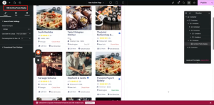
Here is the complete video tutorial
How to add archive page template, sort by filter, list-grid view switcher and search results filters on the archive page

Archive & Search Page Builder

Archive Template Setup, Page Layout Structure & Search Filter Builder

Document Overview

Scope: Creating a new archive/search page template, building the two-column layout, configuring Sort By dropdown, and adding Search Filter Builder widgets

Tools: Elementor, CubeWP  Theme Builder, WordPress


1. Introduction & Overview

This guide covers the complete process of building a custom archive and search results page using Elementor and the Cube WP plugin. The archive page is used for displaying search results, taxonomy pages, and any post type listing pages. The Archive page includes a professionally designed two-column layout featuring an interactive map, dynamic filters, and sort options. In this tutorial, we will learn how to add the Sort By dropdown, List/Grid switcher, search filters (Near Me, Open Now, Best Match, All Categories) on the archive page.


2. Creating the Archive Template

2.1 Navigating to the Theme Builder

  • Log in to the WordPress backend.
  • Navigate to Cube WP Theme Builder.
  • An existing archive template may already be present — a new one will be added alongside it.

2.2 Adding a New Archive Template

  • Click ‘Add New Template.’
  • From the template type dropdown, select ‘Archive.’
  • Give the template a descriptive name (e.g., ‘New Archive Page’ or ‘New Archive’).
  • For ‘Display On’, set it to ‘All Archives’ so it applies to all search queries, taxonomy pages, and any archive page type globally.

Note: If you only want the template to apply to a specific page type (e.g., only search results or only a specific taxonomy), you can set ‘Display On’ to that specific condition instead. Templates can later be copied and assigned to different conditions.

  • Click ‘Save and Edit’ — this redirects you to the Elementor editing screen for the new archive template.


3. Page Layout Structure

The archive page uses a specific two-container layout: a fixed-width left container (815px) for filters and results, and a flexible right container that takes the remaining width (calc(100% – 815px)) for the map.

3.1 Outer Wrapper Container

  • Add a new container inside the Elementor editor.
  • Set the width to Full Width — this is the outer wrapper for the entire row.
  • Set the flex direction to Row (horizontal layout).
  • Set padding to the required values. Set border radius as per design.
  • Set margin to 0.

3.2 Left Content Container (815px)

  • Add a nested container inside the outer wrapper.
  • Set the width to exactly 815 pixels.
  • Set padding: 25px on the left side, 25px on the right side.
  • This container will hold all the search filters, sort options, and post card results.

Note: The 815px container is the inner content column. Its padding of 25px on each side provides visual breathing room for the filter and results content within it.

3.3 Right Map Container (Remaining Width)

  • Add a second container alongside the left container inside the outer wrapper.
  • Set the width using a calculated value: 100% minus 815 pixels (i.e., calc(100% – 815px)).
  • Set all gap values to 0.
  • Remove all default padding.
  • This container will hold the Archive Map widget and spans the remainder of the horizontal space.

3.4 Inner Structure of the Left Container

Inside the 815px left container, there are two main sections stacked vertically:

Top Section (Filter Row): Contains the dynamic page title, Sort By heading, Sort By dropdown, and the List/Grid View Switcher.

Bottom Section (Results Row): Contains the filter buttons (Near Me, Open Now, Best Match, All Categories) and the post card results grid.

Both sections use nested containers with all default padding and gap values removed for precise alignment control.

3.5 Top Filter Row Container

  • Add a new row/container inside the left content container.
  • This row organizes the filter section at the top and the post results directly below.
  • Set all initial values (gap, padding, margin) to 0.
  • Inside this top row, add three separate sub-containers: one for the page title area, one for the Sort By section, and one for the List/Grid Switcher.
  • Remove all default padding from each sub-container.

4. Page Title & Sort By Label

4.1 Page Title Container

The top-left section of the filter row shows the current page title dynamically.

  • Add two containers inside the title section: one for the ‘Most Recent’ label and one for the dynamic page title.
  • Set both containers to ‘fit-content’ width.
  • Set space-between for the parent container alignment.
  • Gap between the two title elements: 4 pixels.

‘Most Recent’ Label (Static Heading):

  • Add a Heading element. Set text to ‘Most Recent’.
  • HTML Tag: H3.
  • Font Family: Open Sans.
  • Font Size: 14px. Font Weight: 400.
  • Text Transform: Capitalize.
  • Line Height: 13px (as per design).
  • Text Color: As per design.

Dynamic Page Title:

  • Add a dedicated Heading widget.
  • This widget uses the ‘Dynamic Page Title’ tag, available under Value Pack Custom Tags within the Cube WP value section.
  • No matter which archive or search page is loaded, this heading will automatically update to show the current page’s title.
  • HTML Tag: H3. Copy and paste the same styling as the ‘Most Recent’ label above (use ‘Paste Style’ to apply identical formatting).


5. Sort By Dropdown Widget

The Sort By section allows users to sort search results. It uses the CubeWP Search Filter Builder widget configured specifically for sorting functionality, displayed as a dropdown.

5.1 Sort By Container Setup

  • Add a container for the Sort By section inside the top filter row.
  • Set container alignment to center. Set gap: 40px (four-zero, between Sort By label and the dropdown).
  • Inside this container, add the ‘Sort By’ label heading and the Search Filter Builder widget.

5.2 Sort By Label

  • Add a Heading element with text ‘Sort By’.
  • Font Family: Open Sans. Font Size: 13px. Font Weight: Semi-Bold (600).
  • Line Height: 27px. Text Color: As per design.
  • HTML Tag: H3.

5.3 Search CubeWP Search  Filter Builder Widget (Sort By Dropdown)

  • Search for ‘CubeWP Search Filter Builder’ in the Elementor widget panel.
  • Drag and drop it into the Sort By container.
  • Set Post Type to ‘Listings’.
  • Show Layout: Desktop only (the mobile version is handled separately).

Sort Items Configuration:

  • Filter Type: Sorting.
  • Display Type: Dropdown (not buttons).
  • Default Sort Option: ‘Most Reviewed’ (set as the default/selected value).

Add the following sort items to the dropdown one by one:

Item 1 — Most Viewed: Sort by view count. Set the operation to ‘equal’. (Used for filtering by total view count — e.g., equal to, less than, greater than a specific number.)

Item 2 — Highest Rated: Sort by rating score. Field: ‘Post Rated’ (not Reviews Count — that is the total number of reviews, not the rating score itself).

Item 3 — Most Reviewed: Sort by number of reviews received. This is the default selected option.

Note: The ‘Most Viewed’ field uses a comparison operator (equal, less than, greater than). This is useful if you want to filter by a specific view threshold. For a standard sort-by-views, set it to ‘equal’ with no specific value, which will display all posts sorted by view count.

5.4 Sort By Dropdown Styling

Navigate to the Style tab of the Search Filter Builder widget to apply the following styles to the Sort By dropdown button and its dropdown menu items.

Dropdown Button Styling:

  • Custom Icon: Select the desired icon for the dropdown trigger button (e.g., a sort icon). Icon Offset: Top -2px, Right 5px.
  • Text Color: As per design. Text Hover Color: Blue.
  • Background Color: As per design. Background Hover Color: As per design.
  • Typography: Open Sans, 13px, Semi-Bold (600), Capitalize, Line Height 27px.
  • Padding: 0. Border Radius: 0. Border Type: None.

Dropdown Menu Styling:

  • Background Color: White.
  • Min Width: Default (not manually set).
  • Padding: 10px. Border Radius: 6px.
  • Box Shadow: Enabled. Vertical Offset: 10px. Color: As per design.

Dropdown Item Styling:

  • Text Color: As per design. Background Color: White.
  • Typography: Open Sans, 13px, Weight 500, Capitalize, Line Height 19px.
  • Border Radius: 7px.
  • Padding: Bottom 14px, Left & Right 10px.
  • Hover Text Color: As per design. Hover Background: White.
  • Selected/Active Background: Bright Blue.


6. List/Grid View Switcher

The List/Grid Switcher allows users to toggle between a card grid layout and a list layout for the search results.

6.1 Switcher Container Setup

  • Add a new container inside the top filter row for the switcher.
  • Set container padding: 0. Width: Fit Content.
  • Set alignment to center. Gap: 8px.
  • Margin Left: 20px (to create visual separation from the Sort By section).

6.2 Archive Post List/Grid Switcher Widget

  • Search for ‘Archive Post List Grid Switcher’.
  • Add it to the switcher container.
  • In the widget settings, for the Grid item: remove the default text label.

Switcher Styling:

  • Item Padding: 13px right, 12px top, 12px bottom, 13px left.
  • Border: None (set border type to none). Border Radius: 7px.
  • Box Shadow: Enable. Color: As per design. Vertical Offset: 12px. Blur: 26px.
  • Icon Color: White (copy and paste the specific hex code).
  • Icon Size: 18px. Icon Spacing: 0 (no text displayed, spacing not needed).
  • Active Background Color: As per design (copy and paste hex code).

7. Search Filter Builder — Near Me Filter

Below the top filter row, a secondary filter row contains quick-access filter buttons and dropdowns. The first filter is the ‘Near Me’ button, which searches listings by geographic proximity to the user.

7.1 Near Me Filter Container

  • Add a new container for the filter row below the top sort/title row.
  • Remove default padding. Set direction to Row. Justify-Content: Space-Between. Align-Items: Center.
  • Add two inner containers: one for the filter buttons (left side) and one for the ‘All Filters’ button (right side).
  • Left container: Width Fit-Content. Gap: 8px (between individual filter buttons). Direction: Row.

7.2 CubeWP Search Filter Builder Widget (Near Me)

  • Add a CubeWP Search Filter Builder widget inside the left filter container.
  • Post Type: Listings.
  • Show Layout: Both (mobile and desktop).
  • Filter Type: Filters.  
  • How to show filter: Select “Show simple field” option
  • Field Type: Custom Fields. Field: Address.
  • Enable ‘Near Me’ option: Yes.
  • Filter Label: ‘Near Me’. Button Text: ‘Near Me’.
  • Icon: Location/map pin icon. Icon Position: Left.

Near Me Button Styling:

  • Field Icon Style: Icon Position — Absolute. Icon Color: White.
  • Button Type: Switch button (primary switch).
  • Text Color: As per design. Background Color: #FFFFFF (White).
  • Padding: 10px. Border Radius: 7px.
  • Box Shadow: Vertical 10–12px, Blur 26px. Color: As per design.
  • Flex Direction: Row. Gap: 0. Icon Size: 13px. Row Spacing: 7px.
  • Icon Color: As per design.
  • Hover/Active Text Color: White. Hover/Active Background: Blue.
  • Hover/Active Icon Color: White.

8. CubeWP Search Filter Builder — Open Now Filter

8.1 Open Now Filter Setup

  • Add another CubeWP Search Filter Builder widget next to the Near Me filter.
  • Post Type: Listings.
  • Filter Type: Filters. 
  • How to show filter: Select “Show simple field” option
  • Field Type: Custom Fields. Field: Business Hours.
  • Filter Label: ‘Open Now’.
  • Feature: This filter shows only businesses that are currently open at the time of the search.
  • Button Icon: Clock icon (select from icon library).

Open Now Button Styling:

  • Typography: Open Sans, 13px, Weight 600, Capitalize, Line Height 27px.
  • Background Color: White. Border Type: None.
  • Padding: Top & Bottom 10px, Left & Right 18px. Border Radius: 7px.
  • Box Shadow: Vertical 12px, Blur 26px. Color: As per design.
  • Icon Size: 13px. Icon Spacing: 8px.
  • Hover/Active Text Color: White. Hover/Active Background: Blue.
  • Hover/Active Icon Color: White. Active Text Color: White.


9.  CubeWP Search Filter Builder — Best Match Filter

9.1 Best Match Filter Setup

  • Add a CubeWP Search Filter Builder widget for the Best Match sorting option.
  • Filter Type: Sorting. Display Type: Button (not dropdown — this appears as a clickable button, not a dropdown list).
  • Sort By: Relevance. Button Text: ‘Best Match’ .
  • Button Icon: Upload a custom icon file representing ‘best match’.

Best Match Button Styling:

  • Text Color: As per design. Background Color: White.
  • Typography: Open Sans, 13px, Weight 600, Capitalize, Line Height 21px.
  • Padding: Top & Bottom 13px, Left & Right 20px. Margin: 0.
  • Border Radius: 7px. Border: None.
  • Icon Color: As per design. Icon Size: 13px. Icon Spacing: 8px.
  • Hover Text Color: White. Hover Background: Blue. Hover Icon Color: White.


10. CubeWP Search Filter Builder — All Categories Dropdown

10.1 All Categories Filter Setup

  • Add a new CubeWP Search Filter Builder widget inside a dedicated container.
  • Post Type: Listings.
  • Filter Type: Filters. 
  • How to show filter: Select “Show simple field” option
  • Field Type: Taxonomy. Taxonomy: ‘Listing Categories’.
  • Display Type: Select 2 (a searchable, styled dropdown — not a plain select).
  • Label: Remove (not needed in this context).
  • Placeholder: Set to ‘All Categories’ to guide the user.
  • Field Icon: Search for ‘list’ icon in the icon library and select it.

All Categories Dropdown Styling:

  • Field Label: Disabled (turned off in Style settings).
  • Typography (Input & Select): Open Sans, 13px, Weight 600, Capitalize, Line Height 27px.
  • Text Color: As per design.
  • Placeholder Typography: Open Sans, 13px, Weight 600, Capitalize, Line Height 27px.
  • Padding: Top & Bottom 10px, Left 39px (extra left space for the icon), Right 18px.
  • Input Height: 47px.
  • Margin: 0. Border Type: None. Border Radius: 7px.
  • Box Shadow: Remove (set to 0). Vertical 12, Blur 26px.
  • Focus Text Color: White. Focus Background: Blue. Focus Border Color: Blue.
  • Enable Custom Select Icon: Yes. Upload custom SVG down-arrow icon.
  • Custom Icon Size: 16px.

Custom SVG Select Icon Configuration:

  • Upload the custom SVG file for the dropdown arrow (down-angle icon).
  • Size: 16px. Right offset: 53px (to position the arrow correctly inside the dropdown).
  • Field Icon Styling: Color — copy and paste the specific hex code used in the design.


11. All Filters Popup

The ‘All Filters’ button opens a side popup that exposes advanced filter fields: Delivery, Takeout, Price Range, and Gender. This popup uses the Search Filter Builder widget configured as a popup trigger.

11.1 All Filters Container Setup

  • Add a new container next to the filter buttons (left side) — this will be the right portion of the filter row.
  • Padding: Right side — 3 pixels.
  • This container holds the ‘All Filters’ Search Filter Builder widget.

11.2 CubeWP Search Filter Builder Widget (All Filters Popup)

  • Add a CubeWP Search Filter Builder widget inside this container.
  • Post Type: Listings.
  • Show Layout: Both (mobile and desktop).
  • Filter Type: Filters.
  • How filed show: Show in Popup (when clicked, opens a popup — NOT a dropdown).

Note: The key distinction here is: the All Filters trigger uses a popup (side panel), not a standard dropdown. Ensure ‘popup’ is selected, not ‘dropdown’, so the filters slide in from the side.

Add the following four custom fields to the popup, one by one using ‘Add New’:

Field 1 — Delivery: Custom field type. Select the ‘Delivery’ custom field. Default option: Allow/No.

Field 2 — Takeout: Custom field type. Select the ‘Takeout’ custom field.

Field 3 — Price Range: Click ‘Add New’, then select the ‘Price Range’ custom field.

Field 4 — Gender: Click ‘Add New’, then select the ‘Gender’ custom field.


11.3 Popup Configuration Settings

  • Button Label: ‘All Filters’.
  • Button Icon: Select the standard filter icon from the icon library. Icon Position: Left side.
  • Popup Header Text: Filters
  • Popup Close Button: Enabled.
  • Show Apply Button: Enabled — labeled ‘Apply Filters’.
  • Popup Icon: No specific icon for the Apply button (left blank).
  • Popup Origin/Position: Configure  which side the popup opens (left, right, etc.) and its left/top position.

11.4 All Filters Popup Styling

Popup Style:

  • Background Color: As per design.
  • Text Color: As per design.
  • Typography: Open Sans, 13px, Weight 600, Capitalize, Line Height 27px.
  • Padding: As per design. Border Radius: 9. Box Shadow: Add box shadow — Color as per design, Vertical 12px, Blur 26px.
  • Background Overlay: Select the overlay option and choose the overlay color.

Popup Content Area:

  • Background Color: White.
  • Width: 300px.
  • Padding: Top 60px, Right 40px, Bottom 30px, Left 27px.
  • Margin: 0. Border Type: Default. Border Radius: 0.
  • Z-Index: Set (increase to ensure it overlays correctly).
  • Box Shadow: Add — Color as per design, Vertical 12px, Blur 26px.

Popup Header:

  • Padding: Top 40px, Right 0, Bottom 20px, Left 0.
  • Text Color: As per design.
  • Typography: Open Sans, 20px, Weight 700 (Bold). Line Height 22px.

Popup Close Button:

  • Color: As per design. Hover Color: Blue. Hover Background Color: As per design.
  • Icon Size: 18px. Padding: 0. Border Type: None. Border Radius: 0.
  • Position from Top: 35px. Position from Right: 30px.
  • Z-Index: Set (to ensure the close button renders above all content).

Popup Footer (Apply Button):

  • Enable Footer: Yes (to show the Apply Filters button). (Note: if not needed, disable it.)
  • Background Color: Blue (custom added).
  • Typography: Open Sans, 30px (or as per design), Weight 600, Line Height 27px.
  • Border Radius: 7.

11.5 Hover & Active States for Popup Trigger Button

  • Hover Background Color: Blue. Hover Text Color: White. Hover Icon Color: White.
  • Active Background Color: Blue. Active Text Color: White. Active Icon Color: White.

11.6 Switch Field Styling (Delivery/Takeout Toggles)

Inside the popup, the Delivery and Takeout fields use toggle switch components:

  • Switch: Set space-between layout. Border Type: None. Switch Border Radius: 4px.
  • Slider Handle Border Radius: 4px.
  • Background Color: White. Handle Background Color: White.
  • Handle Text Color: As per design. Main Text Color: As per design.

Label Styling (for switch labels):

  • Font Family: Open Sans. Font Size: 16px. Font Weight: 400. Line Height: 28px.
  • Label Color: As per design.
  • Remove default margin and padding from label. Z-Index: 1.

11.7 Input Field Styling Inside Popup

Input Typography:

  • Font Family: Open Sans. Font Size: 13px. Font Weight: 500.
  • Text Transform: Capitalize. Line Height: 27px. Text Color: As per design.
  • Text Hover Color: White.

Button Text (Apply / Place Order):

  • Font Family: Open Sans. Font Size: 13px. Font Weight: 500. Line Height: 27px.
  • Background Color: As per design. Text Color: White.

Input Options / Select Styling:

  • Color: White (for selected option text).
  • Padding: Top & Bottom 8px, Left 18px. Margin: Right 0, Left 0, Top 10px, Bottom 20px.
  • Border: Solid, 1px width. Border Color: As per design. Border Radius: 7px.
  • Focus Text Color: White. Focus Background: Blue. Focus Border: Blue.
  • Box Shadow: Not applied during focus state.

11.8 Checkbox Styling Inside Popup

  • Enable custom checkbox styling.
  • Background Color: White. Border: Solid 1px. Border Color: As per design. Border Radius: 2px.
  • Font Size: 25px.

Checkbox Label Styling:

  • Font Family: Open Sans. Font Size: 14px. Text Transform: Capitalize. Line Height: 27px.
  • Label Color: As per design.
  • Spacing: 33px. Letter Spacing: 38px. List Item Style Width: 100%. Margin Bottom: 10px.
  • Icon Size: 17px. Icon Top Spacing: 6px. Icon Left Spacing: 4px.
  • Parent container Align-Items: flex-start (so items align to the top, not stretch).


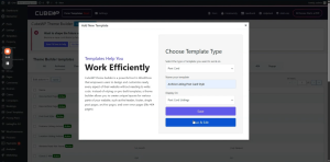
Here is the complete video tutorial
How to Add a Frontend User Dashboard?

Frontend User Dashboard

Building & Configuring the CubeWP User Dashboard

Platform WordPress + Elementor + CubeWP 
Feature Frontend User Dashboard
Tools CubeWP User Dashboard Builder + Elementor Shortcode
Scope Dashboard tab creation, content types, page setup, and shortcode integration

1. Overview

This guide explains how to build and configure the Frontend User Dashboard using the ListingPro Thema and CubeWP plugin in WordPress. The dashboard is a frontend interface accessible to logged-in users, displaying personalized content organized across multiple tabs. Each tab shows specific content types such as announcements, events, appointments, coupons, leads, reviews, inbox messages, and user listings.

2. Accessing the Dashboard Builder

2.1 Navigating to the Dashboard Builder

  1. Log in to the WordPress backend (admin panel).
  2. In the left menu, navigate to CubeWP.
  3. Click on the User Dashboard.

3. Configuring Dashboard Tabs

3.1 Understanding the Tab System

The frontend user dashboard is organized using a tab-based navigation system. Each tab represents a distinct content category visible to the user on the frontend. Tabs are configured individually in the dashboard builder.

3.2 Adding a New Tab

For each tab you want to add to the dashboard, perform the following steps:

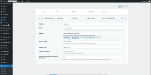
  1. Click Add New in the User Dashboard configuration screen.
  2. Enter a Tab Name (e.g., Dashboard, Announcements, Events, Appointments, Coupons, Inbox).
  3. Set a unique Tab ID string — this identifier is used internally for referencing the tab.
  4. Select an Icon for the tab from the icon selector (e.g., a calendar icon for Events).
  5. Configure the User Role setting to control which users see this tab. If no role is selected, the tab is displayed to all users by default.
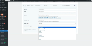
  6. Select the Content Type for the tab — either Page Content or Post Types.

3.3 Content Type Options

Page Content

Select this option when you want to display the content of a specific WordPress page inside the tab:

  1. Choose Page Content as the content type.
  2. In the page selector, choose the page you want to display (e.g., a page named Main Dashboard).
  3. That page’s content will render inside this tab on the frontend.


Post Types

Select this option when the tab should display a list of posts from a specific post type. Available post types include:

  • Announcements – Displays official announcements made by the admin.
  • Events – Displays event listings assigned to the user.
  • Appointments – Displays booking records (e.g., ListingPro Booking post type).
  • Coupons – Displays coupon posts associated with the user.
  • Leads – Displays leads received through the CubeWP form on single listing pages.
  • Reviews – Displays user-submitted reviews from single listing pages.
  • Listings (My Listings) – Displays all listings belonging to the logged-in user.


ℹ️  Note: When selecting Post Types, choose the appropriate post type from the available list (e.g., select announcements for the Announcements tab, or ListingPro Booking for the Appointments tab).


3.4 Plan-Based Content (Conditional Display)

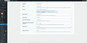
Certain tabs support a plan-based display condition. When this feature is enabled:

  • The tab content is only shown to users who have an active plan.
  • If a user has not subscribed to a plan or added a listing through a plan, the content will not appear.
  • To disable plan-based display: locate the plan-based setting for the tab, set it to No, and save.


ℹ️  Note: If announcements are not showing for a user, check whether the plan-based condition is enabled. If this user (or admin) has not added a listing through a plan, the announcement will be hidden. Setting the option to No makes the content visible to all users regardless of plan status.


3.5 Enabling the Conditional Setting

The conditional setting allows you to apply display rules to a tab based on the user’s active plan. This is useful for gating premium content behind subscription plans. To enable it:

  1. Find the Conditional option within the tab configuration.
  2. Toggle it to Enabled.
  3. Configure the plan conditions as required by your business logic.


3.6 Example Tab Configuration

The following table shows a recommended tab setup for a typical listing directory dashboard:


Tab Name Tab ID / Icon Content Type Notes
Dashboard main / dashboard icon Page Content Displays stats graph 
Announcements announcements icon Post Types → Announcements Can be plan-based
Events calendar icon Post Types → Events Shows user events
Appointments booking icon Post Types → ListingPro Booking No booking = blank tab
Coupons coupon icon Post Types → Coupons Displays coupon ads
Inbox inbox icon Post Types → Messages Tracks all messages
Leads leads icon Post Types → Leads From CubeWP form submissions
Reviews star icon Post Types → Reviews User-submitted reviews
My Listings listing icon Post Types → Listings All listings by this user


4. Saving the Dashboard and Copying the Shortcode

  1. After configuring all tabs, click Save in the dashboard builder.
  2. Once saved, the system generates a unique shortcode for this dashboard configuration.
  3. Copy the generated shortcode to your clipboard — you will paste it into a WordPress page.

5. Creating the Dashboard Page

5.1 Adding a New Page

  1. In the WordPress Dashboard, go to Pages and click Add New.
  2. Give the page a descriptive name (e.g., User Dashboard).
  3. Publish or save the page as a draft.

5.2 Editing the Page with Elementor

  1. After saving, click Edit with Elementor to open the page editor.
  2. In the Page settings, set the Page Layout to Elementor Canvas — this provides a clean, header-free layout ideal for dashboards. Alternatively, select Full Width if preferred.
  3. Add a new Container element to the page.
  4. Set the container’s padding and margin — 30px is recommended as the default spacing.
  5. Inside the container, add a Shortcode widget.
  6. Paste the dashboard shortcode copied from the User Dashboard builder into the shortcode field.
  7. Click the Publish button in Elementor to save and deploy the page.


ℹ️  Note: The dashboard page is now active. Navigate to this page on the frontend while logged in as a user to verify that all configured tabs appear and display their content correctly.


6. Main Dashboard Tab: Content and Graph Widget

6.1 Dashboard Stats Overview

The main Dashboard tab typically displays a summary of the user’s activity. The recommended layout includes:

  • A stats section on the right side showing: Total Listings, Total Reviews, Total Chats, Total Bookings.
  • A graph/chart widget on the left side displaying historical data trends.

6.2 Using the CubeWP Dashboard Widget

The graph element is provided by the CubeWP Frontend Pro plugin and uses a widget called CubeWP Dashboard. To use it:

  1. In Elementor, add a two-column container to the main Dashboard page.
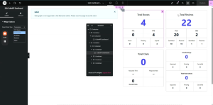
  2. In the right column, add the stats/counter elements of boosts, reviews, bookings and Chats for listings using the CubeWP Dashboard widget.
  3. In the left column, add the CubeWP Dashboard widget from the Elementor widget library to show the graph.
  4. Configure the widget’s post type to match your primary post type (e.g., Listings).

7. Boosted Listings and Campaign Display

If a site admin or a specific author has boosted a listing, the active boost campaign for that listing will appear in the user’s dashboard. This is displayed automatically when boost data is associated with the user’s listings.

8. User Profile Form

The dashboard may include a User Profile tab or section where users can update their personal information. This is implemented by:

  • Creating a dedicated Profile page that contains the user profile form.
  • Adding that page as a tab in the dashboard builder using the Page Content content type.
  • The form fields displayed include all mandatory user fields required for account updates (e.g., name, email, profile photo).
  • Users must fill in required fields accurately for the system to update their account settings across the platform.

9. Verification and Testing

  1. Log in to the site frontend as a regular user (not admin).
  2. Navigate to the User Dashboard page.
  3. Verify that all configured tabs appear in the dashboard navigation.
  4. Click each tab to confirm the correct content is displayed.
  5. Test the Announcements tab — if plan-based, ensure only plan subscribers see it.
  6. Check the Events and Appointments tabs to confirm post data renders correctly.
  7. Test the Inbox and Leads tabs for incoming messages and form submissions.
  8. Verify the graph on the main Dashboard tab loads correctly.


ℹ️  Note: If any tab is missing from the frontend, refresh the browser. Tabs configured in the backend are synchronized to the frontend automatically after saving.


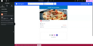
Here is the complete video tutorial
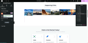
How to add term card and taxonomy widget to the homepage ?

Term Card & Taxonomy Widget

CubeWP Taxonomy Widget – Configuration, Styling & Custom Grid Layouts

Platform WordPress + Elementor + CubeWP
Feature Taxonomy Widget & Term Cards
Scope Term card creation, dynamic data binding, hover effects, and per-term grid layouts

1. Overview

This guide covers the complete workflow for displaying taxonomy term cards using the CubeWP Taxonomy Widget. The use case demonstrated is displaying location-based term cards on a homepage — for example, showing business locations from a Locations taxonomy. The process includes: adding the taxonomy widget to a page, creating a custom term card template in the Theme Builder, binding dynamic data (term images, names, counts, links), applying hover animations, and configuring custom per-term CSS grid layouts.


2. Adding the CubeWP Taxonomy Widget to a Page

2.1 Navigating to the Page

To begin, navigate to the homepage (or any page where you want to display the term cards) and open it with Elementor:

  1. Go to the WordPress Dashboard.
  2. Navigate to the pages, then select the target page (e.g., Homepage).
  3. Click Edit with Elementor to launch the Elementor editor.

2.2 Adding the Widget

  1. In the Elementor sidebar widget panel, navigate to the CubeWP category.
  2. Locate the CubeWP Taxonomy widget.
  3. Drag and drop the widget into a container on the page.
  4. It is recommended to first add a dedicated container and set its padding to 0, then place the widget inside this container for better layout control.


2.3 Configuring the Widget Settings

After placing the widget, the following settings are available in the widget configuration panel:

  • Taxonomy Selection – Select which taxonomy terms to display (e.g., Locations).
  • Number of Terms – Configure how many terms to show at once.
  • Style / View – Choose between box view (default) and other layout styles.
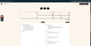
  • Layout Display – You can change layout display i.e grid or flex. Can also change other grid properties such as number of grid rows and grid columns.
  • Colors – Customize colors applied to the term card elements.


ℹ️  Note: The default view style is Box View. Multiple view styles are available, including pre-built styles like Classic Two Tech Style One and Classic Two Listing Feature Style One. Custom styles created in the Theme Builder will also appear here once published.


3. Creating a Custom Term Card Template

3.1 Accessing the Theme Builder

  1. In the WordPress Dashboard, navigate to CubeWP.
  2. Click on Theme Builder (also referred to as CubeWP Theme Builder).
  3. Click Add New Template.

3.2 Configuring the Template

  1. In the template creation dialog, select Term Card as the template type.
  2. Give the template a descriptive name — for example: Location Listing Style 1.
  3. Attach the template to the appropriate taxonomy — in this case, the Locations taxonomy.
  4. Click Save and Edit with Elementor to open the Elementor editor for this term card template.


ℹ️  Note: The taxonomy assignment is critical — it ensures that this term card design is only used for terms from the correct taxonomy (e.g., Locations). If you want a term card for a different taxonomy (e.g., Categories), create a separate template with that taxonomy selected.


4. Building the Term Card Layout in Elementor

4.1 Container Setup

  1. In the Elementor editor for the term card, add a new Container element.
  2. Set the container’s default padding to 0 to provide a clean canvas.
  3. This container will serve as the root wrapper for all term card content.

4.2 Adding the Term Image

The term image is the primary visual element of the term card. To add it dynamically:

  1. Add an Image element inside the main container.
  2. In the Image settings, look for the dynamic options. Click the dynamic data icon
  3. All custom fields attached to this taxonomy will appear in the dynamic field list.
  4. Navigate to the CubeWP Custom Fields section in the backend dashboard to verify that a field named Location Image (or Term Image) exists in the taxonomy section. If not, create one by clicking Add New in the Custom Fields area.

Selecting the Dynamic Image Field

  1. In the Elementor image settings, under Dynamic Tags, select the Taxonomy Image.
  2. Set the Source to CubeWP Field .
  3. From the custom field options, Select Term Image field.
  4. The image will now dynamically display the image assigned to each location term.

 Image Styling

  • Width: 100%
  • Height: 100%
  • Object Fit: Cover — ensures the image fills the card without distortion.
  • Object Position: Top Center — controls how the image is cropped.


ℹ️  Note: By default, the term card preview will show the data of the most recently added term. This is expected behavior — on the live frontend, each card will display its own term-specific data dynamically.


5. Adding Term Count and Term Name

5.1 Container Structure for Data Overlay

To display the term count and term name as an overlay on top of the image, use the following container structure:

  • Main Content Container (position: absolute) — positioned over the image to create the overlay.
  • Inner Container 1 — displays the term count.
  • Inner Container 2 — displays the term name.

5.2 Adding the Term Count

  1. Add a Heading widget inside the first inner container.
  2. In the heading settings, enable Dynamic Tags and select the Term Count tag from the CubeWP Taxonomy Custom Fields options.
  3. Apply the following styling:
  • Font Family: Open Sans
  • Font Color: White (#FFFFFF)
  • Adjust font size and weight as desired.

5.3 Adding the Term Name

  1. Add a Heading widget inside the second inner container.
  2. Set the heading level to H3.
  3. Enable Dynamic Tags and select the Term Name tag from the CubeWP Taxonomy Custom Fields options.
  4. Apply styling:
  • Font Family: Poppins
  • Font Color: White (#FFFFFF)
  • Adjust font size and weight as required.

6. Configuring Position and Overlay

6.1 Positioning the Overlay Container

The content overlay container must be positioned absolutely over the image:

  1. Select the main content container.
  2. In the Layout settings, set Position to Absolute.
  3. Use Alignment tools to center the container horizontally and vertically within the card.
  4. If there is a gap between elements, adjust the section spacing to 0 and set the container height to 100%.


ℹ️  Note: Since there is no direct percentage height option in Elementor’s standard controls, you can add custom CSS via the Advanced tab. Use the selector to target the container div and apply height: 100%.

6.2 Positioning Data at the Bottom of the Card

If you want the term name and count to appear at the bottom of the card (rather than the center):

  1. Select the inner data container.
  2. Set its Position to Absolute.
  3. Use the Bottom property to anchor it to the bottom of the parent container.
  4. Center the content horizontally using the alignment controls.

6.3 Applying the Overlay Background

To create a dark overlay effect on the card (visible on hover):

  1. Select the main container.
  2. In the Style tab, go to Background and set the Background Type to Classic.
  3. Set the Background Color to solid black (#000000).
  4. Set the Opacity to 0 — this makes the overlay invisible by default.
  5. In the Hover state, increase the Opacity to make the overlay visible when the user hovers over the card.


7. Hover Effects and Animations

7.1 CubeWP Term Card Hover Effects

The CubeWP Term Card provides built-in hover animation settings accessible from the Style tab of the main container. Locate the section labeled CubeWP Term Card Hover Effects:

Animation Direction Options

  • None – No animation (default).
  • Bottom to Top – Content slides up from the bottom on hover. Recommended for most designs.
  • Top to Bottom – Content slides down from the top on hover.
  • Left to Right – Content slides in from the left.
  • Right to Left – Content slides in from the right.

Translation Distance

When using Bottom to Top animation, set the Translation Height to control how far the content moves:

  • Recommended starting value: 400px (matches typical card image height).
  • Adjust based on your actual card height to achieve the correct animation travel distance.

Overflow Setting

To prevent animated content from overflowing the card boundary during the animation, set the main parent container’s Overflow property to Hidden.

7.2 Sub-Container Hover Translation

For additional animation on the sub-containers (e.g., the data overlay block), you can also apply hover translation:

  1. Select the sub-container.
  2. Navigate to the CubeWP Term Card Hover Effects section in its style settings.
  3. Set the translation direction (e.g., Bottom to Top).
  4. Set a small translation value — for example, 10px — for a subtle upward movement on hover.

7.3 Adding a Dynamic Term URL Link to the Term Name

To make each term name card clickable (linking to the term archive page):

  1. Select the heading  where the link should be applied.
  2. In the Link settings, enable Dynamic Tags.
  3. Navigate to CubeWP Taxonomy Custom Fields 
  4. Select the Term URL tag — this dynamically fetches the URL of each term.
  5. The link will now be applied, and clicking the card will navigate to the correct term archive page.

8. Per-Term Custom Grid Layout

8.1 Overview of Per-Term Grid Settings

The CubeWP Taxonomy Widget supports a custom per-term grid layout system. This allows you to configure a CSS Grid layout where each term card occupies a specific position, column span, and row span — creating a visually complex mosaic or magazine-style layout.

To enable this feature:

  1. In the CubeWP Taxonomy Widget settings, locate the option labeled Enable Per Term Grid Settings.
  2. Toggle it to Enabled.


8.2 Using the Grid Configuration Tool

CubeWP provides an external grid configuration tool (accessible via a website link in the widget settings) that generates the necessary CSS for your grid layout. To use it:

  1. Open the grid tool website linked in the widget settings.
  2. Set the number of Columns for your grid (e.g., 6 columns).
  3. Set the number of Rows for your grid (e.g., 2 rows).
  4. Drag and drop the term items in the grid tool to define their position and span.
  5. For each item, configure: Column Span, Row Span, Column Start, and Row Start.
  6. The tool generates CSS code for each div configuration.
  7. Copy the generated CSS values for each term position.


8.3 Applying Grid Configuration to Each Term

After generating the layout from the grid tool, apply the values in the widget’s Per-Term Grid Settings. For each term item (by position number), configure:

  • Term Position – The order/index of the term (1 = first term displayed).
  • Column Span – How many columns this term card should occupy.
  • Row Span – How many rows this term card should occupy.
  • Column Start – The grid column line where this item starts.
  • Row Start – The grid row line where this item starts.
  • Custom Width – Set to 100% unless a specific pixel width is required.
  • Custom Height – Set in pixels based on the image height required (e.g., 434px for a tall card, 215px for a half-height card).

8.4 Example Grid Layout: 6 Columns x 2 Rows

The following example demonstrates a 6-column, 2-row grid layout suitable for displaying 6 location terms:


Term Position Column Span Row Span Notes
1 (First / Hero) 2 2 Starts at col 1, row 1; height = 434px
2 2 1 Starts at col 3, row 1; height = 215px
3 2 1 Starts at col 3, row 2; height = 215px
4 2 2 Starts at col 5, row 1; height = 434px
5 1 1 Positioned in grid as needed
6 1 1 Positioned in grid as needed


ℹ️  Note: The first term (hero card) is positioned at column 1, row 1, spanning 2 columns and 2 rows. This creates a large featured card. Terms 2 and 3 are stacked on the right at 2 columns wide but only 1 row tall each. Adjust these values in the per-term grid settings based on your specific design.

8.5 Fixing Image Height in Grid Cells

A common issue with the per-term grid layout is that images do not fill their grid cell height by default. To fix this:

  1. Return to the Term Card template in the Theme Builder.
  2. Select the Image element.
  3. Set its Width to 100%.
  4. Set its Height to 100%.
  5. Set Object Fit to Cover.
  6. Set Object Position to Top Center.
  7. Save and Publish the term card template.
  8. Reload the frontend page to verify that images now fill their respective grid cells correctly.

If the image still does not fill the container height, apply custom CSS via the Advanced tab in Elementor:

  • Target the container div selector.
  • Add: height: 100%;
  • Publish the changes and reload to verify.


9. Publishing the Term Card and Verifying on the Frontend

  1. After completing the term card design, click Publish in the Elementor editor for the term card template.
  2. Navigate back to the Taxonomy Widget on your homepage.
  3. In the widget’s Style dropdown, the new term card style (e.g., Location Listing Location Style One) will now appear in the list. If it does not appear, perform a page reload.
  4. Select the new style from the dropdown.
  5. Publish the homepage page.
  6. Reload the frontend and verify that all term cards are displayed with the correct images, names, counts, and animations.


ℹ️  Note: After selecting the new term card style in the widget, the style will be immediately active and visible in the Elementor preview. Always publish before checking the live frontend to ensure all changes are saved.


10. Additional Widget Configuration Options

10.1 Controlling the Number of Terms Displayed

In the Taxonomy Widget settings, you can control exactly how many terms are shown at once. For example, setting it to 6 will display the first 6 terms from the selected taxonomy in the configured grid layout.

10.2 Applying Custom CSS for Advanced Layouts

For layout customizations not available through Elementor’s standard controls (such as forcing a container height to 100%), use the custom CSS option in the Advanced section of the Elementor element settings:

  1. Select the element that requires custom CSS.
  2. Go to the Advanced tab in the Elementor panel.
  3. Expand the Custom CSS section.
  4. Write your CSS using the selector provided (e.g., selector { height: 100%; }).
  5. Click Apply and then Publish to save the changes.

10.3 Building Custom Styles with Elementor

All term card styles are fully built using Elementor’s visual editor. You can create any number of term card styles by adding new templates in the Theme Builder, designing them in Elementor, and then selecting them in the Taxonomy Widget. There are no restrictions on the complexity of the design — you can use any Elementor widget, container layout, and styling option available in your installation.


Here is the complete video tutorial
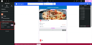
How to add banner search form on the homepage?

Banner Search Form

Configuration & Styling Reference

Platform WordPress + Elementor + CubeWP
Feature Search Form (Banner Area)
Scope Search form creation, placement, and full styling

1. Overview

This guide covers the complete process of building, placing, and styling a Search Form widget on the banner section of a homepage using the CubeWP Search Form plugin integrated with WordPress and Elementor. The workflow includes configuring the search form in the dashboard, selecting the appropriate post type, adding fields, and then styling each component to match a custom design.


2. Creating the Search Form in the Dashboard

2.1 Accessing the Search Form Builder

To begin building a search form, navigate to the WordPress Dashboard and follow this path:

  1. Go to the WordPress Dashboard.
  2. Hover over CubeWp and then Navigate to Search Forms.
  3. Select Search Forms.
  4. Select the post type against which you want to build the search form (e.g., Listing Post Type).

2.2 Configuring Search Form Fields

The search form supports a variety of field types drawn from default WordPress custom fields and custom taxonomy-based fields. The following fields are available:

Default WordPress Custom Fields

  • Keyword Field – Allows users to enter free-text keyword searches.
  • Search Button Field – Triggers the search and redirects to the search results page.

Taxonomy-Based Fields

These fields are attached to the Listing Post Type and sourced from its taxonomies:

  • Locations – Filter listings by geographic location.
  • Features – Filter by listing feature attributes.
  • Listing Tags – Tag-based filtering.
  • Listing Categories – Category-based filtering.


ℹ️  Note: Any field can be selected and reordered based on your design requirements. You can attach any field you desire to complement your search form layout.


2.3 Adding What (Keyword) field

To attach the Keyword (used as the ‘What’ field) to the search form:

  • Attach the Keyword field to the designated spot in your form configuration.
  • You can change label to What, add class to input or container, and change the placeholder

2.4 Adding the Google Address Field

To attach the Google Address field (used as the ‘Where’ field) to the search form:

  1. Locate the Google Address field in the available field list.
  2. Attach it to the designated spot in your form configuration.
  3. Set its display label — for example, ”Where’.

Drag the search button into the form, change the search button’s name/label. Save all changes before proceeding.


3. Placing the Search Form on the Homepage (Elementor)

3.1 Opening Elementor on the Homepage

After saving the search form in the dashboard, navigate to the homepage and click Edit with Elementor to open the page editor.

3.2 Creating the Container Structure

The search form must be placed inside a properly configured container. Use the following structure:

Outer Container

  • Add a new container element to the page.
  • Set the background color to white (#FFFFFF).
  • Apply a border radius of 6 pixels.
  • Add a bottom margin of 40 pixels to ensure proper spacing from surrounding elements.

Inner Container

  • Place a second container inside the outer container.
  • Set the default padding to 0 for this inner container.

3.3 Adding the Search Form Widget

  1. In the Elementor widget panel, navigate to the CubeWP category.
  2. Find the widget named Search Form.
  3. Drag and drop the Search Form widget into the inner container.
  4. In the widget settings, select the post type — choose Listings from the dropdown menu.
  5. All fields previously attached to the Listings post type will now appear in the preview.

4. Styling the Search Form

The  Search Form widget provides dedicated styling sections for each component. All styling changes are reflected in real-time within the Elementor preview. Below is a comprehensive breakdown of all available styling options.

4.1 General Form Container Styling

Property Recommended Value / Notes
Padding (default) 20px top/bottom, 30px left/right
Border Radius 6px (or set to 0 to remove)
Box Shadow Set to fully transparent if not needed
Background Color Customizable per design preference


4.2 Styling the ‘What’ Field (Keyword Field)

Label Styling

  • Set label color as desired — customizable background color and text color are supported.
  • Adjust label padding: recommended values are top: 11px, bottom: 16px; set left/right as required.
  • Set label border-radius to 0 to remove any rounded corners on the label.
  • Use position: absolute to layer the label on top of the input field for a floating label effect.

Input Field Styling

  • Set input padding to 8px as a starting value.
  • Increase left padding significantly to accommodate the label positioned absolutely on the left side.
  • Set width to a fixed pixel value (e.g., 300px) or keep at 100% based on design needs.
  • Remove default browser margin by setting margin to 0 — also remove bottom margin.
  • Set background color as required by your design.
  • Set border type to none to remove the default input border.

Icon Configuration

  • An icon can be added to the ‘What’ field if required.
  • To remove an icon entirely, simply do not include it in the field configuration.


4.3 Styling the ‘Where’ Field (Google Address Field)

Label Styling

  • Apply the same padding values as used for the ‘What’ field label to maintain visual consistency.
  • Set label border-radius to 0.
  • Set label position to absolute so it appears overlaid on the input field.

Input Field Styling

  • Set container width to 300px (or as required by your layout).
  • Set border width to 0px and border property to none.
  • Set padding to 70–90px (left) to accommodate the Google Address icon displayed inside the field.
  • Apply a left margin of 10px to the input for proper spacing.

Google Address Icon Positioning

  • The Google Address field automatically displays a location icon inside the input.
  • Position the icon using top: 10px from the top edge.
  • Apply a left margin of 10–20px to position it correctly within the input.
  • Ensure the icon is vertically centered within the input field.

4.4 Styling the Search Listing Field Container

  • Set the padding for the sub-label.
  • Set the label border-radius to 0.
  • Set the container width to 100% (or 99–100px fixed if required).
  • Set bottom margin to 0 to remove unwanted spacing.
  • Add additional padding as needed based on your design.

4.5 Styling the Search Button

The search button is fully customizable through the widget’s button styling panel. The following properties can be configured:

  • Color – Text color of the button label.
  • Background Color – Fill color of the button.
  • Padding – Internal spacing within the button.
  • Margin – Spacing around the button; set left margin to 10px minimum.
  • Border – Border type, width, and color.
  • Border Radius – Rounded corners configuration.
  • Icon – Attach a search icon to the button. Search the icon library and select the appropriate icon.
  • Icon Size – Adjust the size of the icon within the button.
  • Icon Color – Set the icon color (e.g., black or white depending on the background).
  • Typography – Configure font family (e.g., Open Sans), font size (12–14px), and font weight.

Button Default Styling Reset

  • Set button padding to 0 to reset default browser styles.
  • Set top margin to 0 to remove any unwanted default spacing.
  • Ensure the icon is positioned within the button boundaries and visually centered.

4.6 Label Typography

To style the typography of input labels globally across the search form:

  1. Go to the Label Style section in the widget settings.
  2. Adjust the Typography settings for the label.
  3. Set Font Weight to 200–400 depending on desired visual weight (lighter values produce thinner text).
  4. Monitor live changes in the Elementor preview to select the best weight.

4.7 Input Field Styling (Global)

  • Padding – Adjust for all input fields consistently.
  • Border Color – Set or remove the input border.
  • Background Color – Set a custom background fill.
  • Placeholder Color – Set to black (#000000) or any preferred shade.
  • Text Color – Configure the color of user-entered text (e.g., #333333).
  • Height – Set a fixed height value (e.g., 45px or 46px) for consistent alignment.
  • Margin – Set to 0 to remove browser default margins.

5. Keyword Suggestions

5.1 Enabling Keyword Suggestions

The ‘What’ field supports an autocomplete keyword suggestions feature. To enable it:

  1. Go to the WordPress dashboard, hover over CubeWP, navigate to the settings and click on it.
  2. Locate the Keyword Suggestions section. 
  3. Enable keyword suggestions for Listings
  4. Select the taxonomies whose terms should appear as suggestions — for example, ‘My Listing Category’ and ‘Listing Tag’.
  5. Save the settings and reload the frontend to verify that suggestions appear in the ‘What’ field.

5.2 Styling the Keyword Suggestions Dropdown

The keyword suggestions dropdown is styled from within the Search Form widget’s Style tab, under the Keyword Suggestions section. The recommended configuration is:

Container / Dropdown Box

  • Background Color: #FFFFFF (white)
  • Container Padding: 7px
  • Border Radius: 7px
  • Border from Top: 12px

Individual Suggestion Items

  • Text Color: #333333 (dark gray)
  • Padding: 15px left and right, 8px top and bottom
  • Margin: 0px (all sides)

Typography

  • Font Size: 14px
  • Font Family: Open Sans
  • Font Weight: 300 (Light)
  • Line Height: 20p

Images in Suggestions

  • Listing images: Set to 30x30px (or 20x20px as preferred).
  • Image Border Radius: 0px (square corners).
  • Image Margin Bottom: 10px.
  • Border between image and title: 10px spacing.
  • Taxonomy label images: Can be hidden if not required.

Hover State

  • Change the background color on hover to a lighter shade for visual feedback.
  • A border effect can also be applied on hover to highlight the selected suggestion.


ℹ️  Note: After configuring all keyword suggestion styles, publish the page and reload the frontend to verify that the suggestions appear and behave as expected when a user clicks inside the ‘What’ field.


6. Publishing and Final Verification

  1. After completing all styling configurations, click the Publish button in Elementor to save and deploy the changes.
  2. Navigate to the frontend homepage URL.
  3. Verify the search form displays correctly with all fields, labels, and the search button.
  4. Click inside the ‘What’ field to confirm keyword suggestions appear as configured.
  5. Hover over suggestion items to verify hover state background and border effects.
  6. If further adjustments are needed, return to Elementor and fine-tune the margin (e.g., increase left margin from 10px to 15px) and padding values as required.


ℹ️  Note: All styling changes should be verified on both desktop and mobile views to ensure responsiveness. The margin adjustments between the label and icon (e.g., 15px from left edge) are critical for visual balance across different screen widths.


Here is the link of the video tutorial